For more context, read a bit about Amicus.
The first version of Amicus was built by developers and didn’t take into account how volunteers would actually use it. One of my first projects was redesigning the call tool—the app’s main point of interaction.
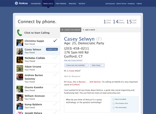
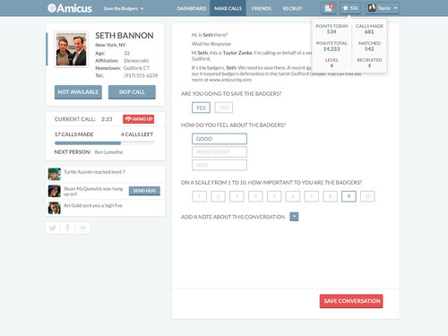
This was the call tool when I joined.
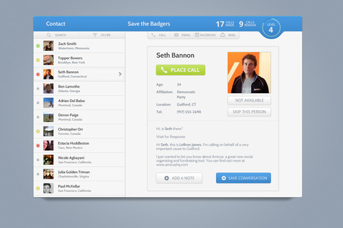
They had a new version in the works, which was a visual improvement, but kept the flow more or less the same.
This flow in place didn’t make much sense to me.
It presented each user with a list of friends to call. The choice drew their focus away from the most important areas of the page—the person they were calling, and the script they were reading. It was adding cognitive load for no reason.
Volunteers had to decide who to call, click on their names, and then click the call button. I felt that we were asking too much of them.
As a call tool marketed to large non-profits, Amicus needed to optimize for the number of successful calls. With the onus on them rather than the app, volunteers didn’t feel as comfortable calling people on the list. The flow created friction, increasing the time between calls and stopping volunteers from entering a flow state—where we needed them to be.
I borrowed the new aesthetic from the previous mock and focused on solving some of these issues.
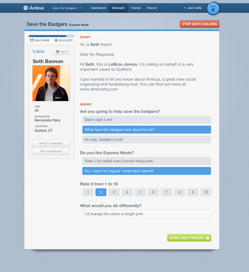
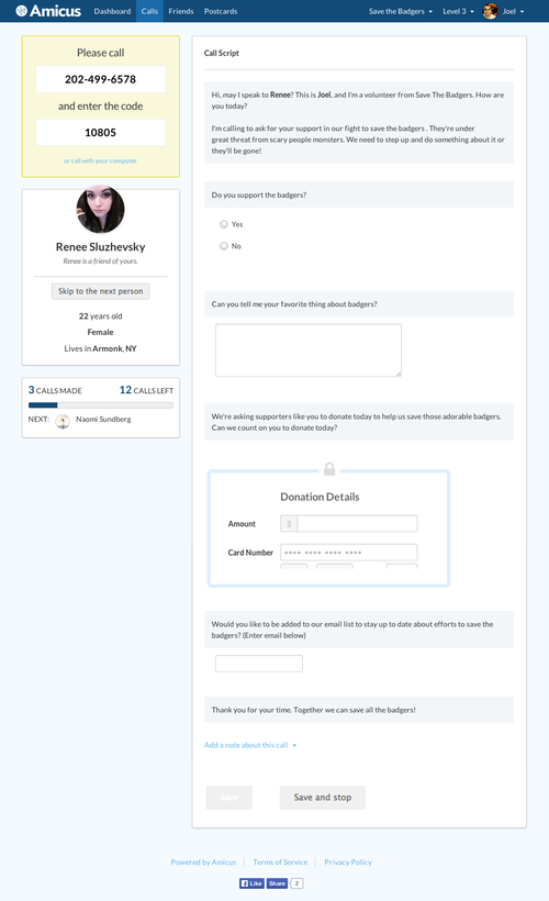
I removed components tangential to the tool’s use case. The app could potentially pick who to call next, so I removed the list and introduced auto-calling.
I also added a form with which volunteers could easily save data, to either be used by the non-profit or subsequent callers.
All volunteers would see in this new interface was the person they were in a call with. When the call was over, they’d submit their form and automatically call the next person (with a skip option, just in case).
When I joined, Amicus a tiny startup. We had four people on two desks at General Assembly, when it was still a co-working space. We would get sidetracked often and build features we didn’t need. We’d focus our resources on tangents. As a result, the “express” call tool was tabled for over a year.
I saw Amicus mature from that scrappy startup into a more mature company. We moved into a large office in SoHo, hired out a larger team, and adopted an effective agile process. Things began progressing in a quick and directed fashion. This shift provided valuable lessons in prioritization and strategy. It also, thankfully, led to the implementation of my revised flow.
We put together a sprint team to rebuild the flow. There were a few areas that needed massaging, but we wanted to work quickly. Rather than design new mocks, I built the design on our sprint branch and pushed changes as I had them. I was working remotely at the time, and this process kept the team in sync with the latest version of the design. I coded several animations that would provide clarity and context to each part of the screen.
I redesigned weak points as they came up. Some of my notes from the sprint:
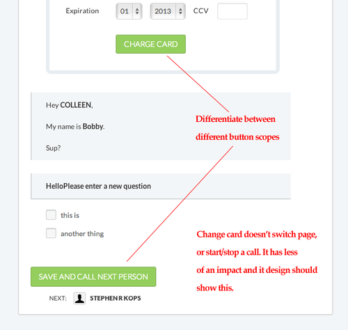
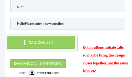
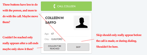
Before jumping in, I conducted some research into which states a call could exist in. I decided to visualize these states as cards placed on the top left of your screen. The instructions for what to do next would always go there.
I wanted each element’s purpose to be extremely clear and consistent. Following are screenshots of the final state designs:
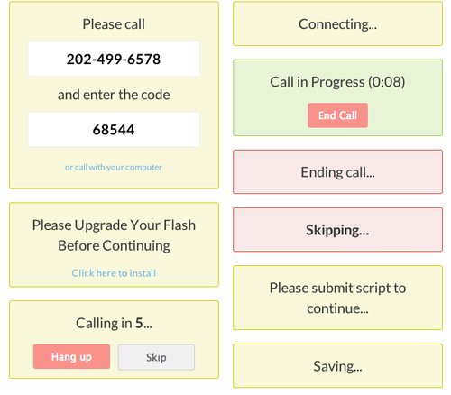
We offered two modes of calling: through your phone and through your computer’s microphone, both served by Twilio.
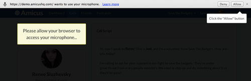
Calling through your computer presented a technical challenge—browsers ask for permission before using your microphone. We found that users often got stuck on this step, ignoring the alert, which would often block them from receiving the alert in the future, breaking our app forever.
I developed a dark overlay and an animation where a tooltip would fly across the screen. Corny, but successful in grabbing their attention. For each browser, I designed solutions that would fit their respective methods of asking for permissions. No browser left behind.
After an entire year of stagnation, the new call page was completed in two weeks.