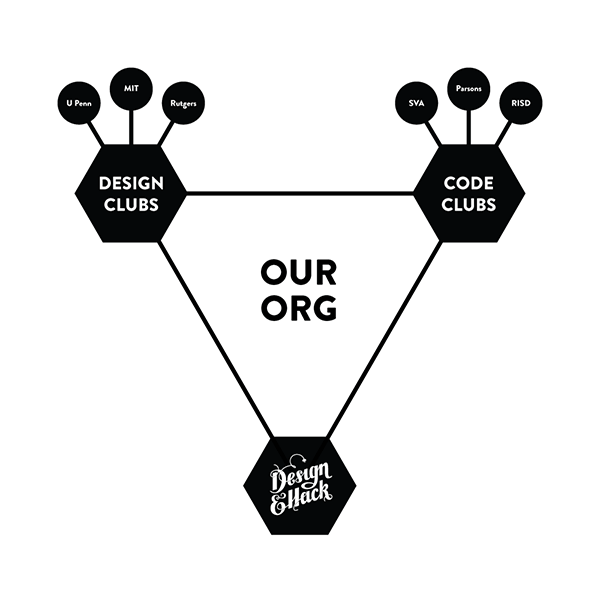
I am president and co-founder of Design & Code, a non-profit organization with the mission of teaching designers how to code. We currently have branches in Parsons, The New School for Design, and in the Interaction Design MFA at SVA. We have recently decided to expand and also teach developers about design.

This page will go over some experience design, but mostly visual design work that went into different aspects of the organization.
Initial Branding
Design and code started as the Parsons Code Club. Since we were all designers, we put together a crowdsourced brainstorming session for our brand with our initial members. The brand we chose was a concept by Robert Vinluan, who later joined the org leadership, for a generative brand based on a triangular grid. For the next year, this was the logo we’d use.
For an interactive version of the logo, check out our GitHub page.
The Website
Design & Code’s website is the stuff of legend. Since being founded in December 2012, we have planned on building a website. It was never a priority though, and every time we got some headway on it, the organization would evolve into something slightly different. A Design & Code website should be completed soon. Then again, we’ve said that before. For now, this is a glimpse at the process around the first Parsons Code Club website.
Once we decided to build a website, we met to define our goals.
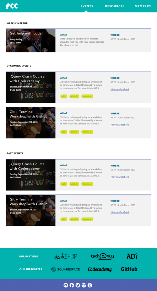
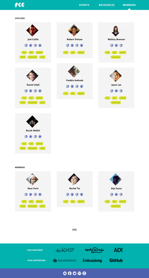
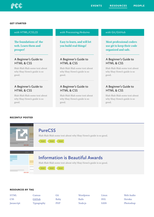
We wanted the site to have several pieces of content; events, where we would list our weekly meetings as well as special lectures and workshops; resources, where we could add articles and external links to tools and tutorials; member listings, so that they could reach out to one another; and a homepage to aggregate the latest and most important parts of this content.
If you are on a desktop machine, you can click on these thoughts/wireframes to expand slightly for extra legibility.
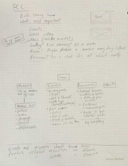
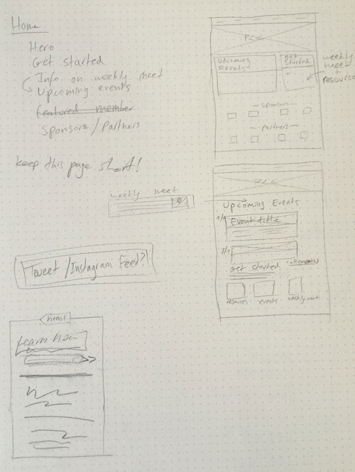
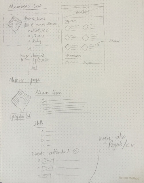
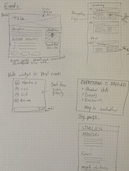
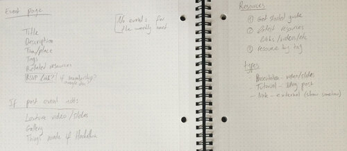
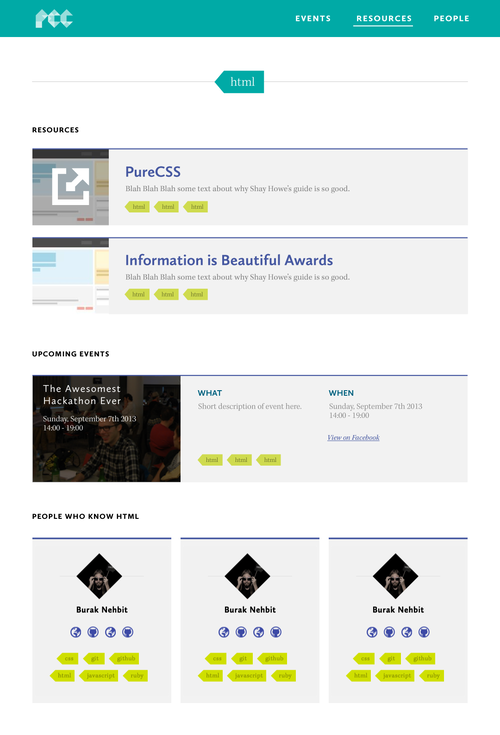
I envisioned the entire site as one connected database. Everything would be tagged. Events, resources and people alike. If a visitor was looking at an event posting, it should be easy to then get tutorials on the same subject matter, or contact other club members who are more experienced in the specific language. Tag pages would aggregate any data with the tag.
Robert and I were in charge of designing the site. We synthesized the best parts of each of our wireframes and put together this design for the site, based off of our brand at the time.
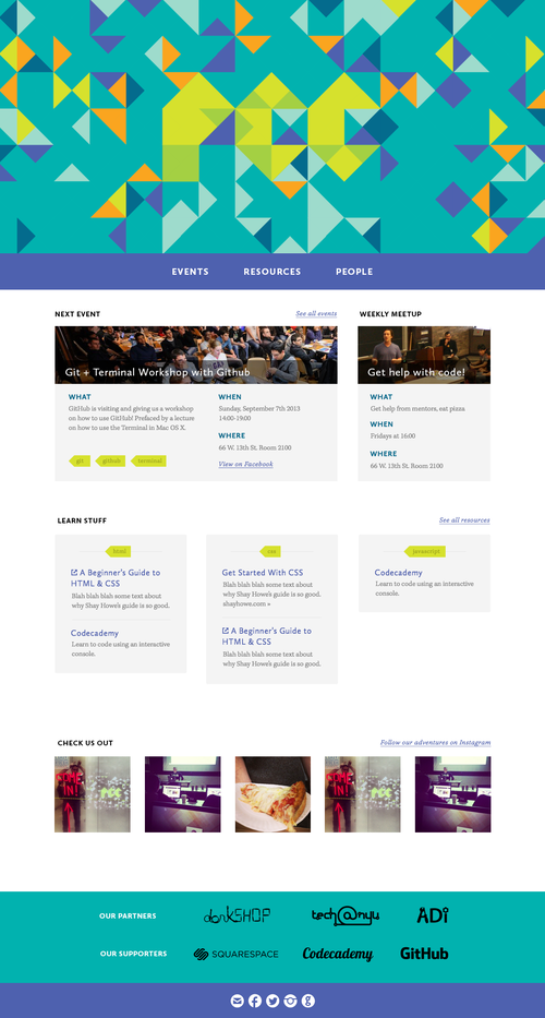
The homepage would have the full animated header, while individual pages would show a thin header with a subtle monoscale animation of the logo.
I actually coded the entire front-end of the site. We just never got around to implementing it. So it goes.
Creative Code Club
At some point we decided that only serving Parsons was not enough. We wanted clubs in every design school. We’d outgrown Parsons Code Club and needed a whole new idenity for our wider mission.
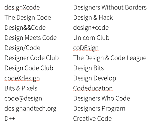
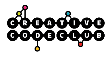
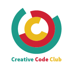
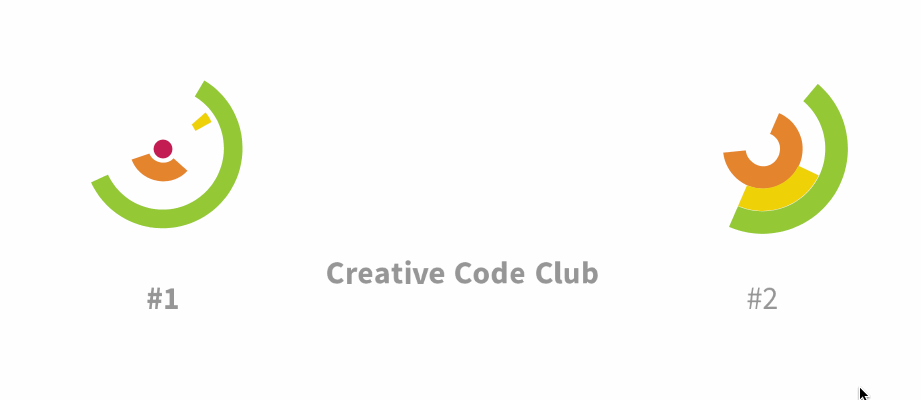
The first step was choosing a name. We must have gone through over a hundred before settling on Creative Code Club. By this point, the organization had become my thesis at Parsons, so with the extra time I had to dedicate, it became my responsibility to brand it.
We wanted our brand to communicate these characteristics:
- Intelligence
- Unity
- Progress
- Dynamism / Flexibility
- Tech
- Design
- Friendly / Welcoming
It was also important to me that the brand be generative. We were a creative code club, after all. It seemed wrong not to have code be an actual part of our brand.
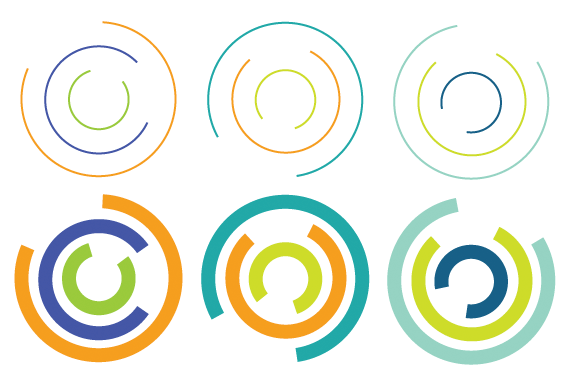
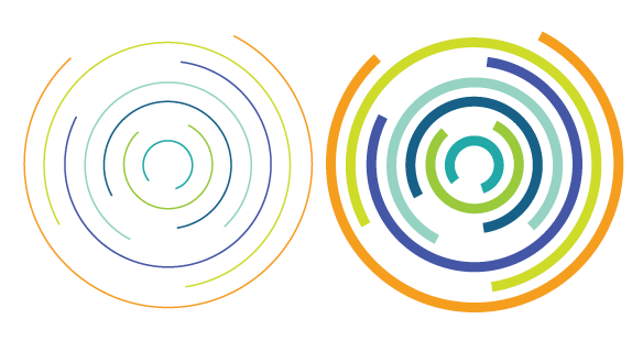
My first direction was a node-system. Every time the logo was printed or shown, the node structure would be generated anew. It would never look the same. The idea was to allow for different schools to exist within a single unified brand system.
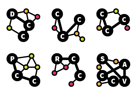
This direction was deemed too childish, reminiscent of a theme park. I tried out another possible direction, with 3 intertwined Cs. The idea here was not just to generate different combinations of Cs, but to create some sort of interaction.
I even built a few Processing apps as prototypes of possible brand interactions.
The three Cs lent themselves inherently to this brand system. The problem with this direction is that I was far from the first to have thought of this. Although I loved it, I decided to scrap the direction and move on.
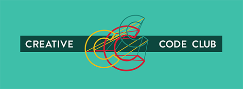
My third attempt (after many sketches and failures) was a sort of wireframe style. 3 randomly positioned and scaled Cs connected by lines. It was very clearly a brand developed rather than designed. This was both a pro and a con.
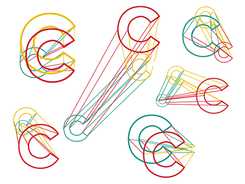
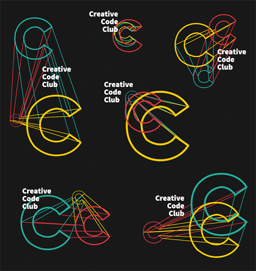
It was too tempting not to create a Processing app for this as well.
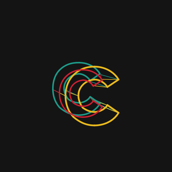
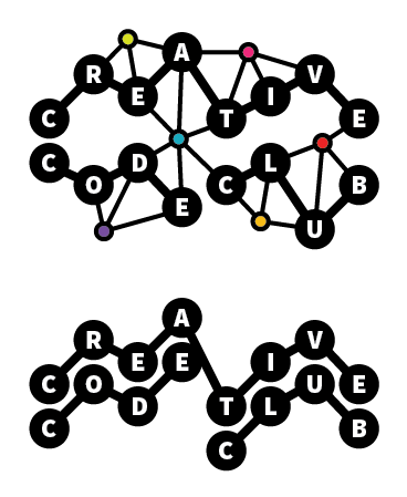
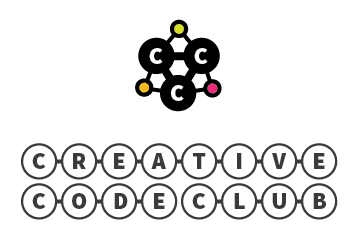
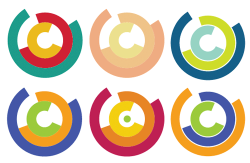
This remained our brand for the next few months. In addition to the logo, I chose Brandon Grotesque as a strong and friendly geometric sans-serif for titles, and balanced it out with Kepler Std, a more delicate and proper serif.
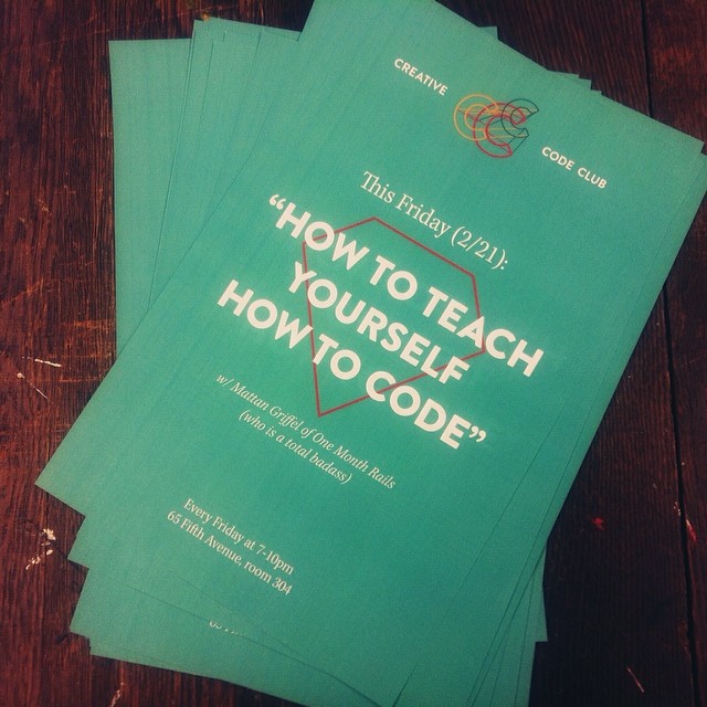
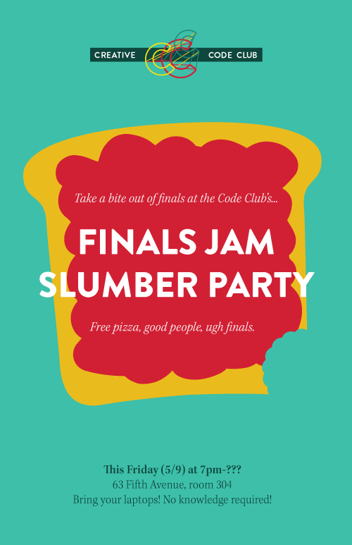
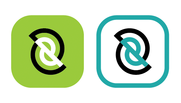
Following are a few implemenations of the brand.
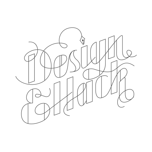
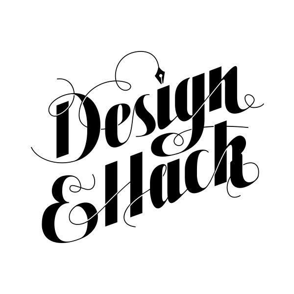
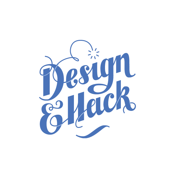
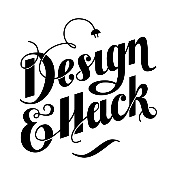
Design & Hack
Design & Hack has been a passion project of mine since I first had the idea for it slightly over a year ago. It’s planned for September 2014 and will be the first student hackathon focused on design. Following is some design work in collaboration with Robert Vinluan.
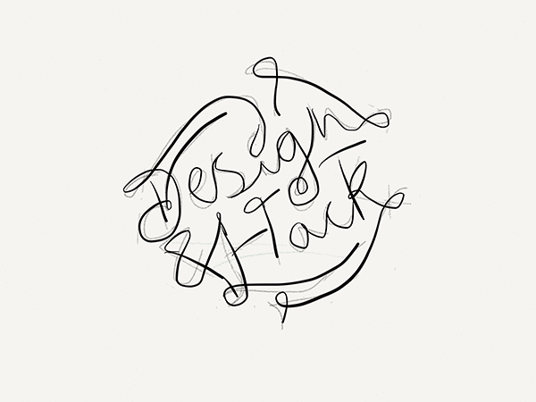
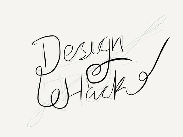
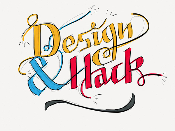
Once I got the sketch more or less down, Rob and I began the process of polishing it into a brand we could be proud of.
There was also a site to be built. Robert and I collaborated on this as well. We are good collaborators. If you ever need collaborators, you have our number.
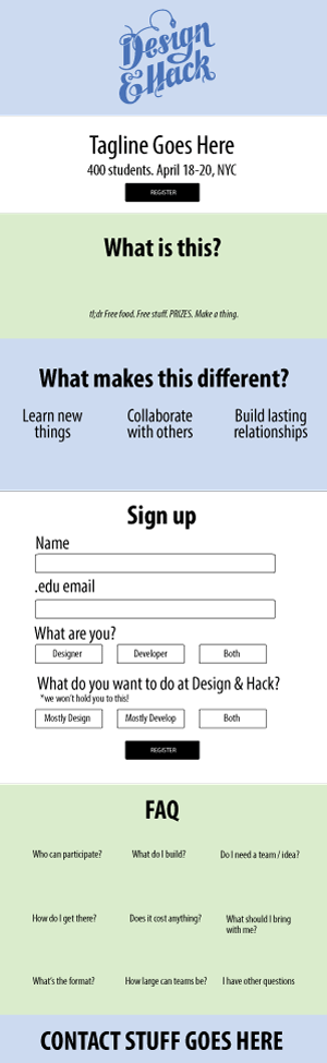
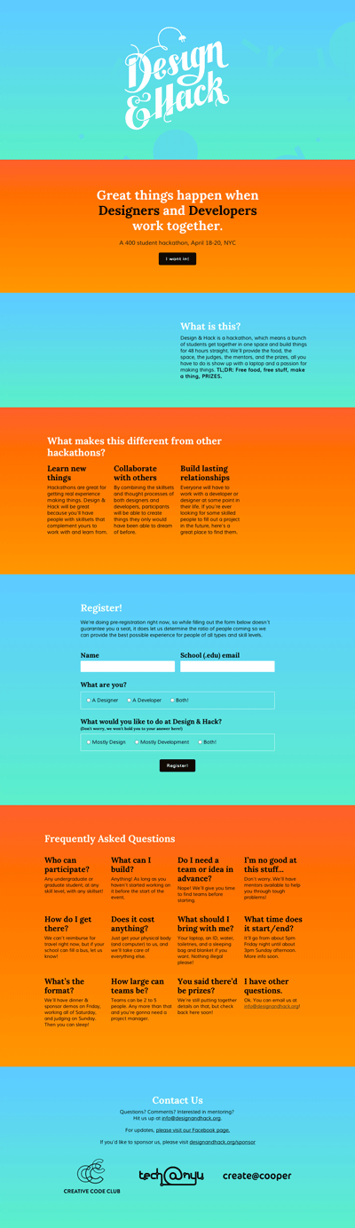
Check it out
The site got 400 signups in less than a week, so we must have done something right. To see it in action, go to designandhack.org.
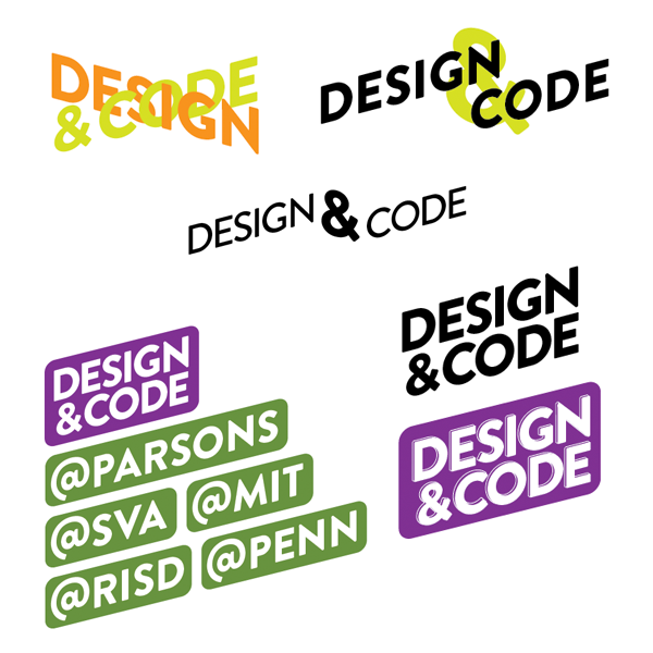
Design & Code
At this point we had branches at both Parsons and SVA, but we weren’t what we needed to be yet. Our final evolution came after the influx of excited messages from developers about Design & Hack.
Our mission thus far had been to teach designers how to code in order to better tech culture, provide new perspectives on the creation of tech, and lead to better things being made. The problem was we’d only been serving one part of the market. We were moving designers closer to developers but neglecting developers who wanted to learn about design.
I had a vision for a better organization that would sit in the intersection of design and technology.
This new organization needed a new name. We almost intuitively decided on Design & Code. It had been in our brainstorming sessions before but never quite fit until that moment. The whole organization seemed to suddenly make more sense.
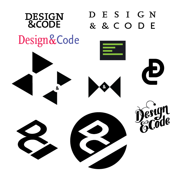
Design & Code also needed a new brand, so I quickly got to work, sketching out as many possible directions as I could.
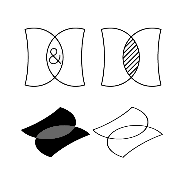
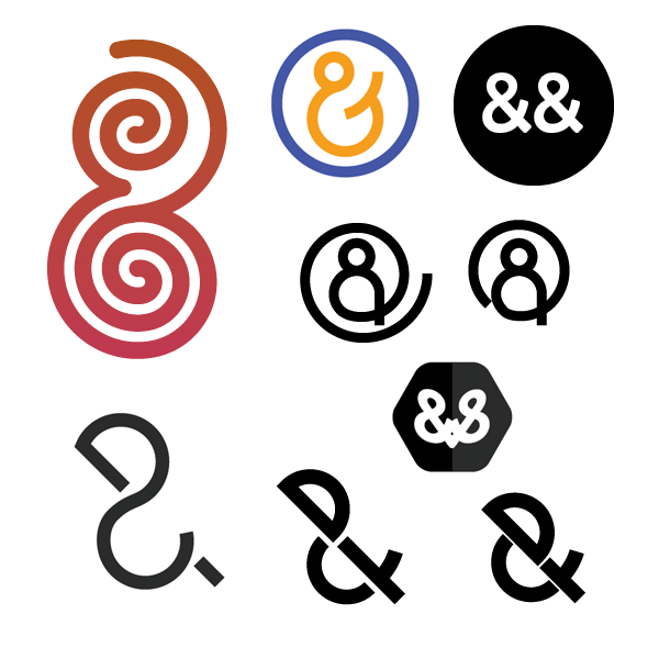
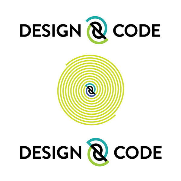
I finally reached something I liked through experimentation with spirals. To me they represented two worlds intertwining, which was what we were trying to do. The resulting shape is a quirky ampersand. It grew on me quickly. I spent some time iterating on it and built a D and a C around it.
With every iteration I liked the logo more, but when I tested it on people the ampersand was not immediately noticeable and some parsed the type as “design code” rather than “design and code.” The D and the C weren’t noticeable at all. I tried to make the ampersand clearer but lost the pure forms I had grown to love.
And then I decided to scrap it. For the record, I still love it. I’ll just have to make two versions of every branded design from now on. One with our actual brand, and one with this, just for me.
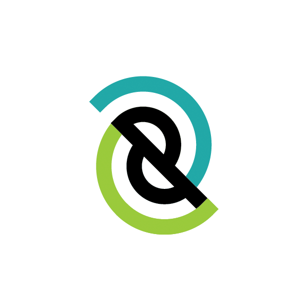
A few weeks later Rob and I brandstormed and reached our current brand. The mark itself is anything but spectacular, but the potential of the system, and what we plan to do with it, is very exciting.