For more context, read a bit about Amicus.
The Dashboard
When I joined, the Amicus dashboard was not doing its job very well. There were a good deal of stats, your organization’s announcements, and a leaderboard. There was no clear next step, no obvious area to focus on. Users would get lost.
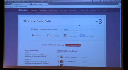
This wouldn’t do. If a dashboard isn’t providing value, there’s no point in it existing. Indeed, around the time I left, I was exploring ways to remove it entirely.
This dashboard needed to be cleaner, with fewer stats and a call to action you couldn’t ignore. I hid most gamification stats (such as calls made and friends matched) to the header and focused on what the user should do next. I hated the aesthetic pretty much the moment I finished designing it, but the structure was solid.
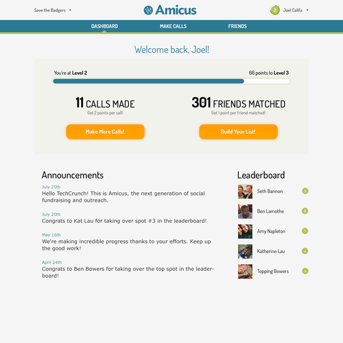
At the time, there were two important actions we needed users to take.
First, we needed them to match their friends. This meant tying their Facebook friends with existing voter data, which we pulled from external APIs. The voter data included contact information, political affiliation, and so forth. We needed users to connect the two data sets so we could figure out who to include on a call list and which number to call.
Second, we wanted them to then call these people on behalf of the cause they were representing.
Usability tests showed that displaying two buttons was confusing to users (in hindsight: no shit). We decided to focus on getting users to make calls.
We ended up shipping a version of this overhauled dashboard. It showed how many calls you made and nudged you to make more. For the points.
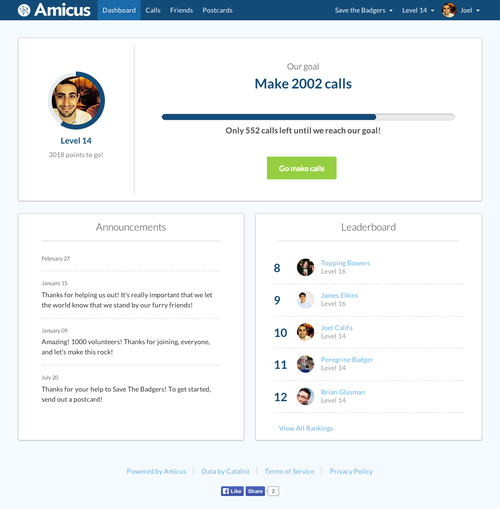
Soon after, though, we shifted to a new strategy. Amicus had a relatively shallow layer of gamification. This, we decided, was the wrong approach.
Our users were volunteers. They cared enough about their respective causes to call others on their behalf. We were using an artificial point system as motivation, but we had a much more powerful motivator at our disposal: the cause’s success.
The initial progress bar showed their progression to their next level. I changed this to represent the entire initiative’s goal, which shifted the messaging. By making calls they weren’t helping themselves. They were achieving the goal that they were here for.
Although we shifted focus, we opted to keep our leveling system in place. I minimized its importance and differentiated it from the initiative’s goal. I ended up building a radial progress bar using d3.js and changed the other styles to fit.
The result is our current dashboard:
Community
One of the most powerful aspects of a volunteer office is the other volunteers. They’re in it with you, they cheer you on. When you walk in, there are often walls of notes where volunteers have written why they’re there. When you hit a goal, someone rings a bell and your motivation skyrockets.
This kind of motivation seemed more organic and sustainable. We felt that by replicating it we could create a positive feedback loop that would push our volunteers to new heights.
I explored several ways to do just that.
Energy Room
My first thought was what I called the Energy Room. A page filled with profile pictures from all currently active users on your campaign. Lights would flash when they were calling, when they were hung up on when they received donations, and so forth.
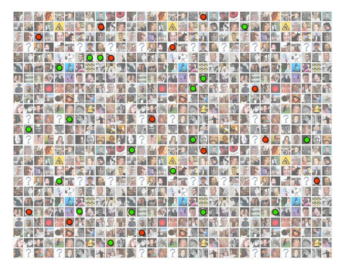
This was awful, but I saw some potential. I felt a less distracting version of it could be integrated into the call page.
Temporary Teams
As we explored the possibility of surfacing campaign activity on the call page, I made a call to focus on smaller, tight-knit teams that could work together to achieve goals.
This way we wouldn’t need to have many users on an organization for it to feel welcoming (or, alternatively, not empty). The teams would be temporary, in the style of online games. When one team member leaves, someone new takes their place. The system would work to find a good team for you.
The team’s size would allow for more personal interactions. I wanted team members to be able to perform cute gestures such as “high fiving” each other. In a smaller context, these gestures would mean more.
The system could include quick and whimsical canned responses to make the experience more enjoyable. The ones in this video are just examples, not serious proposals for a final product 😬
Fixed Groups + Why Are We Here?
Temporary teams became fixed groups. Here, we let users create permanent groups of friends and work towards goals together. The leaderboard shifted to groups rather than individuals to get some competition going. Now you were working for the cause, but also for your team.
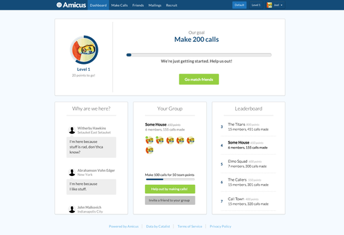
Finally, I ran a design sprint for communities with some of our engineers. The project we ended up running with was “Why are we here.” The idea was for users to type in their reasons for being part of the campaign. These messages would serve as motivation for other users.
Conclusion
Amicus was fast-paced and exciting around this time. We’d just hit our stride in terms of product development. We could explore varying concepts, prototype them quickly, and get them in the product.
The new dashboard and fixed groups were well received by our non-profits, and both had a positive effect on volunteer engagement.