We all know that moment. You register for a new service, type in your chosen password, but can’t get in. Your password could very well be secure, but the opinionated service you’re trying to use disagrees.
You must use at least 1 symbol, 1 number, 1 uppercase letter, and 1 lowercase letter.
Forget about the now famous XKCD strip that proves a long lowercase password is more secure than a short dollar-sign-riddled password. Let’s assume your go-to password is $$ICECREAM$$. It’s easy to remember because ice cream is literally your favorite thing, a beacon of light in this terrible world, and the password has a few special characters to boot.
Unfortunately $$ICECREAM$$ doesn’t include a lowercase letter and a number, and is thus objectively insecure. Your password for this service is now $$IceCream100$$. Since this password is more secure anyway, you decide to make it your new go-to password. Not a perfect day, but all in all, you’re happy.
You cannot use special characters in your password.
So $$IceCream100$$ was nice while it lasted. You used it for 6 products before you hit one that wasn’t cool with it. That’s the thing about opinionated services — they often disagree. Maybe they dislike special characters but need numbers, maybe they hate numbers but require special characters. Go figure.

So, okay, exclusively for this finicky service you agree to drop the $$ and use IceCream100 instead. Throwback to simpler days. The problem is that when you try to log in the next time, the system doesn’t remind you that it has a wonky password policy. You try your default password. No go. You try some other permutations you’ve used in the past. Nope. It’s time to use the password reset link again, which at this point is basically your login button.
The service then reminds you that you can’t use numbers. If you’re me, this is the point where your left eye starts to twitch in fury. The good news is, your brain makes the same connections as before and now you remember what your password was. Might as well use it again. You type in IceCream100 again and click submit.
You cannot use a previously used password.

WHAT. You’re at a loss for words. Is this real life? How does this thing even exist? As if the people behind it imagined you scribbling your previous passwords on random toilet stalls across the country. “I know a way around that,” one of them says with conviction, “let’s add a dumb fucking rule to our registration system.”
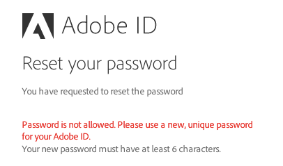
So now IceCream100 is not an option. This sucks, because you have to use a permutation even further out from your default password. So now this single site’s password is iceCREAM100, at least until the next time you forget it, which is as likely as not to be the next time you try to log in.
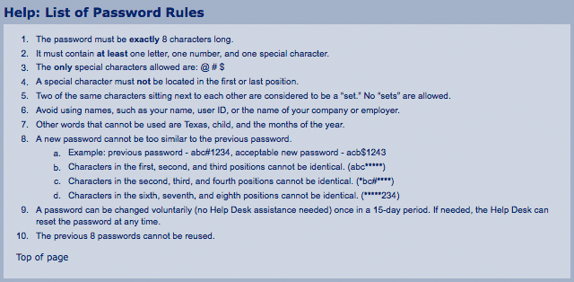
We’ve only covered a small sample of the password rules that can get in your way, but you’re already using either $$ICECREAM$$, $$IceCream100$$, IceCream100 or iceCREAM100 for a multitude of different sites you frequent and you lose track every other day, all because developers with your best interests in mind thought they were helping.
You know what non-technical people with a lot of passwords do? They write them down on sticky notes.
How Did This Happen?
When I was in college, teachers were instructed to repeat the ground rules at the start of every course. Don’t open your laptops in class (so you can’t focus on other things), don’t miss class more than 3 times (so you don’t miss too much), don’t plagiarize (because it’s not obvious), don’t cheat, don’t be late, and so forth.
The constant repetition of these regulations was based on the fundamental idea that students carried no personal responsibility for their education. If left alone, they would surely fail. Every semester began with a stark reminder that in the context of this school, you would always be treated like a child.
A similar idea provides the foundation for online password security — users carry no responsibility for their personal account’s security. Instead, the application must carry the burden. Many apps opt to do this the easy way — sticking to the status quo and treating their users like children.
Risks and Rewards
“But Joel,” you might be protesting aloud at your screen, “using a single password for multiple services is a terrible idea. What if one of those services is compromised?” And you’re right.
If I sign up for a fledgling startup’s new app with the same email/password combination I use for my bank, I risk that it will be cracked. This wouldn’t just compromise my new Tinder-for-Farmers account, but also the place where I keep my money — no matter how secure it is.
So, yeah, it’s a silly thing to do, but that’s not the point. The point here is that it’s my decision. Perhaps, to me, the convenience of a single email/password combination is worth the risk of my accounts being cracked in bulk.
As a user, I have the right to weigh my own pros and cons. Should I pick a stronger password that’s harder to remember, even if it means I’ll become dependent on password tools such as 1Password or LastPass? Should I turn on two-factor authentication, even though I’ll always need my phone handy?
Contrary to the way many of these services treat me, I’m actually not a child, and I resent these inconveniences being forced upon me. This is what we call bad user experience.
The obvious counterargument is that people who write articles about password security for fun are far from regular users. Far from regular people, even. In contrast, grandmas (who’ve become an unfortunate trope for non-technical users) must be protected. They don’t necessarily know that “password” is a bad password.
This is true. Uneducated users might not be able to comprehend the consequences of bad passwords, nor the best practices for good passwords. But there are other ways to solve this.
Making It Better
So, as a designer or developer, what are you to do? You’re working on your app’s registration. You care about your users and you don’t want them to have the awful experience of their account being cracked. How do you make sure they don’t do something stupid?
The ugly truth is that you can’t. Passwords are susceptible to brute force attacks, phishing scams, guessing, and the classic (and most dangerous) looking-over-someone’s-shoulder. Even if you force your users to use the most complex passwords imaginable, they might just write them down and stick them to their monitors. The harder you make passwords to remember, the more likely something like this will happen.
To reiterate, by adding layers of complexity, you aren’t necessarily helping your users — but you are definitely hurting their experience using your service.
Security at the expense of usability comes at the expense of security.” — Avi Douglen
If you’re a developer, focus your efforts on securing your backend. Hash and salt passwords, keep your database secure, implement throttling, check for changes in geolocation, offer a variety of mechanisms for enabling two-factor on your app, make sure your password recovery system is solid. Leave the password decision up to your users.
We have to remember that at the end of the day, users are more than just a weak point of security in our systems. Our services exist for our users, not despite them. I like to think there are ways to get people to use strong passwords without forcing their hands and negatively affecting their experience using our products. Let’s explore some of these ways.
Build and Encourage Two-Factor Authentication
When you set up your two-factor auth system, make sure to integrate it with the systems your users have. You can’t expect most users to have Google Authenticator. Instead, let them choose how they want to authenticate, whether it’s email, text, duo, carrier pigeon, etc. Make it convenient for them to be secure. And once you do, write out the messages you send them in a way they’ll understand.
Encourage turning it on during your app’s onboarding flow, either during registration or after a few days of use.
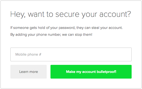
Make it easy for your users to understand why two-factor is useful. Speak to them in their language. Make it easy to turn off if it ends up being too much of an inconvenience.
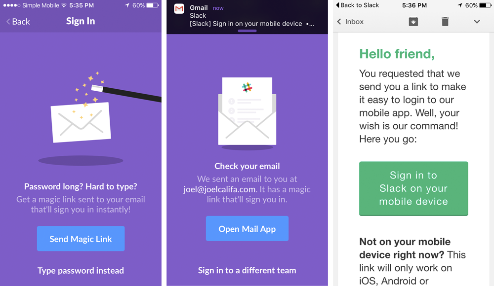
Slack’s login process is an awesome example of framing authentication in a language users can get behind. They abstract away the process by calling it a “Magic Link.” While their system isn’t technically two-factor—it allows you to use either your password or the magic link, which is arguably even less secure—it’s a great example of how something “technical” such as two-factor authentication can be reframed in a user-friendly way.
Yahoo’s also doing away with passwords, and introducing the Yahoo Account Key. The term “two-factor” isn’t even mentioned in the official release, and the value is clear: a password-free future.
Use Password Strength Meters
These awesome UI elements have been proven to be effective (in cases where the account is somewhat important to the user). Password meters provide users with an incentive to use more secure passwords. It hardly matters that this specific incentive is “make the password meter green."

While this is hands down something you should add to your registration forms, these meters have their own problems.
They’re often extremely vague. "Weak password” doesn’t always tell you how to create a more secure password. “Excellent password” doesn’t tell you why it’s good.

These meters are opinionated. An excellent password on one meter could be a weak password on another. Coupled with the lack of explanation, this can be very confusing to less technical users. Standardizing on one estimator, such as the widely applauded zxcvbn, will take care of this.
A password strength meter with additional information and guidance could be an incredible asset for users who don’t know better. Not just for the single registration, but for every future registration as well.
Let’s stop patronizing grandmas and start explaining what makes a good password.
The Password Security Guide
At DigitalOcean, we believe in educating our users. That’s why we’ve invested so heavily in our Community. We don’t want our users to get lost, or even just follow the steps in a tutorial. We want them to understand what they’re doing. We want them to grow.
The following design pattern, which I’ve decided to call a Password Security Guide (henceforth PSG), is my application of this attitude towards the registration process.
The main differentiation between a PSG and a regular password strength meter is that it doesn’t just tell users how strong their chosen password is—it tells them why.

So let’s take a look at this again. Which aspects of the chosen password are “So-so”? Is it that there aren’t any special characters? Is it that it’s one of the most frequently used passwords? Is it the length? Is the site just too picky when it comes to passwords? Why is this happening???
What can a non-technical user possibly understand from this? Only one thing: this picky password system is frustrating, dumb, and, most importantly, wasting their time.
The motivation to create a better password is simple—to get through this form and into the app. Perhaps making the bar turn green is fun and satisfying, but it doesn’t make a long-lasting difference, because it was never about that.
Make someone choose a good password, secure them for a day. Teach them what makes a good password, secure them for a lifetime.”
Let’s shift the motivation away from getting the password meter to green or getting through this one form. Let’s get people to choose good passwords for the sake of security.
Imagine this scenario instead. A non-technical user inserts “qwerty” as their password, and they get something like this:
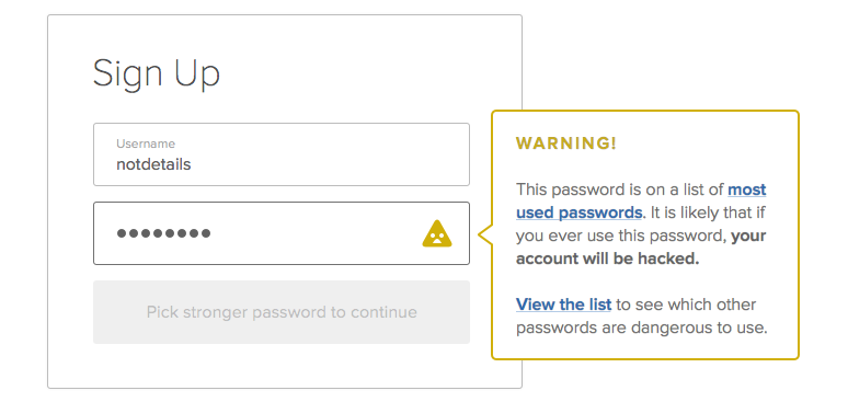
Rather than vaguely noting that the password doesn’t cut it, which could leave the user angry at your system and none the better, we explain what’s wrong.
This user, who was extremely proud of their uncrackable, unguessable “qwerty” a moment ago, now realizes it’s #6 in the all-time most popular password list. The blame has instantly shifted away from the frustrating registration system and onto them. It’s fine, though! Because they know what to do—not just this time, but into the future. They’ll never use “qwerty” again, and the next time an app refuses to accept their password, they’ll think twice before getting angry.

We’re also beginning to treat the user like an adult. We’ve done our part by educating them. Of course, you can still set up common sense rules such as “don’t use a top 10,000 password” or “don’t use a crazy short password,” but if they want to use a relatively weak password that passes these standards, they should be able to learn about and accept the repercussions.
Alternatively, we can allow users to submit the registration form, and only then swoop in with tips. Here’s how that might look:
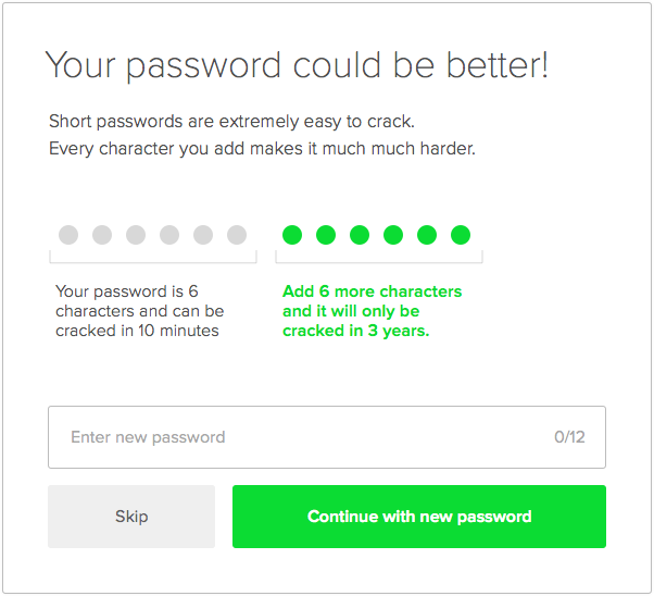
I imagine a future where there is a PSG on every registration form. Users aren’t forced to select certain passwords, but they are better educated during the process. They learn which passwords aren’t great and why, and they’ll take that knowledge to every new form they fill out.
The PSG should be open source, much like zxcvbn, or maybe as a UI counterpart to a library like zxcvbn. This will enable every app to use the same heuristics to determine password strength, and to be updated to combat new security flaws. It will also enable apps to use the same crowdsourced best practices for educating users.
If anyone reading this wants to collaborate on a project that could easily integrate a PSG with a normal password input, hit me up at @notdetails.
Looking forward
Passwords as a security method are far from perfect, and for many people who know what they’re doing—they’re on the way out, likely to be replaced one day by user-friendly two-factor auth services such as Clef.
For the average user, though, it’s unlikely that we’ll be rid of them any time soon. Let’s make the most of the time that’s left. Let’s make passwords better.
Like this idea? Spread the word via tweet or share and we can make a difference!
Joel led Product Design at DigitalOcean. Now he makes GitHub.
He doesn't write often, but when he does, he makes it count.
Sign up below for:
✅ Sneak peeks at upcoming design articles.
✅ Exclusive content and bonus material.
✅ Weekly Q&A with your questions about design, career development, etc.
✅ Access to the archives 🙃