As I sat there, staring at the cat-centric listicle load before my eyes for the third time that day, I wondered whether to blame myself for clicking into the same page so consistently, or if the blame lay with the designers and developers who allowed this to happen.
Links used to be beautiful, I recalled, perhaps not aesthetically pleasing, but those bright blue underlines were so clear, so succinct. I always knew where I was going and what would take me there. Just as important, I always knew where I’d been.
Right then, in front of the now-too-familiar cat gifs, I really missed that.
Forgetting Our Past
The web has come a long way since those early days. We’ve gone through cycles of aesthetic trends and have become so much better at creating beautiful websites. Somewhere along the way, though, we forgot (or chose to forget) about the :visited pseudo-class, the CSS hook that lets you differentiate links that lead to pages your users have already seen.

Indicated visited links provide context, telling users where they’ve been and preventing them from wasting time. A Nielsen study summed this up nicely over ten years ago, “People get lost and move in circles when websites use the same link color for visited and new destinations. To reduce navigational confusion, select different colors for the two types of links.”
Can’t we, as an industry, get behind that reasoning? A “visited” link isn’t that far off from a “read” email. They both provide the user with the tacit understanding of where they’ve been. This prevents users from accidental repeat visits, and gets around the frustration that would follow.

An email client without read/unread functionality would be unacceptable, so why are we fine with a site without :visited styling?
The Fall of a Pseudo-Class
I see two causes behind today’s relative scarcity of :visited styling.
The first is the web becoming more beautiful, and the subsequently raised aesthetic standards. Defaults are viewed as unattractive, so most sites override them, sometimes sacrificing function for form. We want link styling that fits with our brands. We want links that will mesh well with their surroundings, and with links’ default bright blue, and :visited links’ purple, this is usually not the case. We’ve lost a fantastic convention and replaced it with, well, nicer looking links.
Unfortunately, simply setting a new color for links in your CSS is enough to override the default styles for both :active (red) and :visited (purple) states. I’m guessing most designers and developers don’t actually want to get rid of the :visited state, but have unwittingly lost it by overriding unattractive defaults.
The second cause I’ve recognized is less direct. A few years ago it became known that certain sites were sniffing visitors’ browsing histories by checking which links on the page were flagged as visited. The people behind leading browsers rallied to plug the privacy leak and successfully limited what developers could do with :visited.
This doesn’t stop us from differentiating a visited link’s color, but it does hold us back from implementing more interesting solutions. For instance, we can’t apply CSS to the link’s child elements. We can’t add extra pseudo-elements. We can’t change font size, or weight, or letter-spacing. We can’t add borders, or change their width and style (only color). We can’t alter image links. Today, we can only change the color and the background of the text link itself. Online media has evolved tremendously over the past decade, but our :visited links still only work for text. This security fix, while definitely in our best interests, severely limited what we could accomplish.
Revisiting :Visited
Unstyled :visited links hav long been a pet peeve of mine, especially in other portfolios. Every time I browse one, I end up returning to a project several times before finally exiting in frustration, and unfairly blaming the designer responsible. My portfolio, I decided, wouldn’t anger its visitors at my expense.
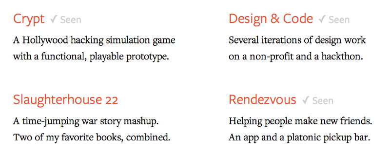
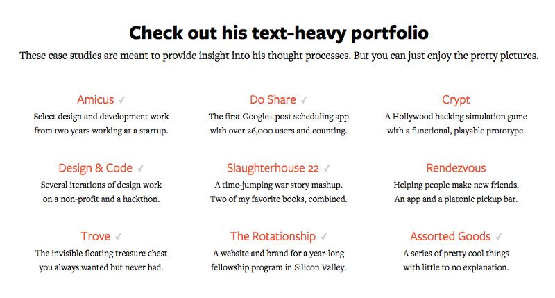
The design I settled on consisted of clear checkmarks with the word ‘Seen’ next to every link a user has been to. Not exactly the Mona Lisa, but this would both reduce my visitors’ cognitive stress, and the novelty could potentially delight and motivate them to visit all of the pages and see more of my work than they would have otherwise. Win win.
The way I wanted to mark this up—a pseudo-element with a checkmark and the word ‘Seen’—was more than :visited would allow for with its shiny new limitations. To build what I wanted, I would need to have a new hook on visited elements, one that worked like any other class. JavaScript wouldn’t recognize visited links, nor would any other method I tried to hack together.
But wait! What’s that in the sky? Is it a bird? Is it a plane? No, it’s HTML 5 to the rescue! With its super powered persistent local storage, it saved the day. Local Storage is a technology similar to cookies. It stores data on the client-side that persists beyond page refreshes. This means it can be used to store a users’ visited pages without us having to create a database, which means it can work on static sites, which means it’s awesome.
My implementation is laughably simple. On each individual page, I add code to log it as visited inside the localStorage. I do this by simply grabbing the current page’s pathname and using that as the key.
localStorage.setItem('visited-'+window.location.pathname,true)I then iterate through all the links on the page.
var links = document.getElementsByTagName('a');
for (i=0;i<links.length;i++) {
  var link = links[i];
}
For each link, I make sure that it’s internal (we can’t make this work consistently for external links) and that the page its linking to has been visited. I do this using the previously set localStorage data.
if (link.host == window.location.host
&& localStorage.getItem('visited-' + link.pathname + '/')) {
If it’s both internal and the pathname matches a previously visited pathname, I add a data-attribute of “visited.” This will appear as **data-visited** on my achor tags.
link.dataset.visited = true;Now I can style visited links to my heart’s content, like so:
a[data-visited] {
  border-bottom: 1px dashed purple;
}

a[data-visited]:after {
  content: ' (Seen)';
}
Feel free to grab the entire code for your own site:
// http://joelcalifa.com/blog/revisiting-visited
localStorage.setItem('visited-'+window.location.pathname,true);
var links = document.getElementsByTagName('a');
for (i=0;i<links.length;i++) {
  var link = links[i];
  if (link.host == window.location.host
  && localStorage.getItem('visited-' + link.pathname + '/')) {
    link.dataset.visited = true;
  }
}
That’s it. A few short lines of code and we’ve replicated the power of the original :visited pseudo-class. With little work you could also extend this to external links that users click on from within your site. It works in all modern browsers, including mobile, and based on the feedback I’ve gotten since the site’s release, it can have a huge impact on your visitors’ experience.
What’s Next?
This is just one possible implementation of a valuable idea that has been neglected for years. One that can improve the experience of almost any site online today.
While content sites with simple text links should definitely be taking advantage of :visited again, It would be great to see people come up with creative solutions for image and video links. More complex :visited states are currently greenfield, but with some experimentation we could end up with a new convention for all types of media. Wouldn’t it be great to take one look at any kind of element and just know?

And considering websites around the web will likely continue overriding the default blue and purple, is there a feasible way to make all visited text links relatively consistent? If there are pink and green and red links out there, how can users know what’s visited and what’s just a link?
My site has orange links. Like most designers, I’m not above the desire to have a beautiful site, and bright blue links got in the way of that. The way I chose to go about it was to mimic the relationship between the blue and purple—a link becoming darker once it’s visited. My links become dark orange, but this could work with any custom link color.

By no means was this a comprehensive design process. I haven’t done usability testing and I don’t know which combinations will work for people who are color blind. But it’s a start. If you’re looking for a way to differentiate your custom links, make them darker, and maybe we can get this design pattern to a place where it provides the same kind of tacit information that purple links have come to signify.
That said, if you’re able to use blue and purple, doing so will give you these affordances for free.

I understand the realities of developing products. You don’t have time to do everything. Cap Watkins discussed this in a fantastic post we can all relate to titled “Good Enough.” But when the investment is so small (a single :visited style or a few lines of code) and the return is potentially so great (substantially less user errors in aggregate, much less frustration, happier users), how can we justify continuing to neglect this?
I know we all have piles and piles of UX improvements in all our backlogs, a thousand tweaks that we’re itching to get out the door. But please, if you find just a moment, revisit :visited.
Hey, thanks for reading! I’d love to hear your thoughts :) Add comments on DN.
Joel led Product Design at DigitalOcean. Now he makes GitHub.
He doesn't write often, but when he does, he makes it count.
Sign up below for:
✅ Sneak peeks at upcoming design articles.
✅ Exclusive content and bonus material.
✅ Weekly Q&A with your questions about design, career development, etc.
✅ Access to the archives 🙃