One of my greatest passions in life is getting to know new, interesting people. This is how I achieve flow. For years I had the vision to create a venue where people could do just that—without romantic agendas. The opportunity to spend some time bringing this vision to life presented itself during my sophomore year at Parsons.
Rendezvous is that concept—a platonic pick-up bar, where people can go to meet new people in the hopes of making new friends. The physical venue would assisted by a sidekick mobile app. The app’s features include automatic chair/table recommendations based on information pulled through linked social media accounts, a history that allows you to track people you met in the bar, and automatic contact detail exchange with mutually liked people. The mobile app could be integrated with the bar through RFID/BLE in tables and pressure sensors in chairs.
This combination of physical space and software could be perfect for people who have just moved to a new city, for people who want to expand their circle of friends, for groups that want to meet other groups, and for people who want to go out on weekdays. I wanted to create a safe place where it would be ok to go alone, and where you would be able to consistently have interesting meetings. This bar would be one of a kind. Conceptually, of course.
Research
Validating the Idea
The first step in any project like this is always to validate your thesis. I asked every person I met whether this was something they’d be interested in trying out. I had no specific target audience in mind, so I didn’t try to narrow the pool.
The older end of my spectrum (ages 30-50) were almost unanimously uninterested. They either felt they had enough friends or not enough time for Rendezvous to be useful to them in any way.
The younger end (ages 18-30) were extremely interested, especially people in their mid to late twenties. The reasons varied from fun, to alleviating boredom, to socializing and networking. A good amount of people said they wished they had this when they first moved to New York.
I was surprised but I felt this was good enough to develop the idea further, this time for a narrower target audience.
Analyzing the Competition
There were many startups attempting to connect people. Almost all of them were either meant for romantic purposes or used for networking. The idea of platonic friendships was, for the most part, ignored. Perhaps this meant that the space wasn’t lucrative, but since this was a passion project, I decided to run with it. I grouped these apps and services into three groups.
The first group was dating sites and apps, which were innumerable. These ranged from websites such as Match.com, eHarmony and PlentyOfFish to less traditional sites such as OKCupid. Then there are niche sites such as JDate. Finally, the most interesting newcomers, mobile apps such as Grindr (and later, Tinder) that had a different take on how to structure the experience. Dating sites weren’t exactly in the same field, but it made sense to think of Rendezvous as a niche dating site for friends. In this perspective, design choices within these services became easier to analyze.
The second group was location-aware apps. Highlight, Glancee and Sonar all allowed you to meet people in your vicinity. The issue with these was that they didn’t give the feeling of safety. Users can’t choose when and where to meet new people. By definition, it is up to circumstances. I wanted Rendezvous to be less creepy. A designated, safe place that you choose to come to only when it suits you.
The third group was services that put together events, such as Grouper or GrubWithUs. Grouper puts 3 male friends with 3 female friends for a night out. GrubWithUs puts groups of strangers together for meals. The issue with these is that you can’t initiate it yourself on a whim. I wanted Rendezvous to account for spontaneity.
An interesting outlier was Shaker, a Facebook app with a virtual bar in which your avatar could talk to new people. Interestingly, Shaker, the only service that wasn’t even attempting real-world interaction, was the closest to my vision for Rendezvous. It’s a 3D space through which you can walk at your leisure, joining and leaving conversations. The issue with this, for me, was that technology was a crutch. The concept was right, but the implementation left it feeling cold. Switching tabs during a conversation cheapens the experience.
I documented all of my insights and built a featureset for Rendezvous.
Experience Design
I was confident at this point in my ability to make relatively educated decisions throughout my design process. I began designing Rendezvous.
Card Sorting
Once I had my featureset, I started card sorting. By the end of the process I had about 20 people in my target audience group my features. I would present people with one feature at a time and have them group it with others. At any time they could rearrange the groups, as long as they explained why they were doing it. I also let them write “NO” on any feature they disapproved of, just to give me some extra information.
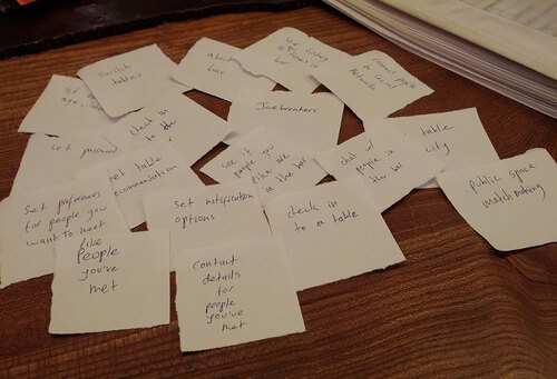
Synthesizing all of this information, I had a good idea of how the information architecture should look, and what screens should take priority in the user flow.
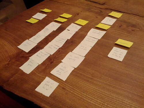
The main groups I got were Profile, Bar Actions, Information, Settings, and Aftermath. This is the model I based my wireframes on.
Wireframes
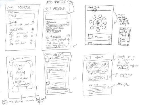
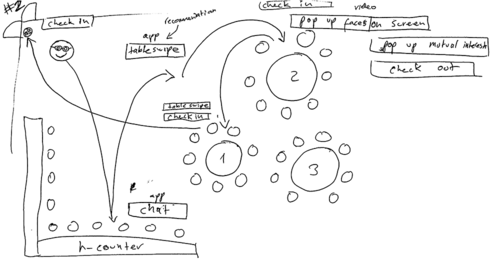
One of the main challenges here was integrating the venue specific features with more general ones. I solved this by building two dashboards. A pre-check-in screen and a post-check-in screen for when you were at the bar.
The pre-check-in dashboard had your history and profile front and center. The bar information and setting were less important so they were placed to the second row. The final row was a large check-in button, setting the expectation for more features once you were there, so that when the screen would change, it wouldn’t be a surprise. This screen would itself be a motivator to go to the bar.
At the bar, bar actions are your most important features. First, finding a table. Then chatting with the other patrons. I put these above the other features. The nomenclature here is also important. Patron Chat implies that it won’t be available once you leave the bar.
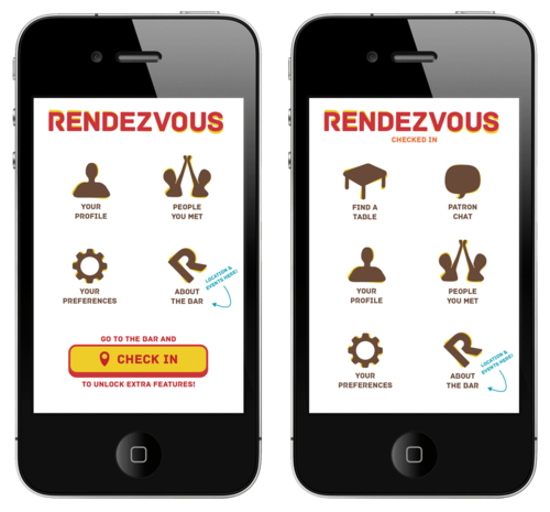
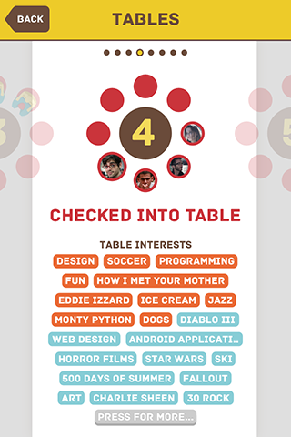
Interests would be listed on tables rather than individuals. This would put groups together rather than pairs, and not divulge too much information about a specific person beforehand. Rather than knowing a specific person shares an interest, the idea is that people could join a group at a table and say ’hey, who here likes Star Wars?’ This moves the experience away from possible romantic endeavors (always a danger!) and towards a more communal experience.
I also spent some time thinking about possible re-engagement. After you leave the bar, you get a list of people you sat with. You could let the app know which people you liked and mutual likes would have their contact information swapped to streamline the start of their friendship. Later on, when one returns to the Rendezvous bar, the app would notify the other. In time, you would have more and more friends and more reasons to go back to the bar.
Visual Design
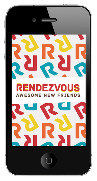
I’d come up with the name Rendezvous mid-way my research. After I finished, people told me that this name gives the impression of illicit romance, ironically, more than any of the other services I took issue with. At the time, though, it correlated with spies for me. I even played around with calling friends “comrades.” Before the theme faded from the app, I had decided to use Archive, a beautiful geometric all-caps that I associated immediately with cold war spycraft.
The typeface and the name are the only remnants of this idea. The aesthetic changed considerably. It moved towards a fun, bright color scheme that was more inviting, but Archive continued to give it an interesting edge.
I designed Rendezvous based on Apple’s guidelines for iOS5 at the time, but ignored most of the system’s aesthetics. I have never been a fan of over-stylized design elements. This whole flat trend was simply the rest of the world moving in line with my aesthetic. In Rendezvous, I stripped down the buttons, labels and bars to solid colors.
I wanted very simple representations of the physical space. You could swipe through tables on the screen and sit down. The only relationship between these table diagrams and the actual tables would be the number of seats and the table number. I imagined these being large circular booths scattered like islands throughout the bar. They’d have very tall backs to isolate them from the rest of the bar and encourage group discussion.
I’ve always had an iterative design process. Following is a brief glimpse at my late-stage design process. Perhaps you’ll be able to glean something about my thought process.
After the I created the demo video, I deemed the type not legible enough and replaced much of the text with a regular case Museo Sans. In hindsight, I would also make the type throughout Rendezvous larger and easier to parse quickly in a dark bar.
Demo Video
I had very recently learned After Effects so I decided to put my new Motion Graphics skills into practice.
Never before had I fully appreciated the hardships of voice actors. I recorded hours of cringeworthy audio, and you only have to listen to four and a half minutes of it.
It needs to be edited down by a minute or two and a better narrator. I’ve been planning on improving it for over a year, but have yet to find the time. Feel free to skip to 1:15, when the actual app demo begins.
The Future
I still want this to happen so much. Rendezvous, or some evolution of it, nearly became my thesis at Parsons. In the end, Design & Code won out, but the app is still near and dear to my heart.
If anyone reads this and wants to create something like Rendezvous, reach out and I’ll send you all of my assets, plus the raw After Effects file. As far as I’m concerned, Rendezvous and the assets I’ve created for it are open source and anyone can use them. Really, I just want this to exist already.