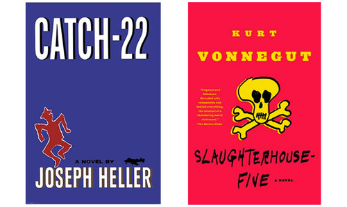
Slaughterhouse 22 was the one of the first print pieces I designed, and I love it to death. It’s a mashup of two of my favorite books—Slaughterhouse 5 by Kurt Vonnegut and Catch 22 by Joseph Heller. They’re basically the same book. This project is me taking that a step further.

The Assignment
This project was for my Typography Studio with Carmile Zaino. The assignment was to combine two books into one, with type as the main vehicle of communication. There were no guidelines and no limitations.
The class was my first exposure to highly detailed and purposeful typography, which I grew to love dearly. Every aspect of this book is intentional.
The Books
Less than a day passed from the moment we heard about the assignment to my decision to focus on these books. They were simply made for each other.
From Wikipedia:
Catch 22 is a satirical novel by the American author Joseph Heller. It follows Captain John Yossarian, a U.S. Army Air Forces B-25 bombardier. It uses a distinctive non-chronological third-person omniscient narration, describing events from the point of view of different characters. The separate storylines are out of sequence so that the timeline develops along with the plot.
Slaughterhouse 5 is a satirical novel by Kurt Vonnegut about World War II experiences and journeys through time of a soldier named Billy Pilgrim. The story is told in a nonlinear order and events become clear through various flashbacks (or time travel experiences).
Both books are about misfit soldiers in the Second World War, and tell their stories through wild tangents that sometimes span decades. They are dark and ironic, political and hilarious. They are very different in some places and eerily similar in others. So it goes.
Experimentation
The assignment was to have both books side by side on the same spread. It didn’t state exactly how to do that. Going in I knew there was potential but was unsure of execution.
My first sketch was a test to see how two columns with slightly different typefaces would look together. I’d never intended to contrast the two books—they were too harmonious. The outcome left much to be desired.

The page was bland, though, and would probably remain that way. One column for each book didn’t leave much room for variation. I decided to add pull quotes to the mix, along with “fun facts” about the war. The quotes would be larger than the body copy, and the facts would be smaller, which would provide enough color for interesting spreads.

Then I found my missing ingredient. The books made you jump from story to story. Here, I could make you jump from book to book. What’s more, the books were similar enough that I could build a vague storyline that made sense by fusing them together.
In the spirits of the originals, I decided that rather than place my sections chronologically, I would place them all over the book—leading users forwards and backwards through the book in the style of Choose Your Own Adventure. This added interactivity would give the book the same sort of wildness the originals had. Readers would either love it or hate it, which is another thing in common with the books.

The New York Times’ reviewers of Kurt Vonnegut’s Slaughterhouse 5 and Joseph Heller’s Catch 22 reached this thoughtful conclusion: Readers will either love them or hate them.
As many have noticed before, their reception is not the only similarity between these two books. They are both humorous, cynical, absurdly whimsical, and temporally challenged criticisms of World War II and the establishment.
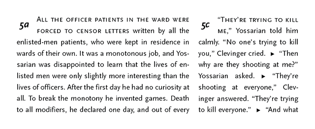
The most similar thing about these wartime novels is their intermittency and broken nature, thus their synthesis results in something almost as solid as the original. That is to say, not solid at all. Instead of jumping between points in time, as the books do, this synthesis jumps between books. Simply follow the pointers at the end of the paragraphs to their corresponding sections and enjoy.
Building the Story
I downloaded a digital version of each book and began running search queries, searching for common themes. The idea was that the book would alternate between them, but in a way that kept more or less the same themes. The new section would always relate to something in the old section—building a cohesive chain from the start of the book to the end.
The pull quotes would bring out the most interesting thing in each page, often from a paragraph the reader will not get to for a while. This is to motivate the reader to continue.
The book starts with Billy Pilgrim getting “unstuck in time” while a chaplain’s assistant. A fitting way to start the book. The chapter this leads to is Yossarian falling in love with the chaplain. Already the two books seem to coexist in the same world.
Typography & Aesthetics
I chose the beautiful Scala super-family for the body copy. With a serif, a sans serif, and small-caps families. Slaughterhouse 5 is wild and ridiculous, so giving it the slightly more embellished Scala made sense. I set Catch 22, which is slightly more grounded, in Scala Sans. The two families are close enough to resemble each other but not enough to get them mixed up.
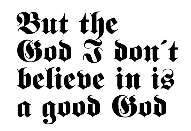
Staying within the theme of WWII and Nazi Germany, I decided to use a blackletter for the pull quotes. I chose Fette Fraktur for its heavy weight. When large and bold, its color on the page is a great contrast to the Scala.
For the facts, I chose Futura LT Book, a very Bauhaus font that complimented the time period nicely and worked well in small sizes. Its light color made for some fantastic compositions.
In the books it feels as though you’re falling through the story with no control and no brakes. I wanted to replicate that, so rather than break for paragraphs, I placed a right-arrow glyph between them as a way of carrying the momentum of the journey. I then set the first couple of words in each section in small-caps as a clear divider.
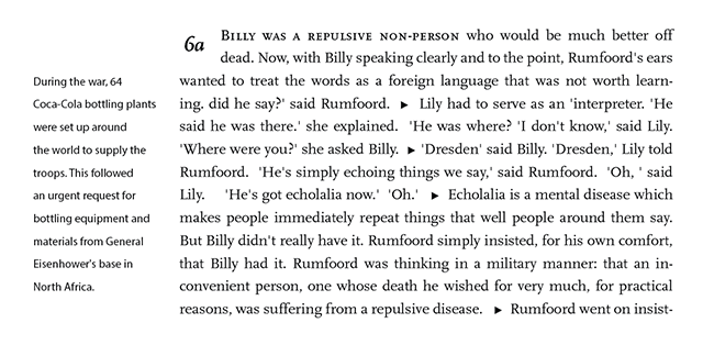
I wanted to give the book an army manual aesthetic, so for the section id (page number and order letter), I carved out a box in the top right of each section, where a dropcap might otherwise go. I set these in the same typeface their corresponding sections had for easy scanning.

I based on entire book on a grid with 10 columns on each side for flexibility, but I’d never stray into the closest column on each side. In the theme of Nazi Germany, I created a strict baseline grid and set every piece of content to it.

For the end-papers, I set running copy from both books in Fraktur and added a gritty texture to make it seem worn out. I printed this pattern on both the end paper and the inside of the cover.

Taking the army manual aesthetic further, I printed the book on gritty paper, in approximately the size of small army manuals, with a cheap staple binding. The cover itself had the same Fraktur pattern with the title imposed in large Scala.

I spent weeks going over every single line, getting rid of rivers and widows, making sure the tracking was cohesive, and everything was legible. This project was intense, but by far one of the most rewarding.