Yesterday, I celebrated 3 months at DigitalOcean. I thought a nice way to mark the occasion would be to publicize what I submitted to get the job.
They had been relatively impressed with my portfolio, so I figured I’d use the same format. I was very interested in the role at this point so I went above and beyond. Taking the extra time was what set me apart. No one I know has the bandwidth to do this for every potential job, but for jobs you really want I truly believe it’s worth it.
Quick disclaimer: no hiring process is limited to a single homework assignment. Mine included a phone call with DO, as well as a 3-hour-long interview with the Creative Director and the CPO. Homework demonstrates some ability (there are many blog posts debating the merits and drawbacks of even requesting this), but it will never take you the entire way.
The following is exactly what I sent.
Brief
The task was to redesign the image selection module within the droplet creation flow. With the current flow in place, though, I’d be limited by current patterns, models and aesthetics. I decided to overhaul the entire flow for more flexibility.
Keep in mind this is the product of a few hours and a good amount of guesswork. An actual redesign would involve a lot of learning, exploration and testing.
Critique
Initially, I went over each section in the current flow and took notes on what was working and what could be improved.
User Interviews
I had limited access to people who used DigitalOcean, especially first time users. But I did have a few friends on the service, so I interviewed a few to get some insights on the process from a developer’s perspective.
Unfortunately / fortunately most interviewees could find nothing wrong with the current droplet creation flow. The one thing that was asked for were better defaults (like the PHP upload limit) and a simple way to add new SSH keys.
New Models
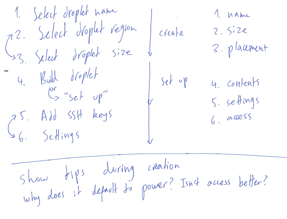
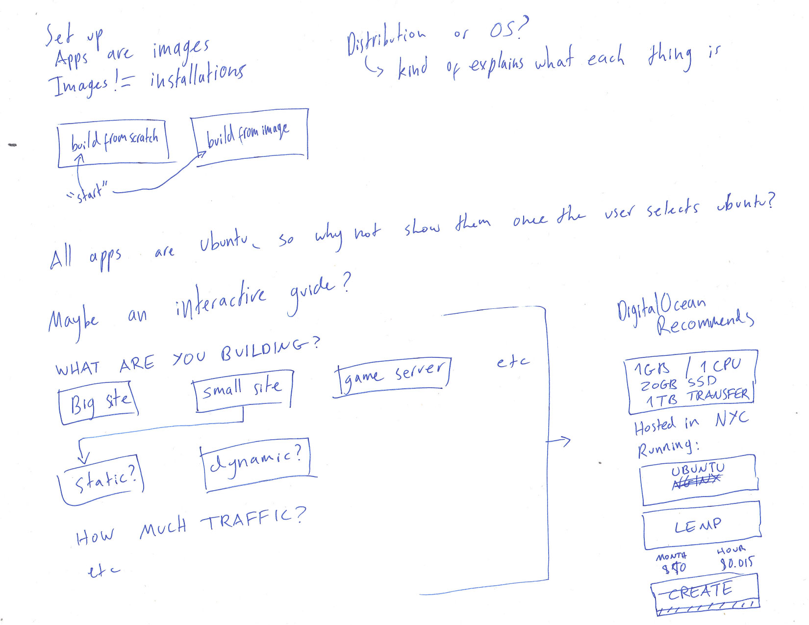
The way the flow was structured made sense to me for the most part, but I thought some things could be clearer. “Select image” felt like the wrong name for what the action was doing. This was more of a “contents” or “setup” phase, considering the previous steps. The setting at the end made more sense within the setup phase than after the SSH settings. I decided to alter the nomenclature and move some things around. I created two distinct areas of the flow—creation and setup.
Images are a terrible model for setting up the contents of the droplet. A much clearer way of explaining it is to portray the droplet as an empty box, and put things on top of that. Most users probably understand what images are, but there is also an extra mental load in figuring out what each of the options will do. One option is just an OS, another is an OS plus an app, another is a direct copy of a previous droplet and all its contents and settings. I knew there was a simpler way to frame this step to the user.
I also felt there was a better way to structure the entire droplet creation flow.
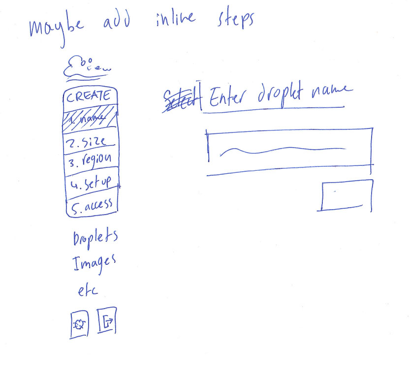
The Wizard
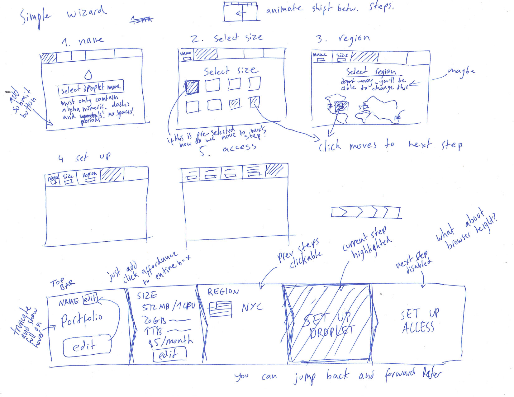
My initial direction was to overhaul the entire process and turn it into a wizard. Users would only have to focus on a single task at any given moment and that would take the load off complicated processes such as selecting an image for the droplet.
Pros
The top bar did a good job of contextualizing the user within the process and giving a feel of how much was left. It also gave a clear picture of the current status of the droplet. In the initial flow, you had to move around quite a bit to get a feeling for the state of the droplet.
Cons
The wizard ended up having too many clicks. Forcing a user to click “next” after every single action makes a very simple process slightly tedious and way longer than it should be.
The top bar was great, but it took up a lot of real estate and wouldn’t make much sense with smaller screens. Jumping back and forth between sections was relatively clear, but not quite as clear as simply scrolling up to the previous section. I deemed having a clear view of the droplet specs not as important as setting it up very quickly.
It was clear that the wizard didn’t work the way I’d intended it to. I went back to the drawing board. Literally.
The New Flow
In the end, I decided to go with the current structure of the page. It does its job very well. Droplet creation is a breeze, and for the most part only small things needed tweaking. For a while I wanted to include steps that animated out of the fixed “Create” button on the side, but I quickly scrapped the idea because it wasn’t based on any existing convention and would just confuse the user.
For the visual design, I wanted to keep the same airy feeling DO currently has in place. I kept the same colors for most of the elements and kept Museo Sans and Helvetica Neue in place. I added a grid to create some visual consistency.
I added new button styles to differentiate them from radio buttons. I brought the check boxes in line with the radio buttons, so users can quickly scan the entire page and see what’s selected. Solid blue now means selected everywhere, which makes understanding how the droplet looks almost as easy as the wizard’s top bar.
I replaced the subheader iconography with numbers. Some of the original icons seemed forced and the headers were clear enough not to need any extra explanation. Numbers do a good job of organizing the flow and separating it into distinct parts. It’s easier for users to feel progress and accomplishment this way.
I’ll now go over each section, followed by the flow in its entirety.
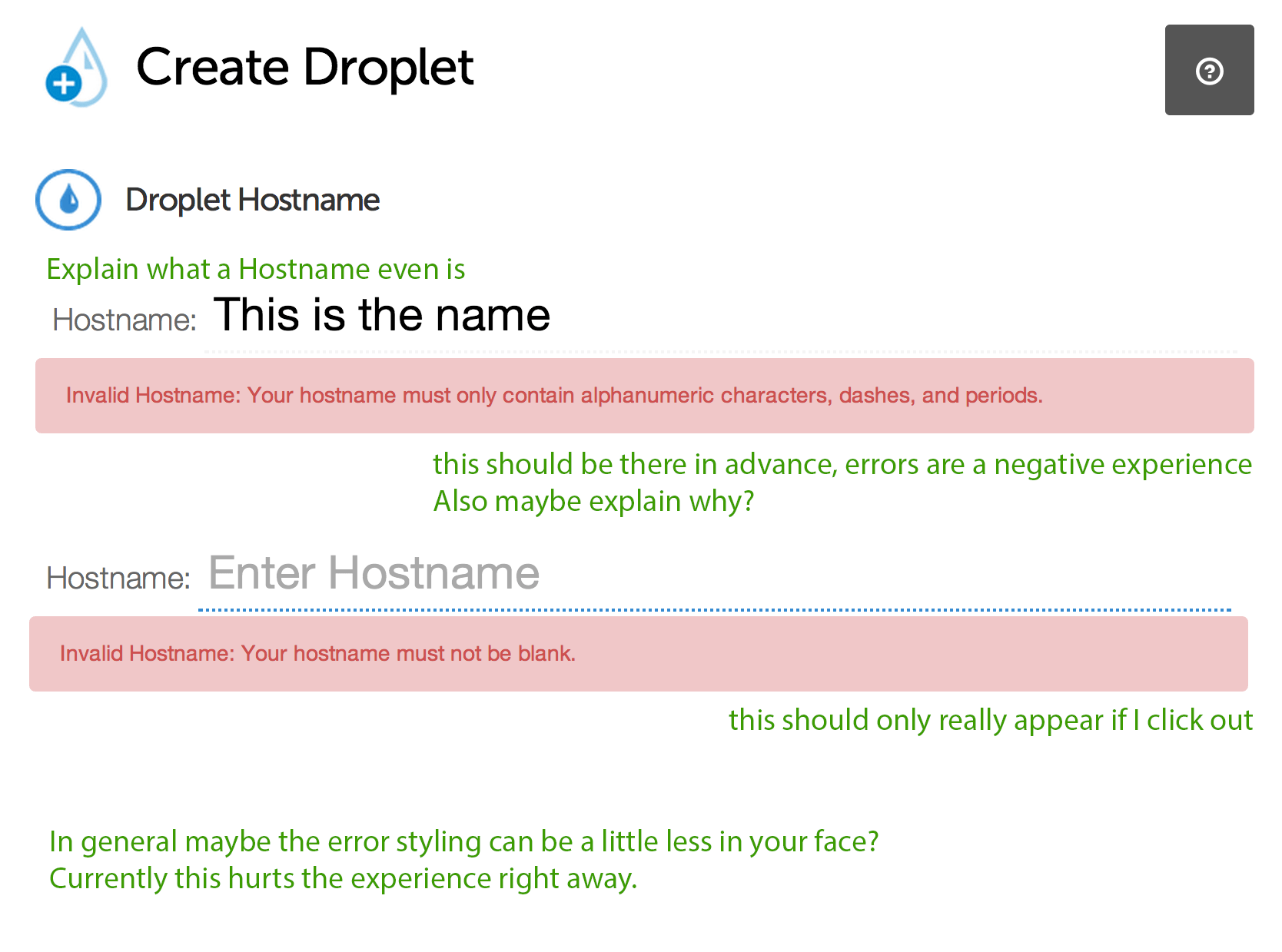
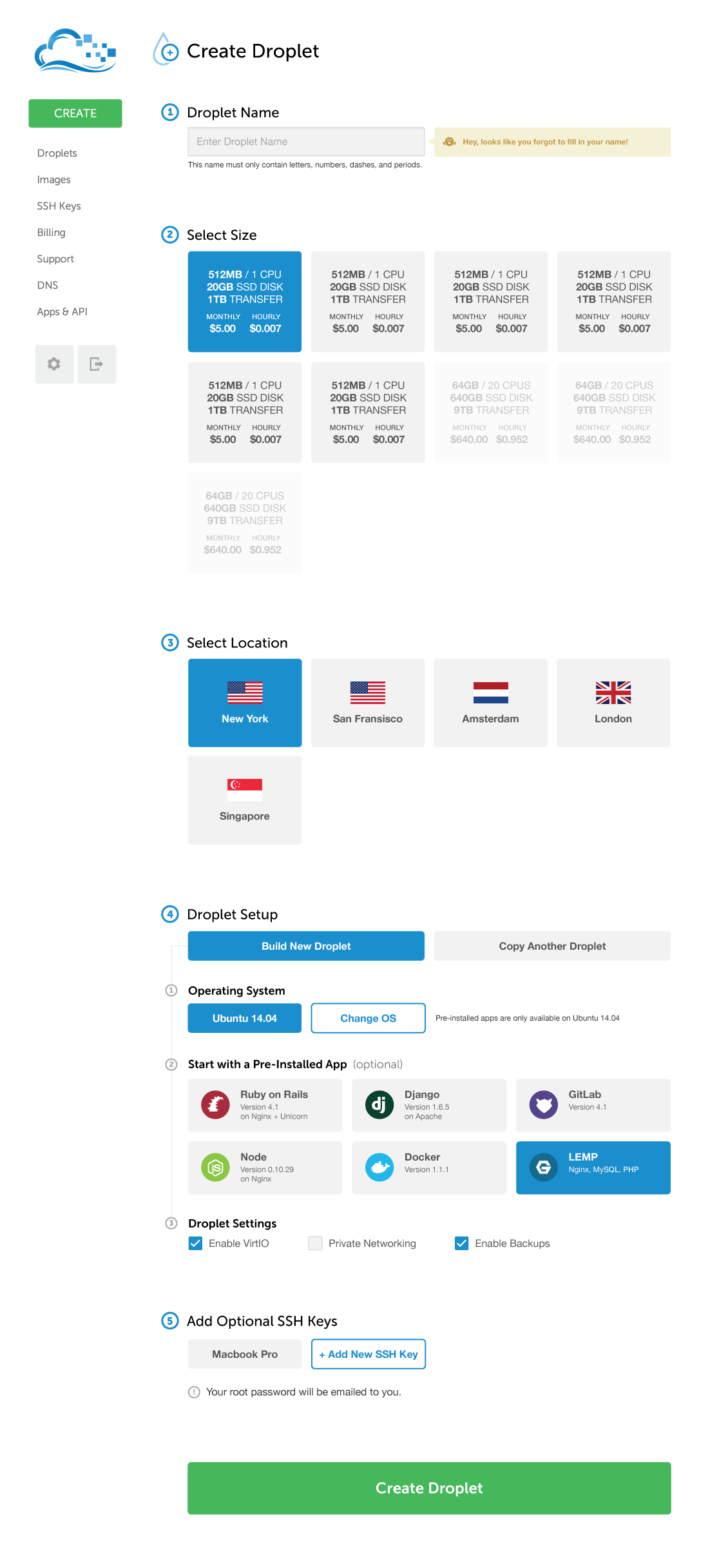
Name
In my sketches, you can see that I decided Hostname was not a suitable label here. When I went through the flow the first time, I had to google what that meant, and found that it was really only the internal name for my droplet (even if it’s used for domain purposes, the name is arbitrary). “Droplet Name” felt like something people wouldn’t have to google.
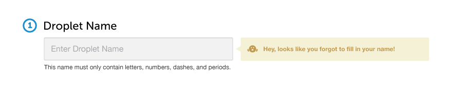
I changed the Droplet Name input from an underline to a clear input box. The alarming red error message gave me the impression that users often miss this, and I wanted it to be very clear that this was an input. I then altered the error message to be more friendly warning notification. I also added a line on the bottom explaining the requirements of the name. Popping up an error with additional information that the user couldn’t have known is a negative experience. Instead, the yellow warning notification that reminds the user to use the states syntax. Maybe something along the lines of “Hey, looks like you aren’t following the guidelines. Cheeky!”
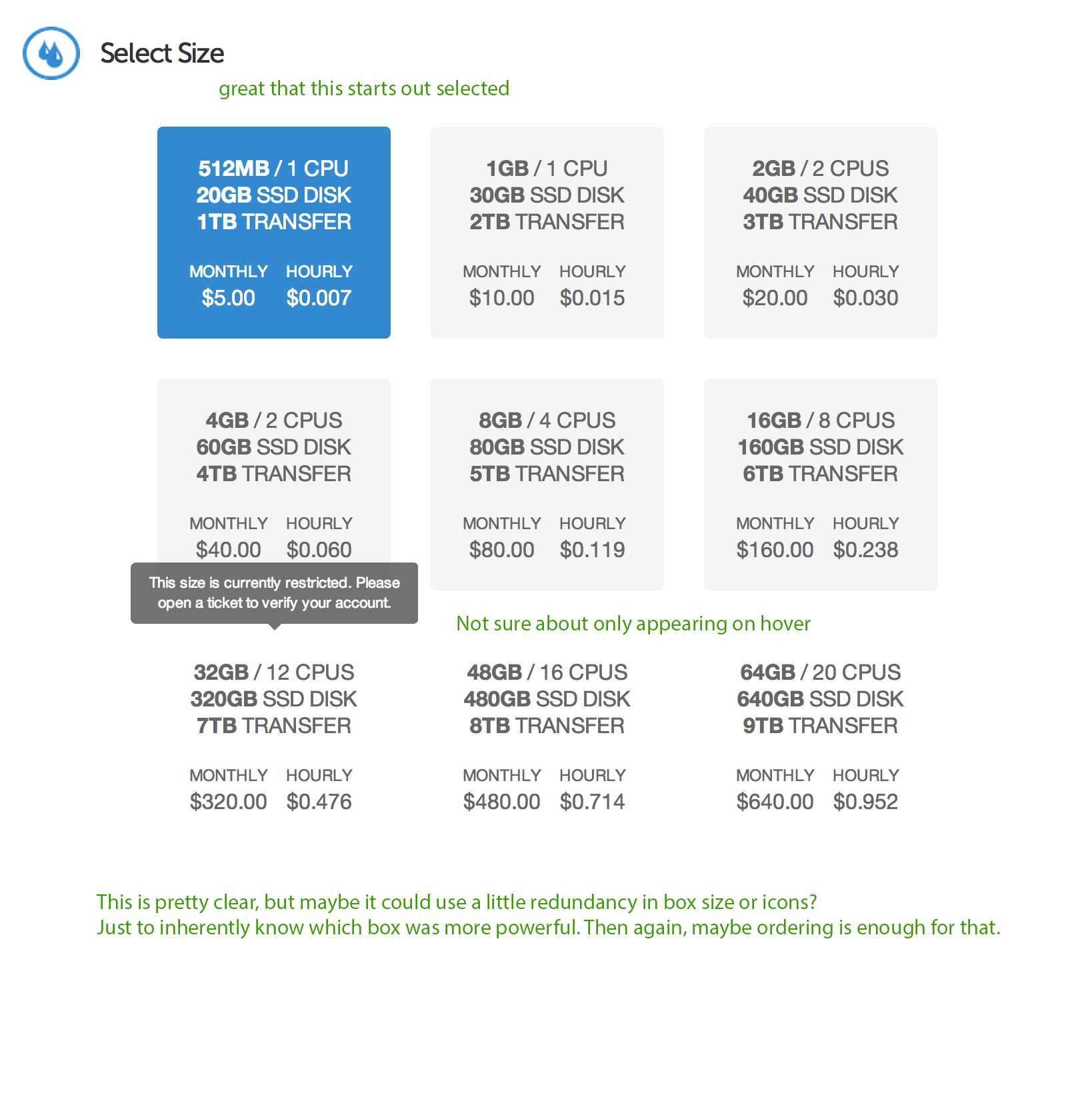
Size
I kept the size selection more or less the same, except within a full-width grid. The original design made a lot of sense to me. Specs up top with important numbers emphasized, and both payment scopes at the bottom. It’s easy to scan and grok quickly and there was no need to change it.
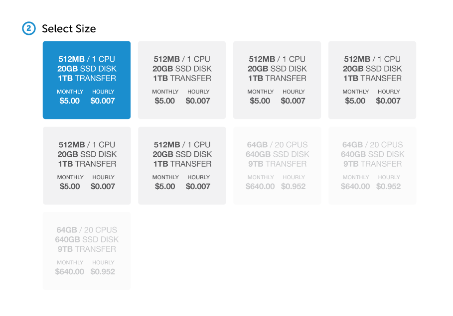
The only thing that was weird to me were the last three boxes, which had a white background—not a great affordance for a disabled radio button. I created a new disabled radio button style by lightening the background and the text—but not enough to be illegible.
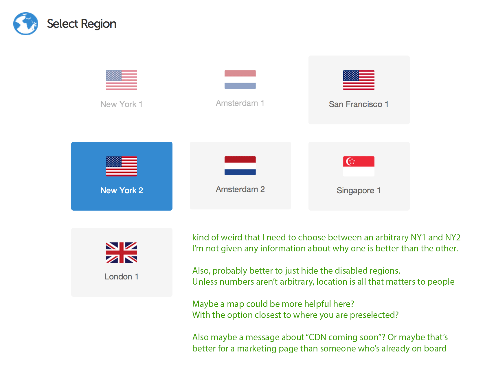
Location
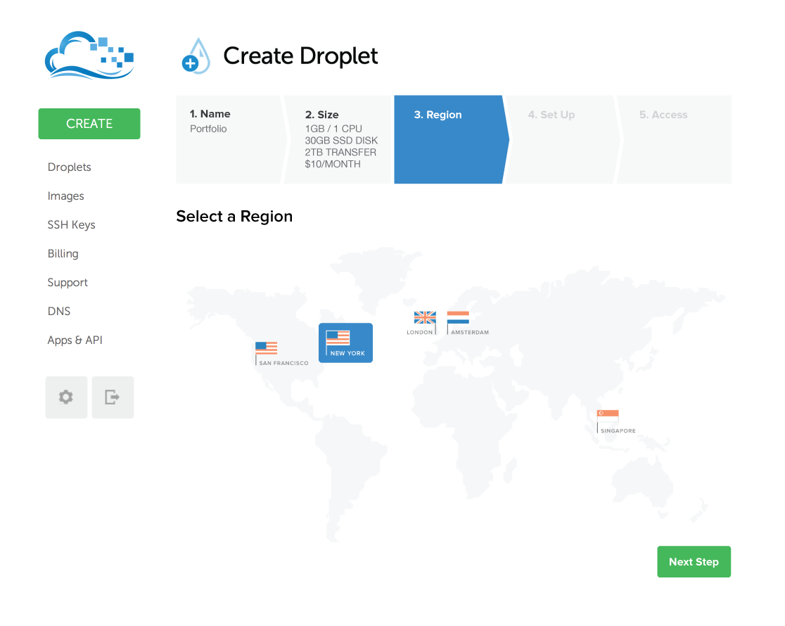
Region, too, made a lot of sense to me. I changed the name to Location since it’s a clearer model for “where the droplet will be.” I also removed the separate servers in each location, since picking a server number is largely arbitrary. That should be done on our end automatically.
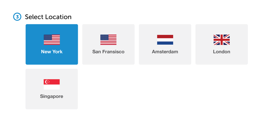
Locations are ordered from the closest to you to the farthest away.
Setup
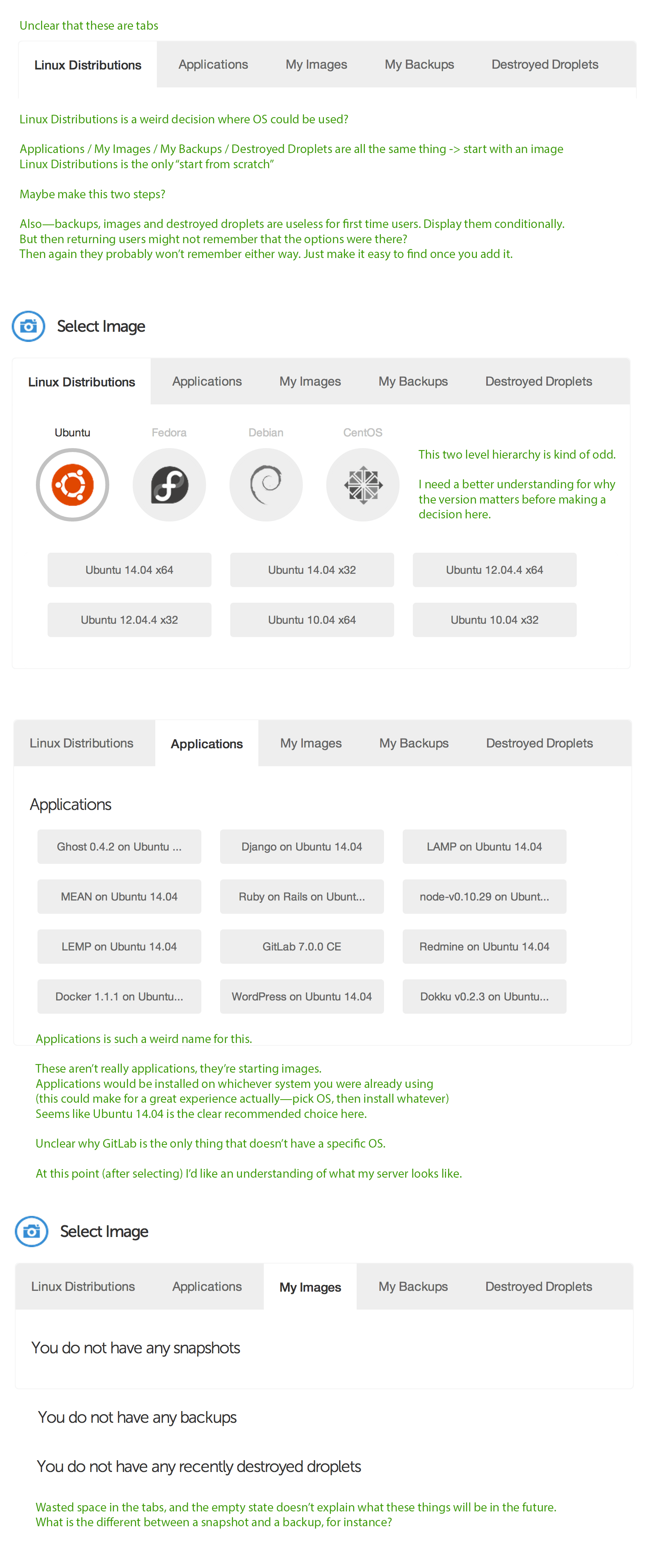
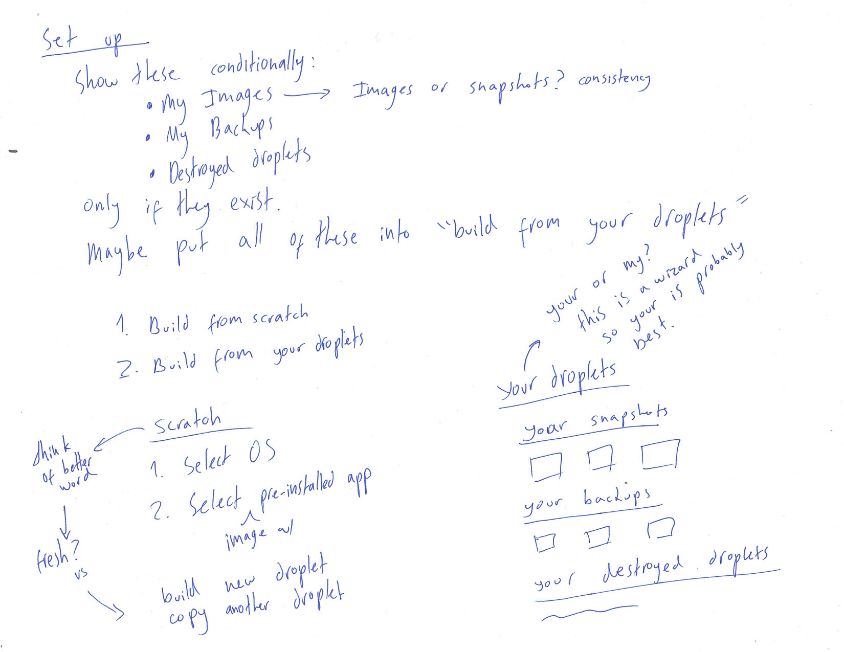
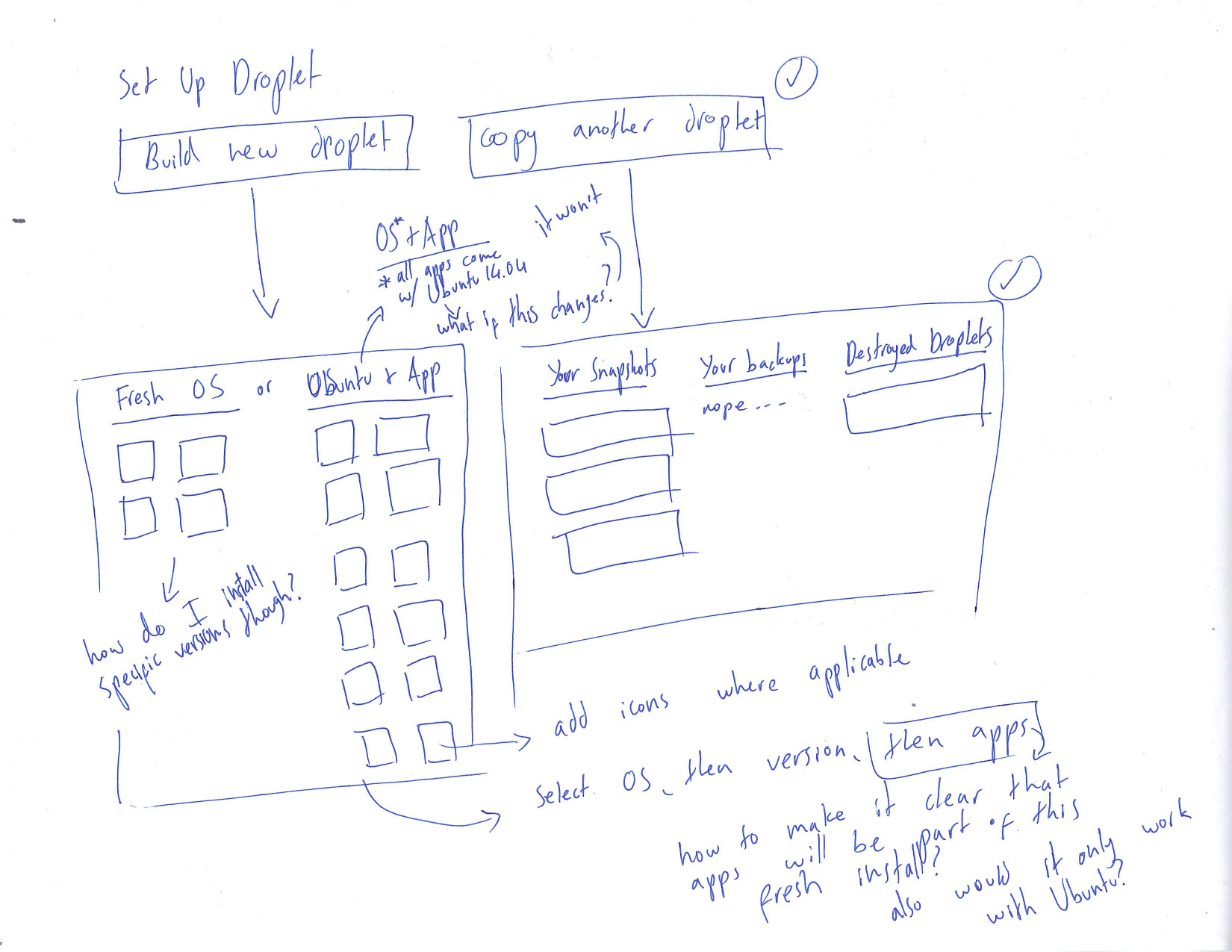
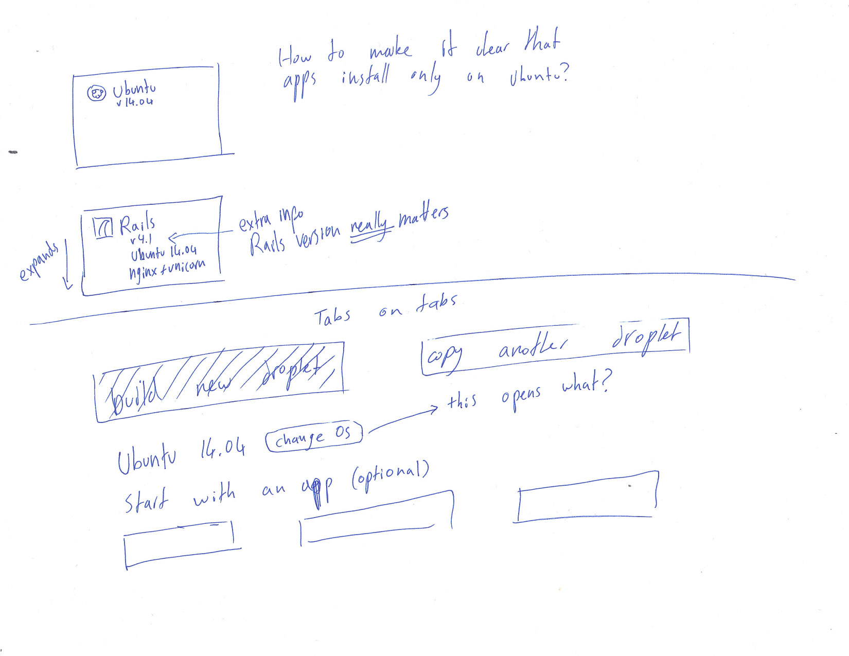
The Image Selection section was the main part of the exercise, which makes sense since it’s the only truly broken part of the flow. In my sketches you can see my process before settling on these mental models. I decided to split the available options into two categories: either create a new droplet, or copy an old one. This first choice is incredibly simple and eliminates half of the remaining options and the mental load that comes with them.
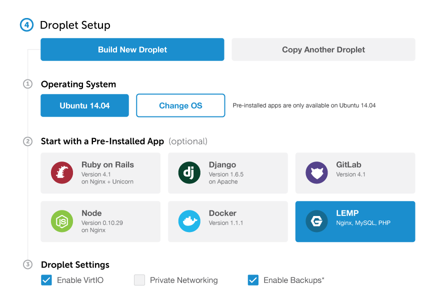
The “Build New Droplet” option is selected by default, since I figured most use cases involved fresh droplets. Under it I created 3 clear steps so the user wouldn’t miss any.
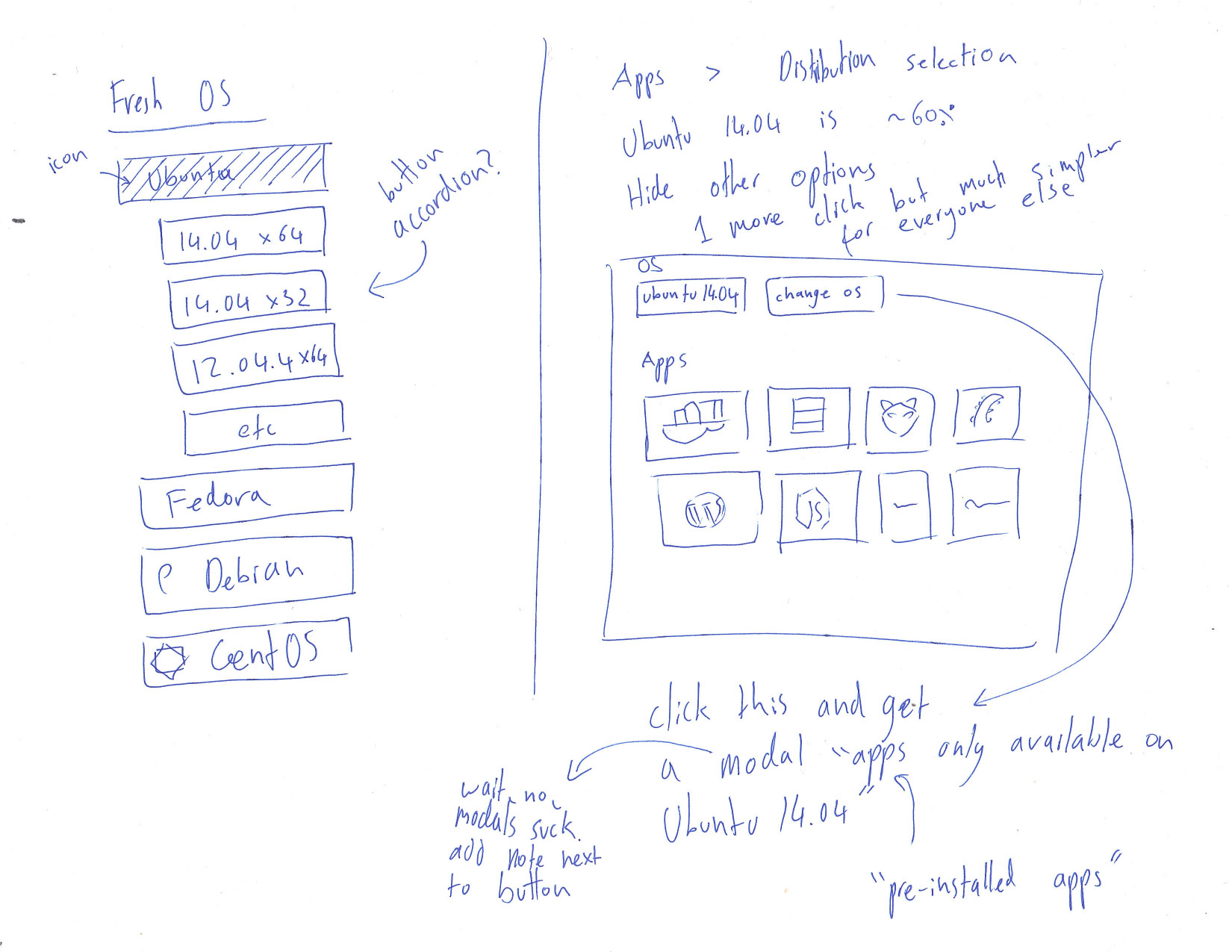
For the apps, I added some important information (developers care about versions!) and icons that make them easier to recognize. Everything is available at a glance and there’s no need to hover over them for extra info.
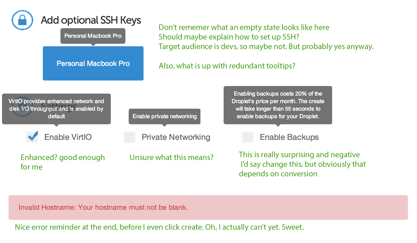
The settings were moved to be the last step of this subtask rather than the last step of the entire process. They made more sense in the context of the droplet setup. At first, I planned to add an “additional fees” label after the Enable Backups setting. This would solve the unpleasant surprise of the “extra 20%” tooltip, but would aso create a brand new fear of even selecting the option, which would decrease conversion (and use of a great feature). I decided to add an asterisk as a middle ground. This way users know to expect something, but aren’t afraid to find out. The tooltip would start with an asterisk, as well, so users wouldn’t continue searching for the terms somewhere else.
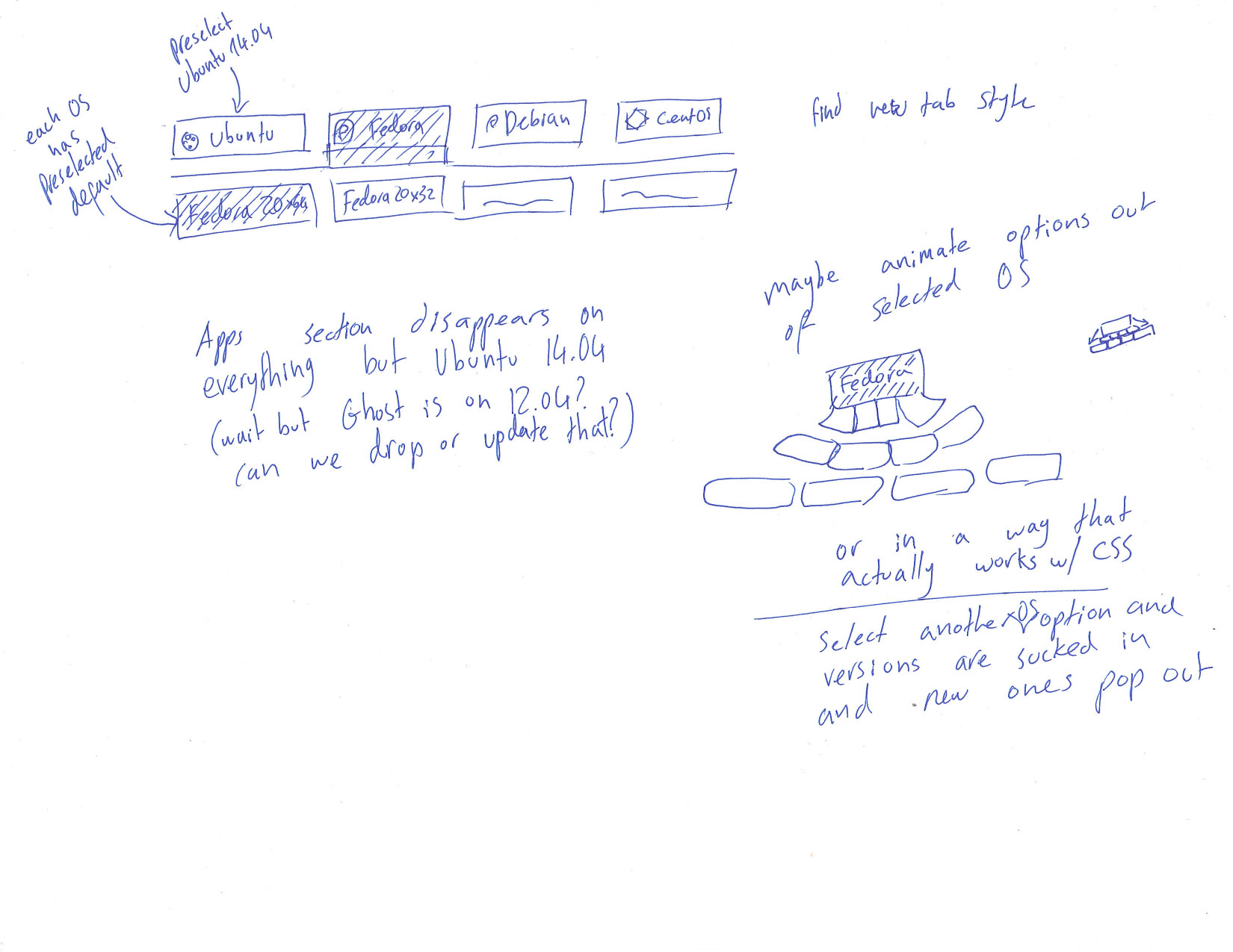
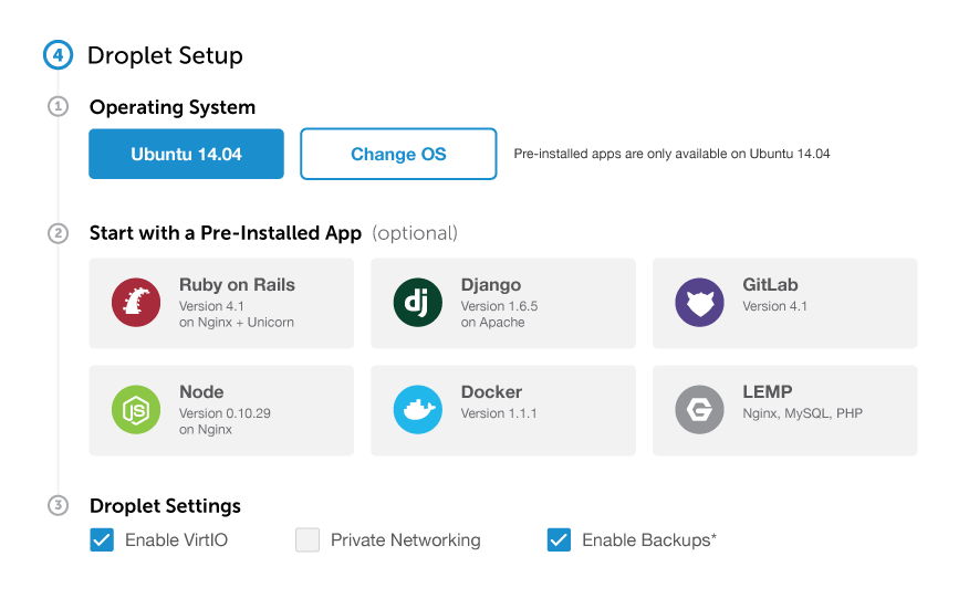
The most complex part of this screen was OS selection and how to make it clear that apps were only available on the default OS. I chose to hide everything but Ubuntu 14.04, since ~60% of users choose it by default. Furthermore, all pre-installed apps come bundled with it, so this would allow me to treat apps as installed apps rather than images that happen to include apps. I gave the OS a ‘selected’ state to make it clear that it was changeable, and added a “Change OS” button next to it, which would result in a new view. I placed a note next to it explaining that by changing OS they’d lose the option for pre-installed apps.
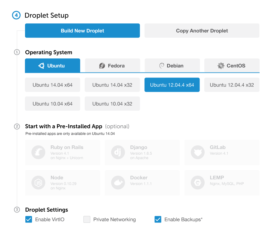
The numbers on the left also solved the aesthetic challenge of tabs under tabs. They made it clear that this section was under “Build New Droplet” and allowed me to create a special style for tabs— basically the same as radio buttons (with all their affordances) but with a blue line at the bottom. The radio buttons under this line are slightly altered—the text has a normal weight rather than bold. Both of these subtle design changes combined create a clear hierarchy. I decided that each OS would have a version selected by default to avoid people missing it and running into an annoying error at the end (the initially selected OS is still Ubuntu 14.04). Switching tabs remembers previous selections, but the currently selected tab/version is what sticks.
In every OS except for Ubuntu 14.04, the apps are disabled (same style as disabled droplet sizes). This is where the text under the “Start with Pre-Installed Apps” header really shines. If you’ve changed OS, you still know exactly which apps are available and how to get the option back. Simply selecting Ubuntu 14.04 from the list will enable app selection, even with the other OS options now visible.
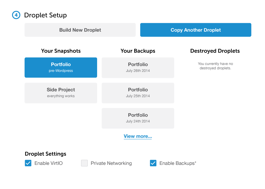
Clicking “Copy Another Droplet” brings up a different screen, with all of your saved droplets in view. This way you don’t have to switch between tabs to see what’s available. You’re there because you know you have a droplet you want to copy, and you can see it right away. This mental model will also work once we have shared droplets (“Another” does not mean “Your”).
The empty states here have enough real estate to really explain what each section means. If you have no snapshots, the system should explain what they are and how to take them. Same for backups. Destroyed droplets are fairly straightforward.
A nice thing about this model is that it makes it very easy for first-time users. Simply default to “Build New Droplet” and hide both options. After all, brand new users never have droplets on file, and by the time they come back to the process, the options will make much more sense.
Access
Setting up which SSH keys to use is fairly straightforward. One thing that users I talked to did ask for was the ability to set up SSH keys inline.

The new button would also make for a great empty state. No SSH keys yet? Simply add one. This could open either a tutorial, a modal, or an inline element to accept the public key.
I also moved the access message to the end of this step and added an exclamation mark so the user would definitely read it (needs to be tested, obviously). Since the “settings” step was moved into setup, the message maintains the same vicinity to the create button.
The Final Flow
The page, in its entirety:
If you enjoyed this, give me a call :)
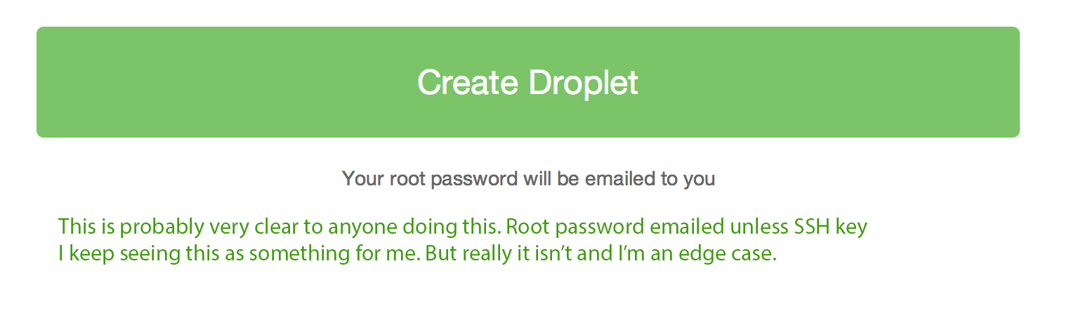
Joel led Product Design at DigitalOcean. Now he makes GitHub.
He doesn't write often, but when he does, he makes it count.
Sign up below for:
✅ Sneak peeks at upcoming design articles.
✅ Exclusive content and bonus material.
✅ Weekly Q&A with your questions about design, career development, etc.
✅ Access to the archives 🙃