For more context, read a bit about my time at DigitalOcean.
When I joined DigitalOcean, our user onboarding flow looked like this:
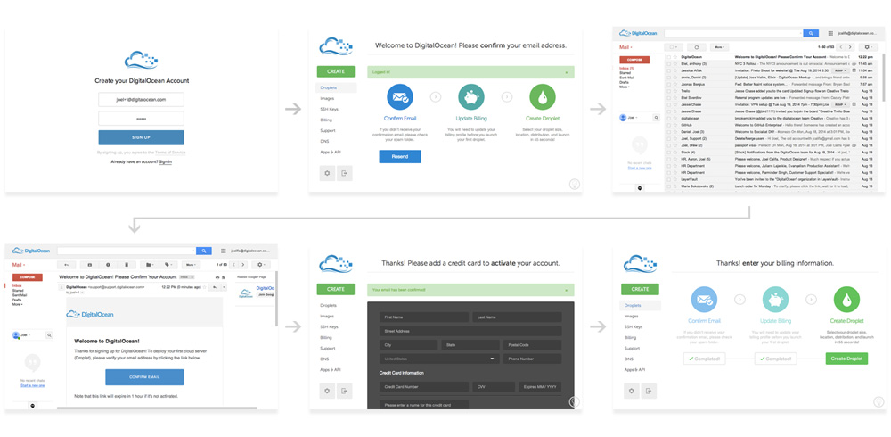
- Sign up
- Land on a screen with 3 steps, which blocks your access to other pages.
- Receive an email, open it, and confirm your address.
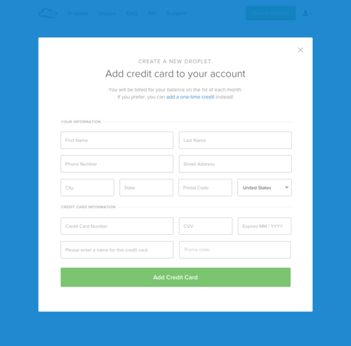
- Land on the credit card form with no context, which blocks your access to other pages.
- Land back on the 3 step screen, your next step is to create your first Droplet.
Our funnel numbers actually weren’t bad considering the designs above.
- 10% of people who saw our marketing site signed up (say, 20,000 customers)
- 80% of those left confirmed email (16,000 customers)
- 50% of those left added a payment method (8,000 customers)
- 75% of those left were subsequently billed (6,000 customers)
Now, if you were especially lucky, you’d also get this beauty. Our friendly fraud and abuse system might have flagged you for suspicious behavior and locked your account. If indeed you were flagged, you’d be dropped on this page right after adding your credit card.
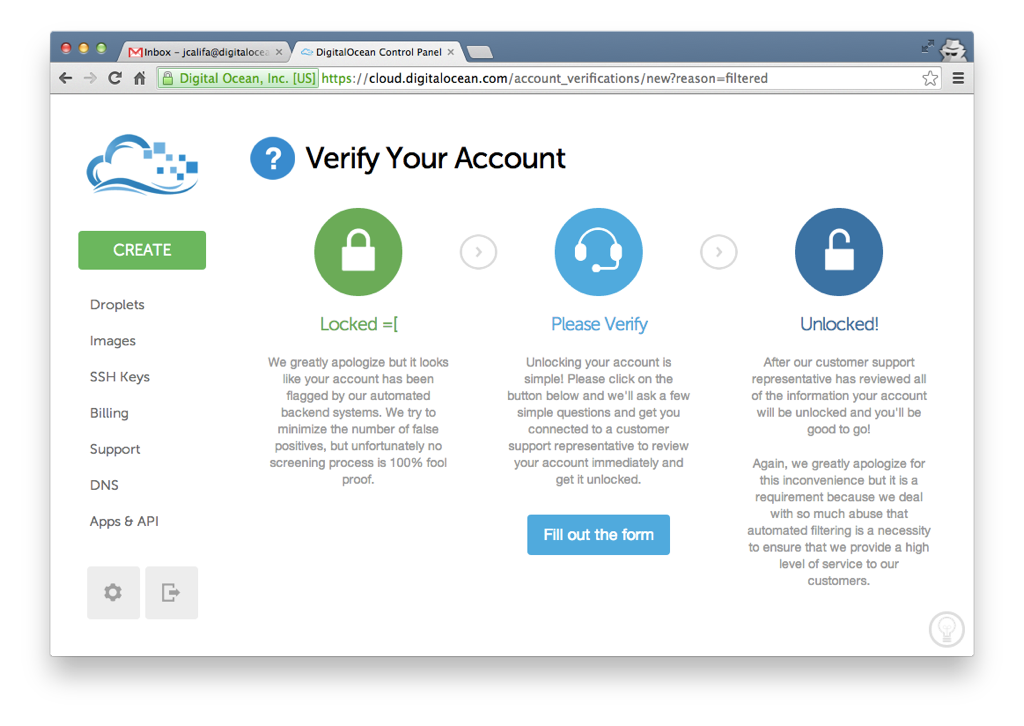
It wasn’t a pretty sight and—considering our high false-positive rate at the time—it wasn’t a rare one either. The only way out was filling out the form in the middle (aka the only step that’s actually a step).
Before we finally tweaked our algorithm, we diverted far too many good actors into this flow. It resulted in an awful experience that they wouldn’t soon forget. In fact, we later found that users that were flagged—even if it was just once a whole year ago—were far more likely to be detractors in our Net Promoter Score surveys. This means that a bad flow here could negatively affect our brand for years to come.
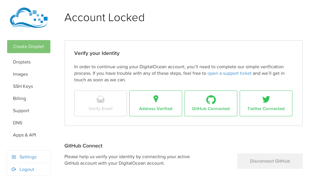
A later version of this flow was designed with additional OAuth features that could help verification. While it was more pleasing aesthetically, it resulted in more confusion.
Connecting your social accounts had about a 10% chance of automatically unlocking your account. If (when) that didn’t work, your only recourse was to click a seemingly unimportant link to open a support ticket. Even if you actually read the copy, it didn’t make it clear that this form would likely be required.
This experience led to people giving us lower ratings literally forever. It needed fixing. Reducing the friction and “bad feels” around the verification flow was the goal of this project, but we decided to take the opportunity to tackle the onboarding flow as well.
Our goals, in order of priority, were:
- Reframe verification to feel less negative. Possibly spin it as a good thing.
- Make it obvious that you need to submit a ticket in order to get verified.
- Increase % of users who add a payment method.
- Increase % of users who confirm their emails.
- Add delight ✨
Flow Mapping
The first step was to get a feel for the onboarding flow, from start to finish. Which parts could we cut? Which parts were more complex than we initially thought? Did we miss any edge cases? Were there any opportunities we hadn’t noticed? Seeing the beast often helps.
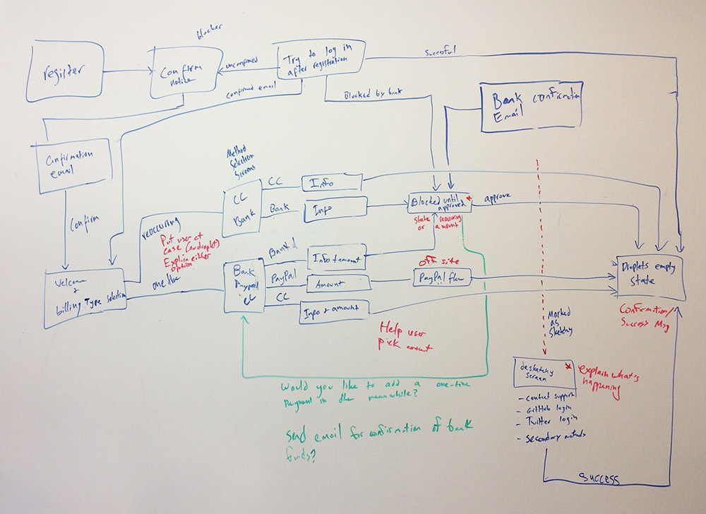
This helped us recognize some pragmatic areas for improvement. We’d explore these both holistically—in the context of the larger flow—and in terms of page-specific improvements. I’ll go through some of these areas, in the order that a user would see them.
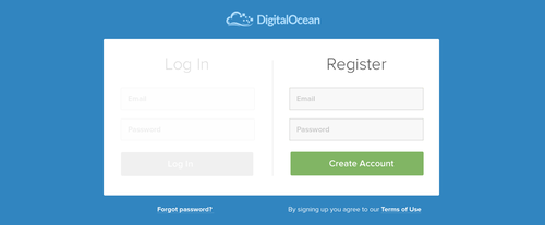
The Login & Registration Screen
Style, Layout & Microinteractions
The most obvious change I made to this step was visual. I felt the previous design’s starkness failed at guiding the user’s eye to the registration box. A higher background-foreground contrast could speed up registration and reduce cognitive load.

Before the redesign, people frequently got our Log In and Sign Up pages mixed up, usually due to the Sign Up CTA on the public site. When they tried to log in, they’d get a message that their email was already taken. Even though we placed a log-in link under the form, this was understandably frustrating.
I suggested we log in existing email/password combinations, regardless of which page users were on. There were no engineering resources to implement this at the time, so I opted for a temporary fix.
This option seemed like it might be overwhelming for users. The point of the visual overhaul was to increase focus, and this did the opposite. I continued to explore options.
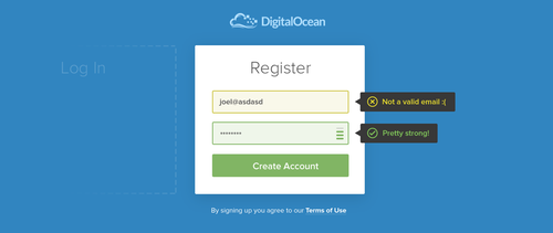
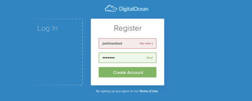
Once I landed on a solid direction, I wanted to see where I could add some delight. DigitalOcean’s brand is friendly and casual. Until this point, though, it had never shone through in the UI.
I explored some whimsical animations, which I felt were a good mix of form and function. They were fun to watch and helped clarify the context of each part of the flow.
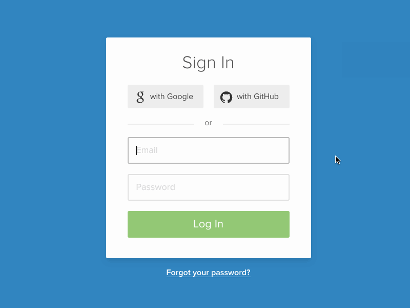
- The success and failure states added some character. More importantly, they gave the user clear feedback.
- The ocean-themed loading animations tied into the brand. It also made the design feel more responsive.
- The card flipping around communicated that 2-factor authentication was part of the same sign-in process.
- The card growing to fill the page gave the impression that you had unlocked the app using the form, and were now opening it.
When combined with a second card for signing up, these animations illustrated that each card represented a separate flow.
Optimizing the flow
One of the main changes we wanted to test was shifting the email confirmation blocker to earlier in the process. In the existing flow, when a user signs up, the first thing they see is this blocker:
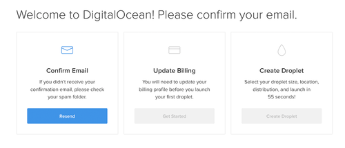
Even with the updated aesthetic, the page felt like a lot of work.
By sending users straight to the control panel, we were giving them a momentary impression that they were in—only to renege the offer and give them additional tasks.
Users could see the navigation, but couldn’t follow it until they completed onboarding.
The flow we had in place forced users to leave this page and manually open their emails. They had to find the right one and click on the button. It would drop them back on the same page, with the email confirmation box disabled and the next box (set up payment method) available.
Shifting the email confirmation step would allow us to remove the first box from this page. Also, if we’re being honest, the last box was only there for visual balance (boo).
Removing the boxes made both the first and second steps feel a lot less like steps. Email confirmation became something you did as part of the registration—before you even see the app.
The changed flow didn’t actually result in less work for the user. What it did was lower the perceived friction. Here, once the user lands on the control panel, they only have one thing to do: set up billing.
What once felt like 3 steps now doesn’t feel like a process at all—it’s just the obvious next step.
As a result, the entire onboarding flow felt much more streamlined.

You may have noticed that in the first flow there were two levels, whereas the second flow has only one. The old flow’s email confirmation screen was a dead end. All you could do was resend the confirmation email. If you wanted to continue the process, you’d have to manually open your email and continue from there.
With flows like this, people often end up with two tabs, one of which remains useless until you remember to close it.
One of our small improvements was to make it more obvious that the tab was now useless, and you could close it. It was a bit better but still resulted in a dead tab.
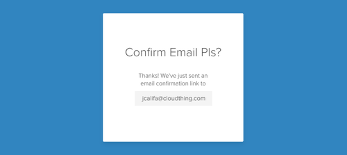
For some email addresses, though, I had an idea that could alleviate this entirely. Instead of a dead-end, we could link off to their email provider logins.
If you used Gmail, for instance, you’d get a button that could lead you straight to your Gmail inbox. This would happen in the same tab, and feel like part of the same flow. We could make the same work for Outlook, iCloud, Yahoo Mail, and any other email provider. I talked to one of our engineers, and he figured out how to ping emails on the fly to check whether addresses were part of Google Apps accounts.
Delight, at its core, is a positive surprise. The experience of entering an arbitrary email (say joel@joelcalifa.com) and getting a direct link to your inbox had the potential to feel magical.
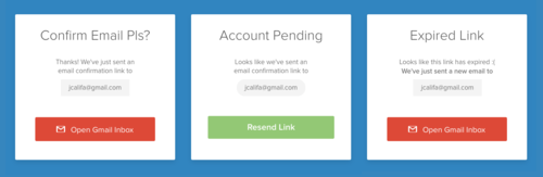
Finally, I put together some screens to account for edge cases. If users tried to log in again before confirming, they’d see an “Account Pending” box with an option to resend the link. This button would then turn into a link to your email inbox. If you logged in after the email link had expired, we’d automatically send you another email and give you that same button.
And that’s the login page. The email would send you to the app, where you could set up your payment method. We’ll explore that next.
Maybe you’d like to play with the prototype?
Username: test@test.com.
Password: test12.
Two-factor: 121212.
Try registering with a Gmail/Yahoo/Outlook email.
Social sign up is just for show.
Payment Method
Focused Flow
Clicking “Update Billing” in the original flow dropped you on the default Billing page in your settings. We felt this flow should take a more guided approach.
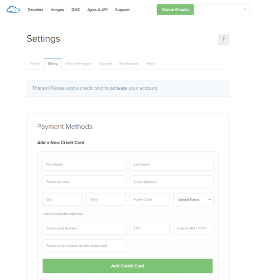
Credit to Earl Carlson, who partnered with me on this flow.
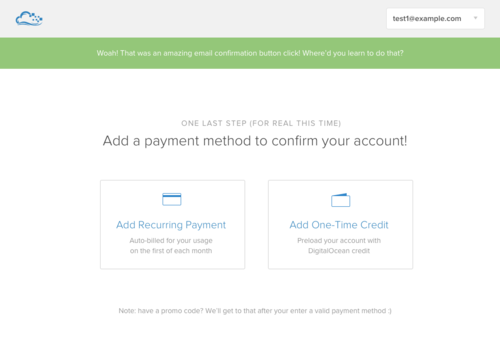
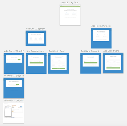
In the first iteration of the redesign, we dropped users in a contained flow, rather than the default page. Once they clicked through their email, we’d ask them how they preferred to pay. The options were One-Time Credit (prepaid credits), or Recurring (paying at the start of every month).
The goal of the guided flow was to make every click obvious. We didn’t care if it would take more clicks to complete, as long as users didn’t have to think about any of the steps.
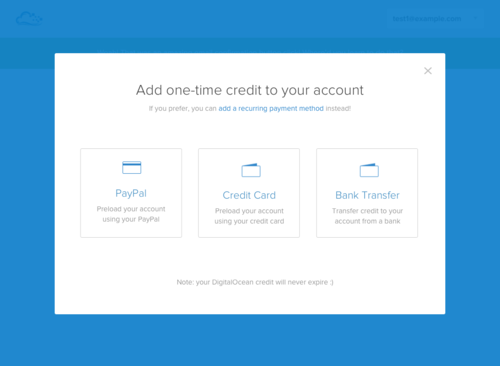
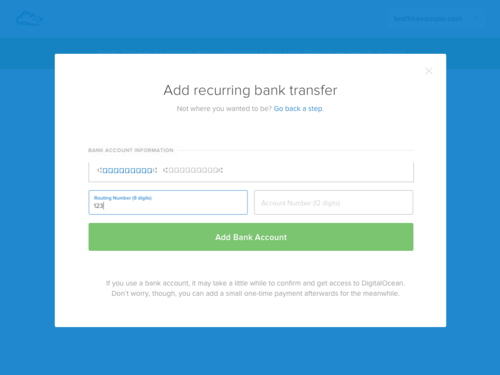
Clicking on one of these options would lead you to the next set of new options. You could load your account with money via Credit Card, Bank (ACH), or PayPal. For recurring payments, you could still set up a card or an ACH transfer, but not a PayPal account.
To put users at ease in times of uncertainty, we added a pattern for helper text at the bottom of each modal,
We started working on each payment form. The recurring credit card form was relatively straightforward. The prepaid PayPal form afforded more opportunity for improvement.
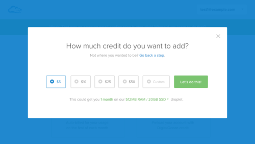
Paying an arbitrary amount of money without knowing its value on the system—without having seen the system yet—seemed like it could be stressful. I introduced a component that showed what each dollar amount could buy you.
The bank transfer form switched focus between numbers on the check as you moved between their respective input fields.
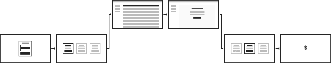
High-level, the guided step flow looked like this:
It later turned out that bank transfers weren’t as relevant and we originally thought. This helped to further simplify the flow.
Droplet-First Payment Flow
Next, I wanted to experiment with dropping users in a fully functional app. We’d only prompt them for payment information once they’d try to spin up a paid resource.
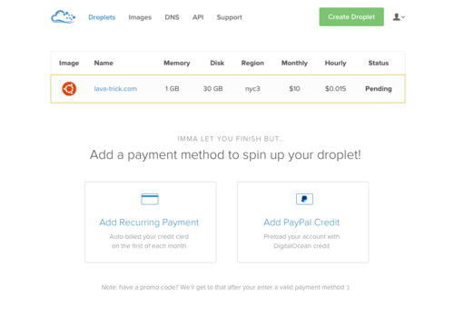
The hypothesis was that users would be more likely to pay once they configured their servers. As with shopping carts, they’d see value before pulling out their cards.
We wanted to ship a version of this and test the scenario, but the engineering effort was deemed too high.
Empty States & Freedom
At this point, we were still showing users the navigation, but not letting them explore the links. The other pages acted as a sort of tease. The only way to satiate your curiosity was adding your credit card or transferring funds from PayPal.
Some of these new customers had heard of us or read up on marketing material. But a good amount had never heard of us before, and we weren’t doing anything to gain their trust. Without trust, why would they give us their details?
Now, 50% conversion for adding payment details isn’t bad. But I believed that if we let users explore and see what they’d be getting for their money, we could increase this.
Instead of dropping the user on that 3-step view or a locked billing flow, I designed an empty state for each page.
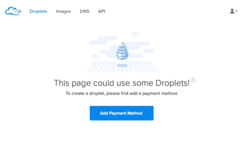
The empty states would be permanent, but their CTA would be dynamic. Until you added a payment method, they would lead you to the billing flow. After that, they’d prompt you to create resources.
I put together similar pages for Images and DNS records. Each page had basic information about the resource, with an option to learn more. This let users browse through the platform and get a feel for what was possible before committing to share their private information.
Finally, I then made some optimizations to the billing modal flow.
I tied the modals more closely to the pages users would have come from. If you had converted on the Droplet page, the form’s title would be “Create a New Droplet.” This framed it as the first step to getting what you want, rather than a way to add something we wanted.
I also ripped out the many billing options that we presented earlier. The most common method was a recurring credit card payment, so I defaulted to that. As a business, it was also our preferred method of payment.
If users wanted to, they could switch to One-Time Credit (via PayPal). We framed this as a secondary option, but it’s obvious and easy to get to.
It was also possible to prepay with a credit card, but we chose to nix it. Based on data, the added constraints wouldn’t affect almost any of our users, and they would result in a much simpler flow. This way we could include two possible modals instead of the original 8 or so. I met with the PMs and got buy-in.
The payment flow we came up with gave users the freedom to move around and see what’s possible. Then it made it easy to add a payment method once users chose to give us a chance.
New Verification Screen
The final piece of the flow was the verification screen. Remember that? There’s a wall of text between us and the last time we discussed it at the top of the page. Let’s recap:
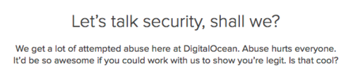
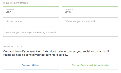
Too many new users were incorrectly flagged for fraud or abuse after submitting their payment information. They would land on a page that said: “Account Locked.” We asked them to connect their social accounts, add their physical address, and other information.
All this was just to get into our app. Keep in mind, this is before they’d actually seen the app for the first time.
The page itself was confusing. We never explained why your account was locked in the first place, or why you now needed to verify your identity. We didn’t even explain how adding social accounts would help with that.
We put the user in a frustrating, uncalled-for situation. To top it off, we weren’t showing them any empathy. Not in the layout, not in the copy, and not in the tone. With such a lousy first impression, it’s not a huge surprise that this hurt conversion and hurt the brand.
Something needed to be done.
Reframing the messaging
The way I saw it, the verification flow had two main issues. The first of these was the abysmal messaging.
“Account Locked” does several things poorly:
- It doesn’t provide any context. What does locked mean? Why do people get locked?
- It tells the user that they’ve done something wrong even though they haven’t done a thing. This is what we call “bad vibes.”
- It’s just cold and off-brand.
The thing is, fraud and abuse protection isn’t inherently bad. It exists to protect the world from sites supporting ISIS or child pornography. It helps to combat spam, and to stop bad actors from committing fraud and stealing other people’s money. And it’s crucial when it comes to providing consistent performance and reliability to all of our customers.
It’s beginning to sound like kind of a good thing, right? It’s absurd that with this many pros to verification, we decided to go with “Account Locked.” We could do better.
Reframing the flow
The second issue had to do with a confusing flow and weak expectation-setting.
The main CTAs on the page prompted users to connect their social accounts. The problem was that these accounts only had a 10% chance of verifying someone. This meant that 9 times out of 10 users would have to open a support ticket anyway.
If you scroll up you’ll see a tiny link to that end.
I repeat, a whole 90% of flagged users had to click that tiny link and fill out a support ticket. And we framed the entire flow around a method that would do nothing but waste their time, patience, and good will.
I decided to redesign the page and frame it around opening a support ticket. I renamed the ticket to “Verification Request.”
I integrated the social OAuth functionality into the ticket, but with lowered expectations. Forms are asynchronous, so connecting your GitHub or Twitter can feel more like adding an attachment. This way, there was no unmet expectations for immediate resolution.
Instead, 10% of the time, users would be magically verified and pulled out of the process. What once caused frustrated could now cause delight.
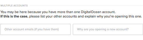
Finally, I added the ability to include dynamic survey questions. A big percentage of users get flagged due to having multiple accounts. This was an obvious opportunity to save our Support team time and canned responses.
Users flagged for this reason would receive and answer the question before our Support staff had to ask it. Users flagged for other reasons would never need to see it. This sped up verification ticket resolution substantially.
Additionally, I placed the page within the regular flow, rather than locking users out. If they were locked, empty states would prompt them to verify their account. I even gave them positive reinforcement for signing up. Here’s the final page.
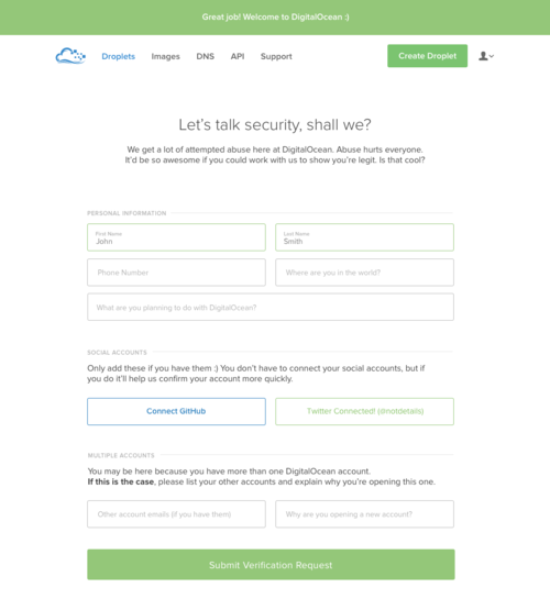
My goal was to stop this page from feeling disruptive. Ideally, flagged users would feel like it was part of the regular flow, something they were always meant to see. And hey, for the most part, it worked.
Conclusion
The new verification flow shipped right away. It resulted in much less confusion and frustration from flagged users.
It was one of those instances in which design can be a powerful bandaid, but not the real solution. By making the experience better for false-positive, we were alleviating a symptom, whereas reducing false-positives by improving our fraud detection algorithm solved the actual problem. It also boosted conversion significantly.
Today, very few people see the verification page, and when they do, it doesn’t feel as negative as it once did. This has resulted in a higher and ever-increasing NPS and more love (plus, in this instance, much less hate) for the DigitalOcean brand.
The rest of the onboarding flow took a while longer to implement. As with Team Account Management, resources at DigitalOcean were scarce around this time. Only two more aspects of this project were shipped right away:
- Empty states on every page, which have
- The login page’s new visual cosign. This has been our login page ever since.
Also in line with the Teams project, most of the elements designed for this flow were subsequently implemented over the next year:
- Blocking users on the email confirmation screen.
- Dropping them in a more focused billing flow (no free exploration because that turned out to convert less)
- Showing users how much they’d get for a certain dollar amount in prepaid credits.
- And users can finally log in via the Sign Up page!
I accidentally tried to log in via this register form, @digitalocean logged me in anyway. Thumbs up for good #UX! pic.twitter.com/xw1vgR74yr
— Lea Verou (@LeaVerou) July 5, 2016
The new onboarding flow, once completed and released, resulted in a full 5% bump in overall conversions, and so I added high-fiving to my LinkedIn profile.