For more context, read a bit about my time at DigitalOcean.
DigitalOcean gained its initial traction by catering to individual developers. We offered one thing: Droplets, which is what we call our simple Virtual Private Server solution. For the most part, Droplets were enough. They took us all the way from an unknown startup to the #2 company in the cloud hosting space.
Business was booming, but we recognized some gaps. While we were on par with the industry in terms of reliability and performance, developers were mostly using us for staging and side projects. They chose to host more “serious” projects on competing services.
For the next two years, we would slowly shift our focus from single developers to teams of developers, and finally to startups. This included an evolution of the brand and the introduction of many new products and features. The first of these features was Teams—the ability to collaborate with your colleagues on your infrastructure (in a way that doesn’t involve sharing a single password).
On Uservoice and in interviews, our users were clamoring for this feature. Especially our highest-value customers. We set out to build an MVP, the scope of which decreased several times throughout the project. The initial spec included:
- Creating a fresh team account.
- Converting your personal account into a team account.
- Transferring resources and funds from your personal account to your new team.
- Adding and editing team metadata.
- Inviting new team members.
- Setting and accounting for differing permission levels for users.
- Joining a new team as a user.
- Switching contexts between personal and team accounts.
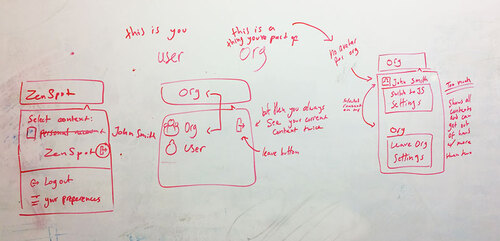
This was a departure from how anyone had used our product before, so I set out to create a model and flow that would make sense to our users, and validate that we got the feature set right.
User Testing
Once I have a good idea of the general feature set and IA for a given project, my next step is to validate it. I created a quick and dirty prototype to test with users. In this case, I opted for a paper prototype that I could move around.
I worked with our Customer Success team to schedule 8 interviews with VIP users who had requested the feature. Within a week I had a ton valuable insights, and within two, my next prototype was ready for testing.
In the first sessions, we found that our initial MVP feature set was solid. It was an accurate representation of our VIP users’ needs, as well as a small sample of our hobbyist users.
The strongest elements included the initial roles (admin, dev, billing), the ease of creating an organization, and the UX around divvying up resources between individuals and teams.
The weakest included the conceptual and visual separation of personal and organizational contexts, the messaging around resource separation, and the messaging around what permissions the different roles were entitled to.
Following is an excerpt from a user research document I wrote at the time. In total it’s about 30 times as long.

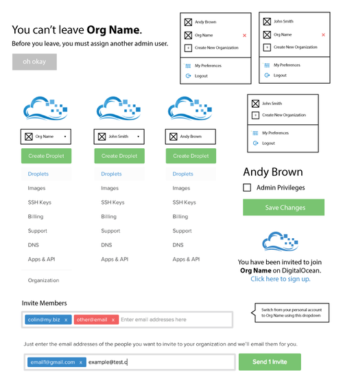
It also became clear that the placement of the context switcher within the main side navigation was confusing to users. This side navigation had existed since DigitalOcean’s debut. Users were too accustomed to switching context in the top right, where most applications include user settings. In the next prototype, I shifted to a top navigation.
This next iteration solved a lot of the issues we found in the previous prototype, but further testing revealed it still wasn’t that intuitive.
So I said, “let there be iteration,” and so there was iteration. I tested out various dropdown designs, tweaked the user flow and copy.
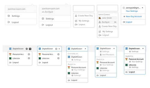
The flow still had a few tricky areas, but over a few iterations, these were resolved. The final version in this cycle was one that users enjoyed and I was proud of.
Rescoping
Between then and release, as often happens in startups, new technical constraints were introduced late in the process. It turned out that the way our databases were set up made it difficult to allow a many-to-many relationship between teams and accounts.
The engineering team decided to treat a team like a new type of user rather than creating a new class for it. Instead, they created a new construct called a “team-user.” This would be much easier technically and result in a much quicker release.
What this meant was that single users couldn’t join multiple teams. Moreover, existing users couldn’t join teams with their accounts. Instead, they would have to create a fresh account per team. This meant they could end up with several logins—one for personal use, and the others to access their teams.
The new architecture meant that the system I’d designed wouldn’t work. It required an overhaul. The deadline for release wasn’t changed. So it goes.
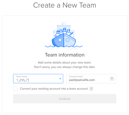
One of the main changes was in the ability to create new teams, versus converting your personal account.
The new technical constraints didn’t mean we couldn’t do this, but I made the decision to remove the feature regardless.
This feature made sense within the previous system. Now, the account you were using couldn’t become a member of your new team. This was confusing and frustrating for everyone we tested with, so I nixed it and left a single option: converting your main account into a team.

Upon further inspection, this too could be optimized. If teams were actually just users in the backend, why include an extra step to “convert” an account into a team? It wasn’t really changing anything. It just flipped a switch and presented a slightly different UI.
I made a slight change to the mental model. You wouldn’t convert your account into a team, you’d just invite “team members” to join your existing account.
We stopped making the distinction between team accounts and user accounts. Every account was already a team in the making. They all had Team pages under their settings by default.
This ended up making all the difference. When presented with this version, users tacitly understood how everything fit together. It flipped the feature on its head and helped alleviate its new, awkward constraints.
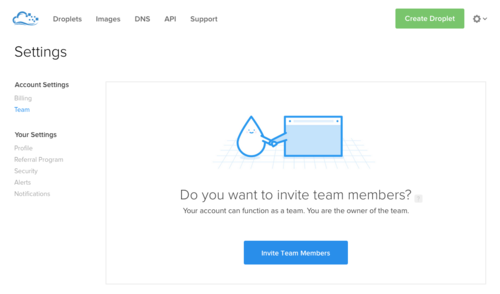
Credit to Kasia Bojanowska for the most adorable empty state.
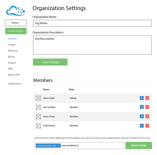
The final tweak was to the Settings page. I divided the list of subpages to show which settings belonged to the user, and which were shared with the team.
Since users now had account settings and personal settings regardless of whether they were a team, nothing needed to change when they added new members. This helped cement the new mental model.
I took advantage of the new top navigation to overhaul our typography and hierarchy. I changed our sub-navigation (which had existed as varying styles of tabs) into a sidebar.
We released the navigation change ahead of Teams with a gif and a snarky button. 75% of our users absolutely adored it, and the rest hated it with a passion. Live and learn.
From @digitalocean’s page announcing UI changes
— Lea Verou (@LeaVerou) August 2, 2015
Best. Button label. Ever.
Note that it’s also the *only* button :) pic.twitter.com/19tOhJTrH7
Credit to Scott Alden for the snarky copy.
Even though the initial MVP was far from perfect, users found a lot of utility in it, and for the most part didn’t mind. It would go on to validate our assumptions and give us time to work towards a more complete feature.
Here’s someone using that first version we released to create a new team and invite a couple members in 10 seconds flat:
The final Teams design introduced new styles and patterns into many parts of the app. It bled into (and took advantage of) another project I was leading at the time—the creation and integration of Buoy, our new CSS style guide. Buoy would help bring the entire app closer to the new styles defined in this project.
Once the design was complete, I worked on implementation (at this time Product Design was still responsible for all front-end code). I solved any issues we missed as they came up.

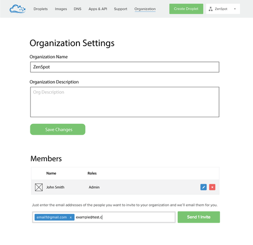
Version 2
We did end up shipping a second version that closely resembled my earlier, pre-scoped designs. This release included a many-to-many relationship between accounts and teams, and real context switching.
We released the update earlier this year with this graphic by Latham Arnott.
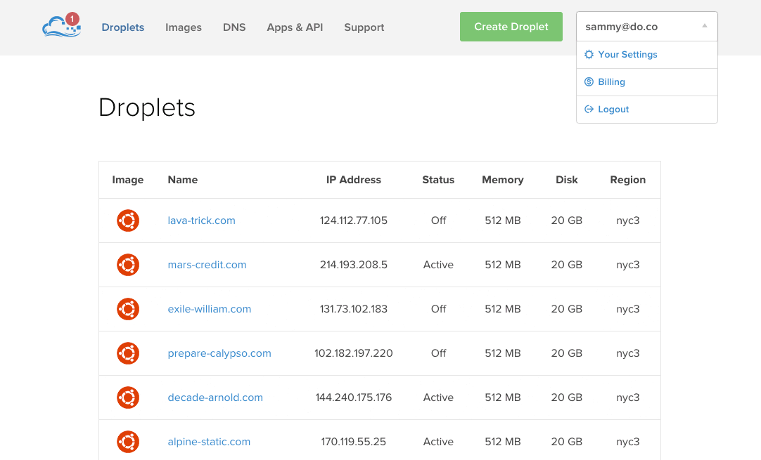
Here’s the current UI:
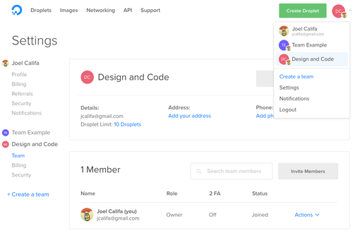
And hey, you can still convert your account really easily :)
Credit to Alex Penny for leading the design on Teams v2
This goes to show that no matter how much you gut a product release, there’s always a path to quality. You just need to follow it.
Conclusion
Team Accounts was DigitalOcean’s first step in our journey towards a more professional user base.
The feature was well received. It resulted in new visual styles and UX patterns that have directly impacted many other products over the years.
Since the first version of teams was released, team accounts have grown to account for over 30% of the company’s revenue. So, that’s cool.