For more context, read a bit about my time at DigitalOcean.
Design at DigitalOcean was a mess in 2014. There was no articulated direction. no consistent visual styles, and no thought-out design patterns. Almost every project was ad hoc, and it showed.
Today, DigitalOcean is widely known for its design quality, in both design and engineering communities. Its clean interfaces and intuitive workflows receive regular praise. In our weekly Net Promoter Score surveys, there is a high correlation between high scores and our design work.
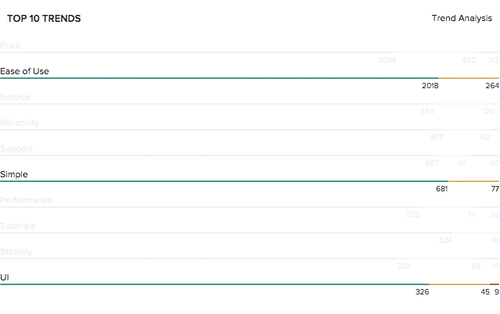
This is a small sample of recent responses on the survey:
Easy to use. No bullshit. Reliable. Clean design.”
The interface is absurdly simple and easy to use.”
dope-ass service at dope-ass prices.
p.s. your designers are dope too.”
Yup.
It took a very long while for us to build DigitalOcean into something we could be proud of. I led two projects at the center of this transition.
The first, Buoy, had to do with our UI styles and patterns. The second was an attempt to carve out north star principles for our design team to work towards. I’ll dive into both.
Buoy: The DigitalOcean Design System
Two and a half years ago, DO was a startup. Not the “sure we’re a thousand people but we wear hoodies and eat pizza” kind—but an actual, authentic startup. The real thing, as they say. 60 people doing their best to figure it out in more or less the same direction, only it ends up being 60 different directions, and as the saying goes: 60 bests don’t make a best.
Now, I believe that everyone has good intentions, which is why I wasn’t angry when I saw that the codebase I’d be working with for the foreseeable future included styles in CSS, Sass, SCSS, and LESS. And I wasn’t too frustrated when I found every flavor of markup, including but not limited to HTML, Haml, ERB, and JSX. And when I saw the JavaScri—actually, don’t get me started on the JavaScript.
Long story short, the codebase was a mess of markup and style pyramids that would put Giza to shame. CSS was everywhere except where you expected it and !important didn’t work. Ever.
Working this way was obviously difficult. Every release—no matter how simple—would take much longer, and result in new technical debt. It could take an hour to pinpoint the right class to use, only to find that the styles rely on five levels of nesting.
So more styles were added. At first, I’m guessing these would have been as close as possible to the original. By the time I joined, though, there were 50 shades of blue and green, 20 kinds of buttons, 8 patterns and styles for tabs, 7 variations on rounded corners, 6 types of input boxes, and so forth. None of these were clearly related, not in class name and not in style. The typography was all over the place, and some pages barely resembled each other.
Needless to say, this wasn’t going to go away by itself, and there’s only so much cathartic power to git blame. At this point, the design team was in charge of all production front-end code. It was our mess to solve. And so six months into my time at DO, I decided that the CSS was going down.
A long-overdue UI overhaul has started (dubbed “normalization”). But as we converted the first pages, it became apparent that we’d only be creating more of the same mess behind the scenes.
Everyone on the team was on board with overhauling our CSS, so I suggested a CSS style guide. These were starting to pop up everywhere at the time. A style guide could help us bring more consistency to our styles and design patterns. It could make our codebase more maintainable. It could also make it much quicker to prototype designs. I jumped in and started doing some research. I reached out to friends at Etsy.

Diana Mounter ran me through the Etsy style guide and workflows, and Brent Jackson ran me through BassCSS and its principles. These style guides and many more, such as Lonely Planet’s Rizzo, provided much of the inspiration for Buoy.
Here’s what Buoy looks like today:
Early Decisions
I read up on CSS frameworks and decided to go with BEM. This is a CSS framework that follows a model of Blocks (components), Elements (the pieces that make up a component), and Modifiers (the different states of a block or an element). Vanilla BEM was a bit awkward on the eyes, so I chose a slightly different naming scheme, based on Nicolas Gallagher’s SUIT.
BEM was critical in building a maintainable style guide. It made us think of our UI in terms of components. This helped avoid unnecessary nesting that would make our components harder to evolve and extend down the line. We had already started building the initial skeleton of what would become Buoy, so I spent a few days translating it into BEM.
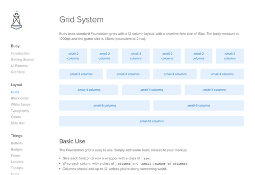
I did some research on the best fit in terms of a grid (Foundation for its ease of use), which units to use (rem units for their versatility), and so forth. We didn’t want to make things we didn’t have to make.
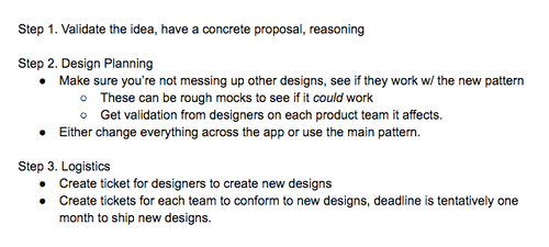
I then drafted up the guiding principles for the project.
Some structure guidelines
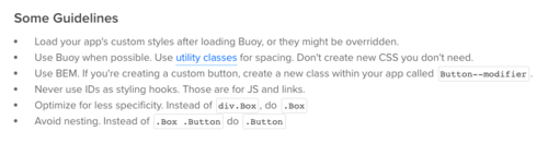
And a few visual patterns
Naming Buoy
I named it. Yeah. That’s it. That’s this entire section ¯\_(ツ)_/¯
I wanted to rename it to BUI later for “Better User Interfaces” because that was clever, plus no one seems to be able to actually spell Buoy. But alas, it was already implemented everywhere and developers gave me side eye.
Component Audit
Once we had a skeleton, I set a few meetings for the team to go over cloud and audit every component. Before we could build out the style guide, we had to figure out what would go in it.
- Was it necessary?
- Could we merge it with another component?
- Did it appear often enough to constitute a reusable style?
- Was it even a good pattern?
The rule of thumb we landed on was that if a component, element, or pattern appeared on more than one page in our app, and we decided it was good enough to keep, it belonged in Buoy. We’d iterate on it from there.
I added a section specifically for components we weren’t sure about called “On Deck.” This is where we’d put single-use components that had the potential to become site-wide patterns. We’d go over these during fortnightly Buoy meetings.
The Style Guide
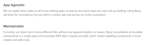
Buoy included many valuable tools that would help us drive consistency and quality throughout our design work. The visuals were based on a synthesis of styles that came out several of our recent projects.
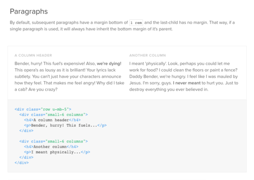
The first thing Buoy helped with was placing our layouts on a fixed grid—the Foundation grid I mentioned before. Previously, almost every element on a page was arbitrary to some extent, but now we could quickly put together consistently sized layouts.
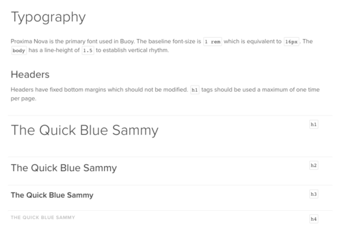
We now had set typography rules, which meant different pages would flow in the same way.
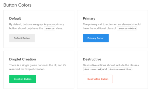
We had consistent colors.
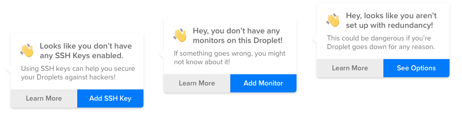
Buoy made it easy for our developers to dynamically add loaders to pages when they were needed.
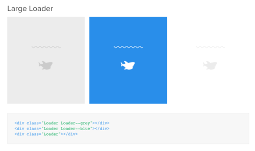
These would load an element with a CSS animation I had designed to give our platform some character.

We had an easy way to add empty states (which had only recently originated in my Onboarding project) to new resource pages.
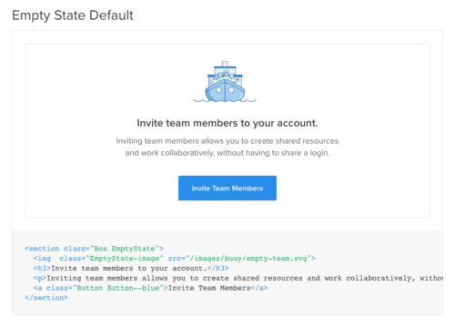
Credit to Kasia Bojanoswka for the lovely illustration.
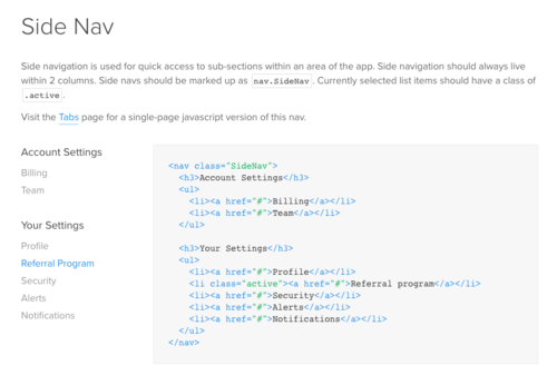
Pages with side navigation (which had originated in the first version of Team Accounts) were now easy to create.
Implementation
Over the course of two months, I and 3 other designers divided pages amongst ourselves. We worked nonstop until Buoy was fully integrated.
The many “Buoy War Rooms” and bug fixes blur together almost. It included fixing how tabs within tabs don’t focus on load. It included form validation, adding focus states, and improvements to accessibility.
We weren’t done until every page had all its legacy CSS ripped out. Until the entirety of our markup was replaced with gracefully nested components.
Credit to Jesse Chase, Colin Keany, Earl Carlson, who slaved over this with me.
Our final PR included 216 commits and 5,000 lines of code removed from about 300 files. Our developers called it the PR from hell, but it LGTM 👍
Almost overnight, DigitalOcean’s control panel shifted from something the Design team hated with a passion to something we were all kinda sorta proud of. And that’s saying something for a designer.
Post-Buoy Integration
In order to maintain the guide, I set up regular Buoy meetings. Here, we determined which patterns were missing, and how styles were being extended within the app.
I created a #style guide channel on Slack (and linked to it from the guide). This served as a destination for all Buoy-related questions.
When I started leading the team, we created a formal process for implementing product-wide design updates.
To avoid stifling innovation, we defined the criteria for fragmenting patterns and creating new ones. Designers who wanted to tweak a pattern or style had to provide the team with clear reasoning for why the change was needed.
Conclusion
Buoy was a smashing success by almost every measure. Every component on our cloud app was audited and calibrated for consistency and quality. Processes were put in place to maintain it. We ripped out thousands of lines of CSS and sped the application up substantially.
It set the foundation for everything we’ve built since. Almost two years later, DigitalOcean’s main application remains almost entirely based on Buoy. While the styles and patterns have evolved and improved, you can still draw a direct line to where it started.
There have also been several internal projects—led by non-designers—that have taken advantage of the style guide. These look like DigitalOcean apps, without much effort.
Finally, it’s become extremely easy for designers and developers to put together and test quick prototypes that look like the real thing.
Future Principles
I started leading the Product Design team about a year into my time at DigitalOcean (more about this here). By this point, the product had changed a lot.
Buoy had done a lot to bring more cohesion to the platform, and whole areas of the product were overhauled to create better experiences. There was no question that we were getting better.
The one thing I felt we were missing was direction. We didn’t have a shared vision we were all building towards. I believed that once we had a north star, we could begin executing with more confidence and begin designing in leaps instead of small iterations.
The Process in Brief
The project took the form of a deck. For the first few weeks, I went wide. I explored possible avenues, sketched out ideas, and designed rough mocks. I talked to engineers to see if the principles I was putting together made sense.
When I felt I’d pursued this long enough, I started converging on the principles I felt were important enough to make the cut. I nixed about half of what I had and polished the rest.
When it was ready, I presented it to the rest of the design team and got their input. We changed a few names and tweaked a few descriptions, but were mostly aligned on the direction and on each principle’s value.
I then included the principles in a larger design vision deck that I presented to leadership. Again, there were few tweaks, but mostly alignment. The principles are as follows:
- Object Oriented
- Show The Right Things
- Scalable Interactions
- User Collaboration
- Keep Your Context
- Keyboard Friendly
- Make Developers Better
I’ll dive into these one by one.
1. Object Oriented
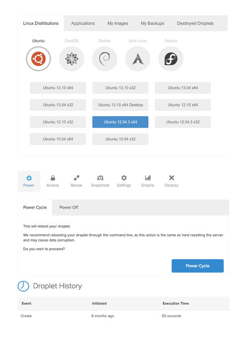
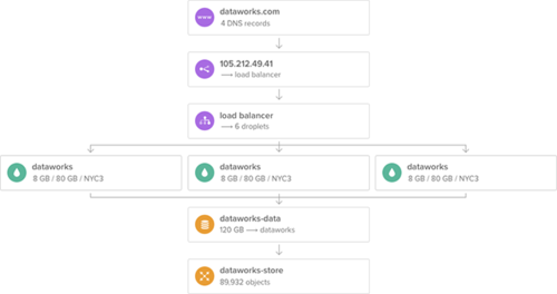
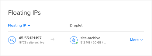
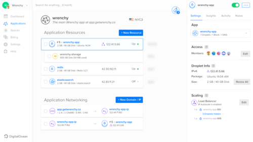
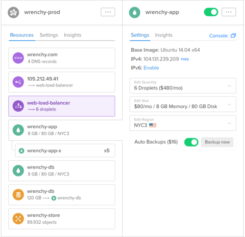
In an effort to bring visual and conceptual consistency to the platform, we have started thinking of all objects (droplets, domains, snapshots, storage blocks, floating IPs, load balancers, API keys, etc) as extensions of the same concept. All objects will be accessed and altered in a uniform, predictable way.Before I started this project, one of the Designers on my team was working on Floating IPs. This was a new product that allowed users to reserve static IPs and assign them dynamic targets. If your server crashes, you can switch your Floating IP to point at an identical one. This is often referred to as “lazy man’s load balancing.”
Developers generally route a Domain to a Floating IP and then route that Floating IP to a Droplet (what we call servers).
The first iteration of the design looked like this:
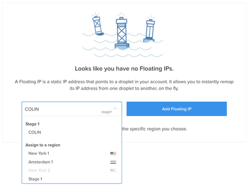
COLIN represented a Droplet in this scenario, but it didn’t really look like one. During a critique, I pointed this out. I suggested that Droplets should look like Droplets no matter where you are in the system. This is what they looked like on their index page at the time:
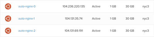
The icon on the left represented Ubuntu, the Linux distribution loaded on the Droplet. This could be Fedora, Debian, FreeBSD, etc. Next was the name, followed by other relevant metadata.
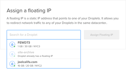
In a table view, this made sense, but you couldn’t fit all of that into a dropdown, like the one used for Floating IPs. We explored possible solutions and finally landed on this design:
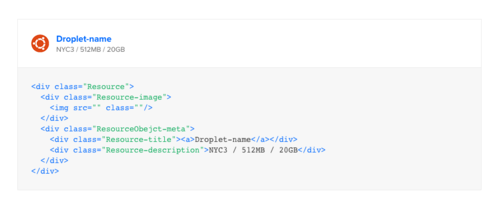
We moved contextually relevant metadata under the resource name. This would allow us some flexibility in which information we chose to present.
We later switched the Droplet’s Ubuntu icon to a generic Droplet icon. The absolute majority of Droplets contained Ubuntu, so that metadata didn’t change often. We decided that it would be more useful for an object icon to represent the resource type. This would be helpful as we added new products to the platform
The sketch I included in the vision deck outlined a few different products color coded by their category. Compute (droplets, images), Storage (block storage, object storage), and Networking (floating IPs, domains).
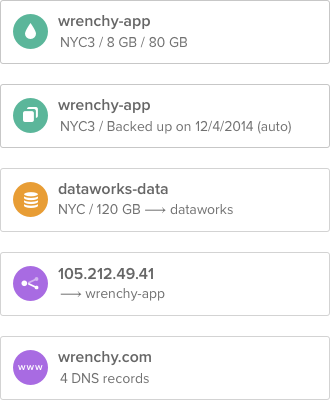
The final floating IP changed to conform to the new pattern:
The extra metadata also helped solve other UX issues on the platform, such as the way our DNS page worked at the time.
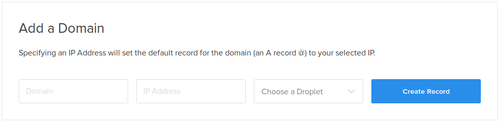
To route a domain, you would type in the domain name in the first input box, then the IP in the second. If you wanted to tie the domain to a Droplet, you would select one from the third box. This would override the second box with that Droplet’s IP. Not the most intuitive flow, to say the least. We hated it.
The new object pattern allowed us to create an input field that would accept both plain-text IPs and Droplet objects.
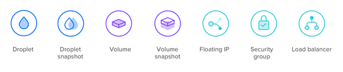
Credit to Celia McQueen for these rad object icons.
The pattern has been a huge success. In today’s UI, resources are always represented the same way, no matter where you are. This has brought cohesion to the platform and has reduced cognitive load when users are connecting their infrastructure.
2. Show The Right Thing
As a platform for many kinds of users, we need to be cognizant of what our users will find most useful on any given screen. Does the screen show the information (such as Objects) in the context that is most useful (such as Infrastructure)?This principle was previously titled “Infrastructure First” and “Surface Relationships.” It started out as a way to take full advantage of the Object Oriented principle. The first step to building your infrastructure is creating your resources. Your Droplets, Domains, Storage, Load Balancers, etc. The second step is tying them together to form a system.
A Domain can be pointed at a Load Balancer, which can be pointed at a Droplet, which can be pointed at a Block Storage Volume.
All of your resources looking and acting the same could result in an infrastructure experience as simple as Lego.
An older version of the principle cited our shifting focus to higher value customers. To do this, I thought, we needed to shift the focus on the platform to higher value systems. These were often made up of more complex infrastructure relationships. The system would be easier to understand if we found a way to better visualize those relationships.
The initial point of this principle was to evolve the interface to show users what they need—when they need it. But this assumed that what they needed was always Infrastructure.
Through meetings with leadership, it became apparent that this assumption was incorrect. So I adjusted the principle. The new version is more generic, but we still found value in reminding ourselves to always think about the context when building interfaces.
3. Scalable Interactions
Higher value customers require more resources. We have to account for substantially more droplets, snapshots, domains, and so forth per account.Our goal is to make it as easy to manage 1000 objects as is it to manage a single one.
Around this time, there was a big push within DigitalOcean to find ways to cater to larger companies.
We already had a good deal of customers with tens of thousands of Droplets. Most of them weren’t using the web app, though, instead opting for the API. While the API made more sense for these kinds of automated operations, we wanted to see what kind of value we could provide them within the interface.
Managing Droplets at their scale was difficult and frustrating using the UI. Even the Support page wasn’t optimized for a high volume of tickets, and there was no API alternative for that. Generally, we were providing miserable experiences for our highest value customers.
This principle was my way of keeping our eyes on the ball. Making sure that we were rigorous in our design processes, and accounting for cases that weren’t easy to design for but extremely important for the business.
The principle also included features such as better search, and tagging—not just as an afterthought, but as an integral part of the system.
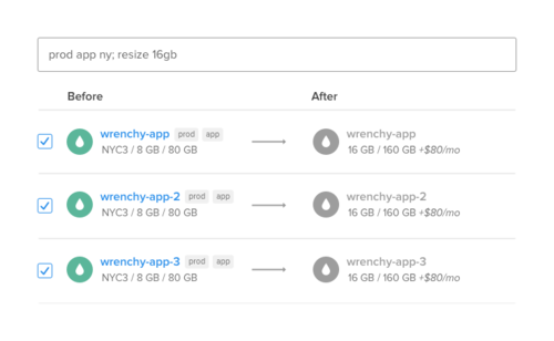
Following is a more recent prototype I put together for multiple resource selection and bulk actions. Hovering over the resource icon reveals a checkbox:
4. User Collaboration
More infrastructure requires more hands on deck. We’ve already built the first version of Team Account Management, but we’d like to take it a step further and make teams and collaboration feel like a native part of the product, fostering collaboration wherever possible. This means that the system is great for individual users, and just gets better as you grow.This one’s pretty straightforward. If you’ve noticed a trend in these principles relating to the shifting focus of the company, you’re not wrong. These principles were purposefully designed to provide value to both our users and the business.
If we provide an experience that only gets better the more you grow, it would make it easier and more enjoyable to grow your business on DigitalOcean.
This principle built on Team Accounts, which provided minimum viable team functionality. Possible features included shared notes/conversations on every object, better permissions, and on-call for Insights.
5. Keep Your Context
We will take advantage of the new abilities granted by the shift to a single-page JS app—such as streamlining the flow between different sections of the app.This means that it’ll be easy to quickly view and work on a droplet from within the main droplet list, or redirect a droplet’s floating IP or storage block from within the droplet itself. Simple, yet powerful and efficient flows for things our users can’t achieve today.
Our old Rails app required a page reload every time you wanted to make a change, or go to a new page. It was slow and clunky, weighed down by years of technical debt. We had recently begun an initiative to convert the app to Ember. JS apps let you load in pages asynchronously, a method employed by pretty much any modern app out there.
I once heard a joke that Product Design was just a collection of lists and single view pages. At the time, our app was the quintessential butt of this joke.
When you were in a Droplet and you wanted to edit the Floating IP routed to it, you’d have to exit out of your Droplet, go to the Networking page and find the right IP. We could link directly to the IP—but you’d still lose the context of your Droplet.
Similarly, when adding DNS records to your domain, you wouldn’t be able to see other domains. These might contain information that’s currently important to you.
I wanted users to be able stay on the main Droplet list and quickly edit different Droplets, without losing the forest for the trees. One way to do this was with sliding resource panels.
We could style our app responsively and allow for a few distinct panels to stack on the side of the screen. These might let users compare different information and graphs between separate resources. It could even allow them to dive deeper into their infrastructure by clicking on connected resources.
6. Keyboard Friendly
If they weren’t forced to use a trackpad or mouse, many developers never would. We believe that for DigitalOcean products to feel like home to developers, everything should be accessible via keyboard. HJKL should work natively.Playing on the Keep Your Context principle, we want users to be able to alter different resources easily without losing their context. We want to create a quick-find experience like Alfred, Slack, or GitHub. through which users can access and change anything from any page.
I’m a power-user. Always have been. What that means for me is that when I can optimize a workflow for added efficiency, I always do it. This includes keyboard shortcuts and automating frequent tasks. Always choosing the faster method whenever I can. Developers, more often than not, belong to this same group.
The keyboard insight came from Colin Keany, one of the designers on my team, who had noticed a developer’s frustration at using a mouse during a user test. Subsequent interviews revealed a trend. We had been tossing around the idea for a long while.
Slack’s Cmd-K is an integral part of the experience. Without it, I imagine the experience would fall apart for many users. The company recently went a step further and catered specifically to developer workflows. You can now use vim search and replace functionality for your last message. I’m guessing developers are in the minority of Slack’s userbase.
In contrast, almost 100% of DigitalOcean’s users are developers. We simply had to do better.
7. Make Developers Better
DigitalOcean users have a vast knowledgebase at their disposal, but accessing this information is difficult from within Cloud. There is an opportunity not just to shift to higher value users, but to turn regular users into high-value users through education.By surfacing the right knowledge at the right time, we can teach users how to properly build infrastructure using DigitalOcean. This is not just great UX, it’s great business.
DigitalOcean has two main differentiators in the cloud industry. Good design, and its stellar Community app. Hundreds of thousands of users have found value in our tutorials. The community’s consistent quality serves as a constant source of love from the industry.
We’re not doing much with this extremely valuable resource, definitely not as much as we can. Its knowledge is not well integrated into our core app, and our services aren’t integrated back into it. The opportunity space here is enormous, but so far we haven’t spent much time exploring it. The only connection as of now is our Support app, and that’s limited at best.
This principle started out as “Learning & Development” but we decided to call it what it is. By using DigitalOcean, developers should get the added benefit of actually getting better at what they do.
This is a principle I believe in beyond DigitalOcean. I described it in one of my recent blog posts, Patronizing Passwords. You should read it.
The pattern has the added benefit of upselling users who need more resources. Not in a cynical way—it also has the potential to down sell them when they’re using too many, saving them money and building love and loyalty.
It can save users from negative experiences before they happen. We can recommend a High Availability solution in case their server crashes or their data gets corrupted.
We could make this something like this work for various levels of technical sophistication. It would augment our brand, provide real, unique value to our userbase that would be hard for competitors to replicate. It could regularly create higher-value users. We might even teach them transferrable skills that would allow them to switch providers. Not a good thing on the surface, but as with any mentor, they will always value us for making them better.
By teaching them “how to fish,” we can help them understand their infrastructure needs. This can also provide more insight into our infrastructure costs. Higher quality infrastructure is also more expensive, but they’ll have a better understanding of its value.
Conclusion
This list of guiding principles was not drafted with pie-in-the-sky idealism. It was designed to focus our efforts on things that could provide value to both our users and the business.
The way I saw it was if these were truly to be guiding principles, they had to remain relevant in the future. DigitalOcean’s future customers had very different requirements. Structuring our north star around the kind of customer we wanted to get would produce designs that were attractive to those same customers. These interfaces could accelerate the rate at which we were acquiring them.
Designing with these principles in mind would create better user experiences, as they’re structured around user needs, rather than business needs. But the choice of which principles to include was based on the current state of the business and its future goals.
Object Oriented made it easier to grok the interface, but it also set up the foundation for building larger, more complicated infrastructure.
Show The Right Thing and Keep Your Context are obvious heuristics, but they promote growth by making it easier to work with that infrastructure in a holistic manner.
Scalable Interactions and User Collaboration improve the experience for organizations with more employees and resources, but they also make DigitalOcean viable for these kinds of customers.
Keyboard Friendly is on its surface a nice-to-have feature, but turning the interface into a native experience for developers would create an emotional connect, foster love, and increase mindshare.
Make Developers Better provides our users with lasting growth, but also creates higher-value customers for the business.
I see design as a powerful tool for accomplishing business goals. Framing our goals this way allowed us to cater to user needs while augmenting the business. When business and user needs can be aligned, great things can happen.