For more context, read a bit about my time at DigitalOcean.
During my time as an individual contributor, I organically leaned towards leadership. I spearheaded site-wide data tracking with Segment. I established processes for CSS structure and for managing design patterns. I built our recruiting pipeline and process from scratch.
A year in, it was clear that DigitalOcean required more Product Design leadership. I stepped up. I was promoted to lead Product Design. Naively, I thought I’d have time to take on more IC work.
Within the first months, I implemented a new onboarding process for new hires. I fleshed-out our recruiting process. I established a weekly design retro and regular design reviews. I worked with the team to articulate our values, defined our design principles, and created a checklist for all Product Design releases.
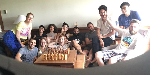
Over the first year, I handpicked some of the best designers out there and doubled the team. These are the crazy talented, driven, inspiring Product Designers I’ve had the privilege to work with. I honestly couldn’t have asked for a better team.
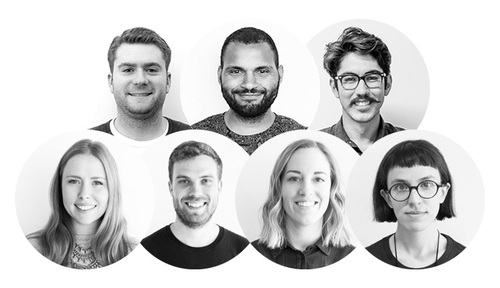
As of this writing, it’s almost two years since I started leading Product Design at DigitalOcean. I shed the Lead title a long while ago, embracing my role as manager to these fine people. Keeping them happy, engaged, and putting out amazing work is what gets me up in the morning.
You seemed to have hired from my perspective the strongest design team in NYC for size/stage of the company. Would love to learn tips from how you did it so I can do the same at ClassPass.”—Noah Levin, Design Manager at ClassPass
I’m so incredibly proud of the product we’ve built together, but this page isn’t about that. It’s about the work that’s behind the work. The effort that went into growing and empowering a team of designers, and making sure their voices were heard within the company.
Design at DigitalOcean
First, I should explain what design is to DigitalOcean.
The company first found its foothold in the industry by doing one thing and doing it well. We offered Virtual Private Servers (we call these Droplets) for an affordable price. The industry had set a pretty low bar for experience design, and DigitalOcean was an outlier, allowing you to spin up servers relatively easily.
The company surged and by the time I joined in August 2014, we were 60 people and going strong. We’re now #2 in the cloud space in terms of web-facing servers.
As a result, simplicity—and therefore, design—has been baked into the company’s culture from the start. There is a shared understanding throughout the company that much of our success can be attributed to good design. Following are DigitalOcean’s core values:
Respect your peers.
Speak up and listen when others do.
Trust and be trustworthy.
Our community is bigger than just us.
Love is what makes us great.
The first value matches the first line of our current company strategy. Deliver great experiences. This made for an environment that was ripe for productive collaboration. We just needed to build trust in our team and maintain it.
When I first took over the team, I had several areas for improvement in mind:
- Growing the team and improving performance.
- Raising the bar on the quality of our design work.
- Building trust with the rest of the company.
I’ll dive into each of these areas, and the work that went in to making them happen.
Growing The Team
When I started managing, my team included one Product Designer and two UI Designers. There was no question that it had an abundance of raw talent, but performance was inconsistent. No one had ever articulated what was expected before.
I had 4 heads to hire, and I didn’t want to set them up for failure. And so my first project as a manager was to create some accountability.
Improving Performance
I did this by establishing a new meeting. I know, exciting manager stuff. I dubbed the meeting Goalfest, and it ended up being a success. I actually wrote an article about it. This post goes into my early management philosophy, which, for the most part, has held true. If you want to get a feel for me as a manager, it’s a good read.
I won’t dive too deep into Goalfest, considering the article ☝. Its main goal was to provide insight into the way we were working and help us improve. Basically, it was a retro. A fun retro!
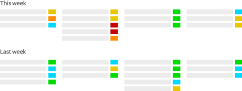
Each person set their own tasks for the following week. We’d take turns rating our previous week’s tasks from 1-5 based on completeness. We’d add comments, explaining why we didn’t accomplish something, or what helped accomplish something else.
The biggest lessons would go under a Lessons Learned heading. This improved our ability to approximate how much we could accomplish in a given week. It taught us what type of work was respectively harder for each person on the team.
I believe deeply in flexibility and experimentation. Goalfest was just that. It evolved quite a lot throughout its life. We added # of hours to tasks so we could better estimate what could fit in a week. These were later changed to t-shirt sizing. We tried using the spreadsheet in conjunction with meetings, and then without. We tried categorization. We tried general tasks, and then incredibly specific tasks. We shifted the time for goal submission and the time of the retro. The meeting wasn’t for me, it was for them, so I wanted to make sure it was valuable.
Goalfest wasn’t that novel, but we hadn’t had anything like it before. It substantially improved both productivity and accountability within the team.
Since I released the post, Goalfest has been adopted by a good number of teams within the company. It was also adopted by many other design teams (within BuzzFeed, Facebook, etc), and included in this InVision post on “Meetings That Will Make Everyone a Design Leader.”.
So yeah, good times 👌
Overhauling The Hiring Process
Goalfest took effect pretty quickly. It took only a month or so to begin seeing real improvement. I felt like we were ready to grow the team.
Sourcing
When I was an IC, I met with several design leaders and soaked up as much recruiting wisdom as I could. I’d already put together our initial methods for recruiting top-tier designers.
The hiring process starts with sourcing and marketing. Continues with first contact. How to get people interested. The interview process. Onboarding. It ends when someone is a fully integrated, productive member of the team.
I wanted to scale my recruiting efforts to the rest of the team, so I built processes for filling up our pipeline and monitoring it.
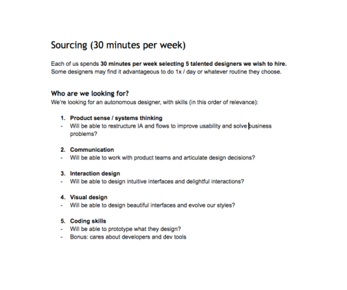
I set aside times during the week for designers to source candidates and wrote scripts for selling them on DigitalOcean as a company.
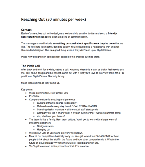
The designers we ended up hiring were a result of me personally reaching out and guiding them through this process. For each designer hired, there were hundreds that weren’t. I also brought in two amazing Brand Designers along the way 😎
Onboarding
When I joined DO, I received a broken old MacBook Air and a hazy task for the week. I made my first commit to the codebase the next day.
Being productive on the surface is easy, compared to having an actual impact. It took me months to get the lay of the land and begin bringing real value to the company.
I didn’t want my new hires to go through the same process. I set out to create a better onboarding process that would set new designers up for success. This included:
- The design team’s values, which we had recently articulated.
- Information about the design team’s and company’s workflows and tools. I’d also make sure they had access to our software and were in the right Slack channels.
- Buoy training and tasks.
- A deep dive into each product within our company’s current and future portfolio, and how these fit together.
- An overview of all the teams we work with, and what the interfaces for those teams are.
- Meetings with people they’d likely interact with, such as PMs and EMs.
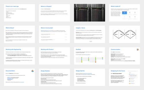
It’s not hard to get a designer to build stuff quickly. Getting them to build the right stuff quickly is. When I started hiring designers, they got up and running within two weeks—with enough context to produce great, impactful work.
Engaging and Growing Individual Designers
DigitalOcean has a learning culture that deeply resonates with me. One of my biggest drivers is seeing individuals on my team grow. Over the years, I’ve facilitated many opportunities for my reports.
I trained one of our UI designers in UX methodologies and helped him grow by assigning him to increasingly more complex projects over a year. He earned the title of Product Designer. Another designer who expressed interest in management received regular mentorship, an opportunity to lead our team temporarily, and finally a promotion to lead the Brand Design team full-time. A different designer recently took advantage of a similar opportunity and is now leading a Product Design team full-time.
Other designers preferred to be stretched through the kinds of projects they’d be working on. Some wanted a wider variety of work or meatier UX projects. Others wanted to lead Design Sprints, to spend more time on our user research processes, or to own our design system. Some designers just wanted to gain more experience in Framer. I’m proud of having always found a path to accommodate individual developmental needs while maintaining coverage on whichever projects were in-flight.
I’ve found that the same designers who aren’t showing up on one project or in one situation can become extremely productive in another. Making sure that every designer on my team is consistently engaged, and putting out their best work has always been my first priority.
Raising The Bar
Another issue I noticed around the time I started managing was the quality of the work we were putting out. It wasn’t bad, but I didn’t feel it was ambitious enough. There were a few reasons for this:
- There weren’t many Engineering resources, so most projects were scoped down.
- Before we found our footing as a Product org, projects were often changed several times mid-process.
- Buoy, our CSS style guide, was great at bringing consistency to the platform, but design systems have a knack for restricting creativity if left unchecked.
All of these things stifled the team’s ambition, and, for a time, it showed in our work. Designs were usable, but not compelling. They worked, but they weren’t inventive. They conformed too closely to our established patterns and styles, even when they shouldn’t have.
The team had all the skills to build amazing products, they just needed a push in the right direction. This push took several forms:
- A process checklist.
- Regular design reviews.
- Regular design jams.
- A new process for design pattern updates.
I’ll dive briefly into each one of these.
Product Design Checklist
My first step was to introduce a process checklist. This wasn’t a step-by-step process that designers had to conform to. Rather, it was a list of things that had to happen before a design would be ok'ed for release.
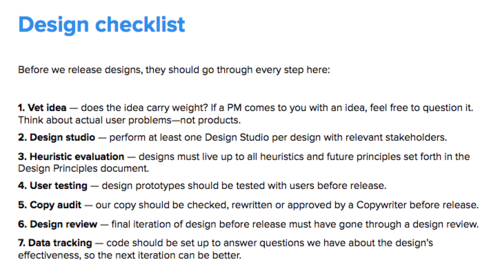
The checklist would lead to a more rigorous design process, which would result in higher standards across the board.
Daily Design Reviews
I immediately introduced hour-long design critiques, three times a week. These were subsequently changed to half-hour-long, daily critiques.
These followed standard practices. Laptops and phones down. One designer facilitates and takes notes. The designer presenting gives context, shows the work, and outlines what kind of feedback they want. The rest of the designers ask follow-up questions and provide relevant feedback.
Then we recap the notes and write out next steps, often to resolve specific issues or explore certain facets of the design. The presenting designer would be held accountable to these next steps in their following design review.
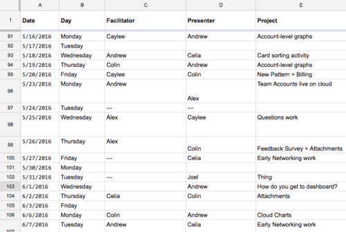
Design reviews have also become the space where we can collaborate with the Brand design team on brand changes, illustrations, and color palettes that will likely affect our products.
I’ve taken part in almost every one of these reviews—not as a manager with added authority, but as a fellow designer. In them, I’ve consistently pushed for more exploration and rigor, better reasoning for decisions, higher attention to detail, and more ambitious work. More importantly, designers on the team quickly began pushing each other for these things, as well. We began holding each other to higher standards.
Regular design reviews turned out to be the single most powerful catalyst for higher quality designs.
Design Jams
Later on in the year, we were more heavily dispersed through our respective product teams. For a time, some designers left our pod of desks to sit with their PM and engineers. This lead to a decrease in the kind organic collaboration you get when two designers’ screens are side by side.
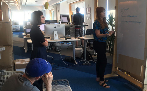
The team felt this and wanted a solution. We implemented weekly design jams. Designers would sign up to bring their problem in and bounce ideas off a white board with the rest of the team.
Holistic design changes
Finally, Buoy became a bit stifling (as described in another curiously long case study). The team decided it needed a way to work outside of its limitations.
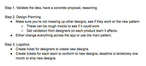
We worked together to create a process for implementing changes to patterns. This would allow designers to experiment with various patterns outside our design system, with the knowledge that they could be integrated later if chosen.
The process forced us to think of the entire system before committing to a change. This would maintain consistency while providing greater freedom.
These four initiatives resulted in a team that was much more enthusiastic, optimistic, and ambitious. In turn, this led to designs of a much higher quality.
Building Trust
Throughout my time as an IC, the design team was a happy tight-knit family. We were in our own little world and the culture was amazing. Unfortunately, this meant we were extremely siloed. We produced a lot of great work, but other departments would see it too late in the process.
As a result, we lost much of the trust the company had in us. They didn’t know what we were doing, and when they found out they didn’t know why we did it. Our platform and network engineers—who actually built the technology—were totally disconnected from the process of figuring out how customers would interact with it. Our leadership team wasn’t involved throughout most of the design process, and as a result wasn’t invested in the solutions we presented.
Beyond trust, we were losing out on varying and important perspectives that could help us build better products. Sometimes, these missed perspectives were critical to a product’s viability. Not having them resulted in tighter sprints and worse products.
Support would see a design in production and let us know it absolutely would not work due to fraud. Engineers would see a design after several rounds and then give us product-changing technical context. The leadership team would see designs late in the game and kill entire features, forcing us to scramble and ship lower quality designs rather than thoughtful MVPs.
This was our faults, of course. We weren’t set up to interface with other parts of the company. We chose to leave that to others and just focus on the work. That didn’t work—but luckily it was changeable.
We started two initiatives right away.
Design Studios
Design Studios are essentially tiny Design Sprints used to kick off new projects. The Product Designer would invite those involved in the project to a structured brainstorming session.
These sessions would usually include a PM, Software Engineers involved in building the product, and Platform/Network Engineers involved in building the underlying tech. Depending on the project, we might also invite people from Support, Marketing, Customer Success or Operations.
Sessions followed a familiar structure:
- 10m: The Product Designer explains the problem
- 10m: Sketch session
- 10m: Each person explains their designs (2m per person)
- 5m: Each person lists what they liked most about other designs (1m per person)
- 25m: Rinse and repeat the last 3 steps.
After the session, the designer would cherry pick the ideas with the most potential and distill them into a first prototype.
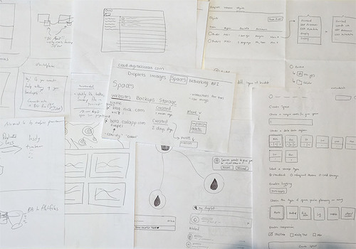
Studios would never result in anything close to a final design, but they had an important purpose:
- They provided us with valuable perspectives that would lead to better design solutions.
- They spread context and opened up a channel of communication with engineers. They served as the start of a conversation that would continue throughout the process.
- They shared ownership over the design, which led to less friction and easier collaboration during the actual build. It also led to developers feeling a stronger connection to our product in general. One Senior Engineer who had been with the company for years said it was the first time they had had any impact at all on the interface, and that it felt amazing.
- They built trust in the Product Design team, by giving our colleagues a taste of what it is that we do.
The truth is, we were never the kind of designers who put the craft on a pedestal. With the right guidance, anyone can take part in the process. I had purposefully hired designs who valued collaboration and left their egos at the door. The problem was that we’d never set up the proper channels for that collaboration to actually happen.
Design Studios now start ever project off on the right foot. They’ve been a huge success across the board.
The Product Design Gazette
Design Studios are great, but they don’t scale—definitely not to 300 people and counting.
Leadership had to have more transparency into our process, and we still needed a way to:
- Build trust with the entire company.
- Keep every potential stakeholder informed of our progress and status. Allow them to step in where needed.
- Tap into a wider range of knowledge from different parts of the company.
The solution turned out to be a company-wide email titled “The Product Design Gazette.”
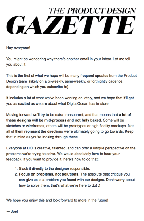
I’d send a Gazette out to the entire company every other week. They quickly became everyone’s favorite email.
This is an amazing update, with so much good work that hard it’s to remember everything. Loving all this and please keep up the good & hard work of keeping DO simple.”—Ben Uretsky, CEO
We’d include everything we thought might be interested and build trust:
- Early ideation and wireframes. Brainstorming sketches.
- Links to design research decks or specifications.
- Case studies for various UX processes.
- Findings from our Design Sprints.
- Various mocks of design directions.
- Links to InVision or code prototypes.
- Polished UI, right before we release
Similar to this portfolio, there was usually also a lot of text. We’d dive into the process and try to give readers as much context as possible, rather than just sending them the pretty pictures.
still my favorite email to receive =]”—Moisey Uretsky, CPO
We continue to receive love from virtually every department—Engineering, Support, People, Finance, Community, Product, Brand, Customer Success, Sales—as well as every level from interns to the CEO.
Everyone feels engaged with the design process, and everyone now trusts us with the product.
Here are some choice responses:
- “This is the best-designed email I’ve gotten in my inbox. Well done.”
- “Good stuff, Joel. I sit right next to you and I know more now about what you do than I ever have!
- "This is amazing! Thanks for putting it together, and for the great designs.”
- “How do I subscribe to this or is this something you plan to send out weekly, monthly?”
- “Top notch content as always, I really enjoy reading through these”
- “Wonderful as usual, thanks for the updates. I like how you shouted out certain people from other departments, nice touch Joel-san.”
- “LOVE the wireframes!!! HURRAH for rapid prototyping and moving fast!”
We also regularly receive awesome feedback and questions that helped other teams build the right supporting technology:
- “Just some clarification on the new sketchy/locked/abuse wording …
- "Generally speaking, user data tends to contain sensitive information … I would be very careful about how we go about this interface because it needs to be very clear that it’s not saved by default…”
- “Will these be the same we use for the community platform?”
- “This is awesome, thank you so much for sending it out. I spent about 90 minutes combing through these today. Celia is great with feedback and super positive :) Alex was also quick and thoughtful with his feedback. Do you know how many people took the time to send feedback?”
The answer is: a lot. We’ve trained everyone on what kind of feedback is helpful and what kind isn’t. This means that designers receive valuable feedback every single time a Gazette is sent out.
The Gazette was and remains a big hit within the company. People are excited to receive it. When we miss it by a week, people ask about it. It’s actually become one of the main ways people find out about project status for our new products, even within departments like Engineering.
Most importantly, it’s built a lot of trust that the Product Design team knows what it’s doing.
Conclusion
Throughout the year and a half that I led Product Design at DigitalOcean, I did a lot. I doubled the team and set up various processes to help designers on my team unlock their potential (self-help book in the works) .
As a result, we have become an incredibly tight-knit, high-performing team. We’re known throughout the company for how healthy we are.
I put systems in place systems for more consistent transparency. These have resulted in more trust and leeway for Product Design across the board.
None of these processes were meant to be restrictive—simply to provide structure where structure was needed. More often than not, process-setting was itself a collaborative process, and we implemented many systems that the team ended up appreciating. Even enjoying.
I’ve been a relatively hands-off manager. I believe strongly in hiring good people and empowering them. I’m there to clear roadblocks, break ties, help with personal development, and just talk when they need to. I’m there to push back when I know they can do better, in terms of productivity, ambition, or design quality. But I’m definitely not there to design for them.
All of the products that came out in the past year and a half were designed by my brilliant team. I just did the work of making sure they could.