Do Share was a collaborative project between myself and Tzafrir Rehan. Tzafrir approached me with an idea for a Google+ post scheduling app in early 2012. He had been interning at Google and had worked on parts of the social network. This explains why he was using it in the first place.
There was no official API at the time and there wouldn’t be for a long time to come. This meant two things. First, we would have to employ a few workarounds and hacks that Tzafrir had in mind to make the app work. Second, the market would be wide open for a good while. Larger apps such as Hootsuite would wait for a more established API before venturing into Google+ scheduling. We decided not to wait for them.

Starting the Design Process
The first constraint we hit with the app was that it couldn’t post as the user without being logged in as the user. The only way to make a the app work was for the user to have their browser open and logged in to Google+. Tzafrir suggested it be a Chrome extension.
The project was straightforward. The extension would need to have its own interface, and an indicator button on the browser’s toolbar. I also wanted to design inline buttons within Google+ modals or next to Google+ post buttons.
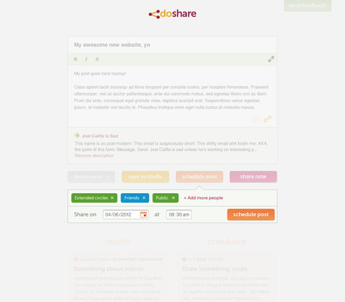
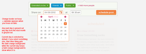
Users would need to be able to either post their content right away or schedule it for a later time. They needed to be able to do this either from within Do Share or from the native Google+ interface.
Most importantly, considering the project’s inherent limitations (i.e. users needing to keep their browser open in order for it to work), the rest of the experience would have to be exceptionally simple and clear.
Initial Sketches
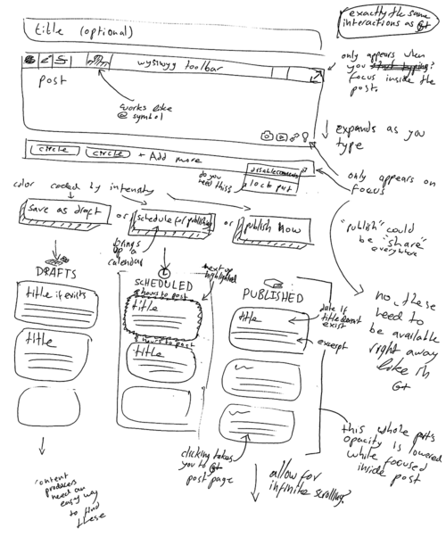
A few days later I sent Tzafrir the initial sketches accompanied by this email.

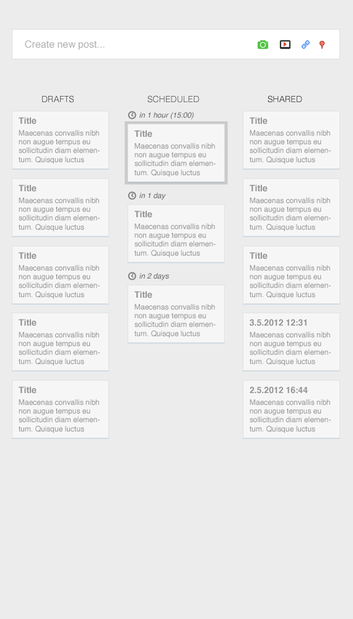
I also included some mid-fidelity wireframes.
User Experience
Do Share was an exciting project for me. It was just me, Tzafrir, a relatively small app, and no foreseeable deadline (though we did set one for ourselves). We had some time to experiment with new kinds of interfaces and interactions. I took full advantage of this to pursue an uncompromising user experience.
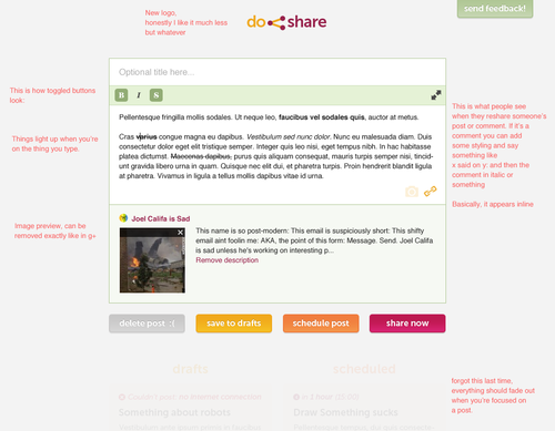
First off, I set us on the path to solving the most frustrating experience online text editors have to offer: user slips. Most text editors include an oversight when it comes to the back button and its effect on user content. It’s not surprising that this issue is so prevalent. Keeping a user’s text inputs in memory requires quite a bit of work behind the scenes. It’s hard to prioritize these smaller experiential details. With Do Share, we had the opportunity to solve this in a novel way. By connecting the post in the list directly to the post in the text box, I’d have them sync in real time and avoid loss of content.
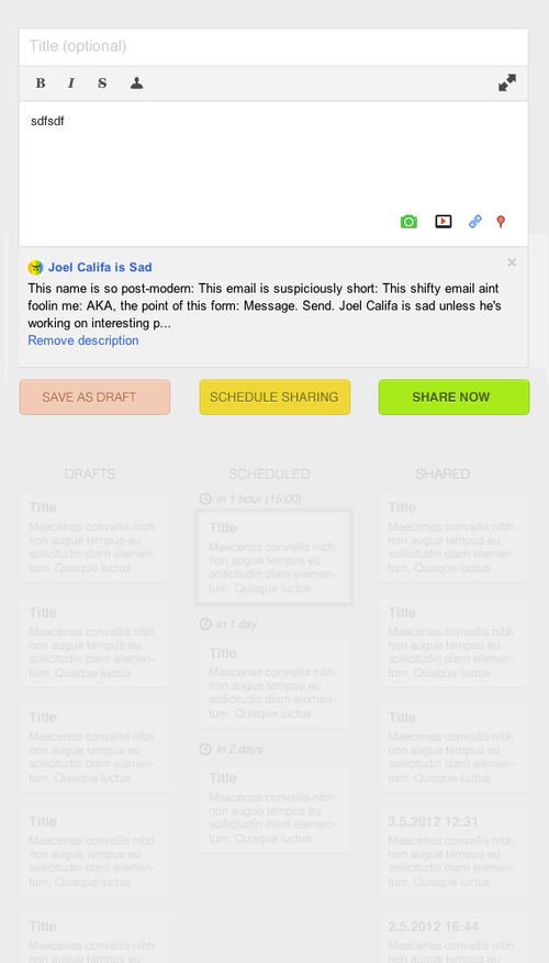
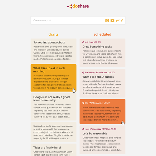
To create a new draft, all the user has to do is click into the text input and start typing. As the user does so, a box will appear in the drafts column with the same text, updating in real time. Everything but the main text input is faded out, so this is a very subtle effect rather than a distracting one. If a user accidentally clicks the back button or closes the browser—the post will be right there in the drafts column. When you click on a post, its content jumps into the text input box and the user can continue where they left off.
By taking our time with solving user slips, we ended up finding the core of our app’s experience, one that remains relatively unique.
I also pushed for Do Share to have post titles. Google+ posts didn’t have titles, but we decided that they could be incredibly useful within our app. Users with many scheduled posts could differentiate between them. Users who wanted to add additional context could add it. We kept the titles optional and when users chose to use them, we simply prepended them to the published posts, in bold.
Then an interesting thing happened—most of our users started using post titles. People without the app began adopting the custom of first-line-as-title. Our small design choice inadvertently started a culture of post titles within the early Google+.
More Designs
A week or so or iteration goes by and I send Tzafrir another email with my latest version.
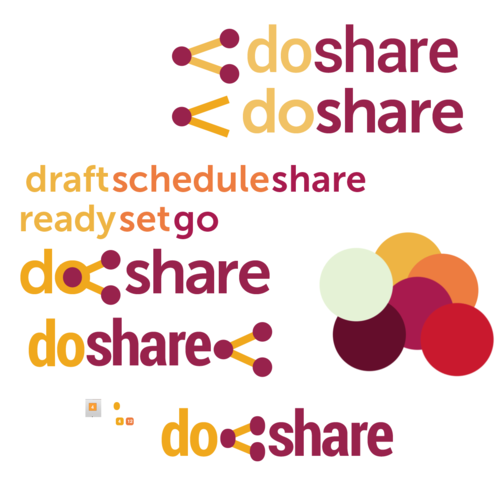
Tzafrir had also asked me to work on some possible brands. I sent him the most successful direction, which I based on the same concept I used to color the interface. Intensifying colors for intensifying actions.
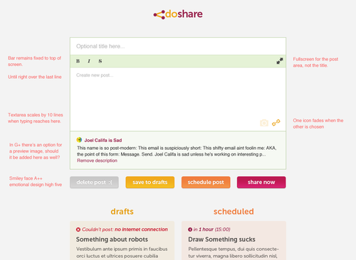
A few days went by and I sent Tzafrir a mockup of the post-editing state with inline notes on how Do Share should work. In the meanwhile, I sent him the sprites and CSS and he pushed it overnight.
At this point, he was pushing versions of Do Share faster than I thought possible. What a pleasure it is to work with a badass developer. No amount of mockups can give you the level of insight that you can get from playing around with a working prototype. I had an up-to-date version almost constantly, and we were iterating rapidly.
I get on post scheduling and send him the next mockup. Sometimes not working directly with code is a dream.
A few more mockups, then we add tagging, and we’re more or less done with v1.
Launching and Beyond
The launch went smoothly and the reception was wonderful. People loved the app from the get go. We got thousands of users in days. The app’s delightful experience seemed to win over the inconvenience of having to leave your browser open.
We got a bunch of press from CNET, Marketing Land, and THIS GUY, plus many other blogs tailored towards people who schedule posts on Google+. Guy Kawasaki took a liking to the app and even wrote about it in his book, so there is real physical ink now somewhere that spells out Do Share.
Since then, Google+ continues to be a ghost town. Tzafrir worked on the app for a while longer and added lots of cool and useful features. His designs left much to be desired, but the functionality is fantastic and I wholeheartedly recommend that you give it a shot. You know, if you’re into that sort of thing.
Designated Compliment Box
Working with Joel is joyous and smooth. His designs are not only beautiful but also specifically crafted for the intended medium. They speak its language. Get ready for fast design to code cycles, because Joel knows his environments as well as you, and will always have your latest code on his machine. If you want to get things done and stay happy while doing it, you better call Joel!” —Tzafrir Rehan