I was approached by Alexey Komissarouk and Kevin Gao to design and develop an online presence for The Rotationship, a year-long fellowship at four different companies in Silicon Valley. The project was relatively urgent so it would have to be designed and coded within a week.
First Steps
Alexey and Kevin turned out to be ideal clients. They sent me a rough draft of the copy beforehand and, for the most part, knew what they wanted. I began by asking them to articulate the purpose of the site. Their top priorities were explaining the gist of the program, and getting interested visitors to sign up.
I asked for a list of sites they liked that communicated the same feel they were going for, along with an explanation of what they liked about them.

Initial Directions
The examples they sent me had some common characteristics but were different enough that I could take the site in a few different directions. This was a rush job, so that night I sent them an email with possible directions.


Kevin and Alexey agreed on the third direction and chose to continue down that path.
Designing the Site
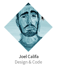
Two days later I send them a mockup of the site’s structure as I envisioned it. The aesthetics were largely unchanged from the original direction I sent out. I incorporated diamonds where I could, the four points representing the 4 fellowships within the program. I kept the same typeface from the initial design—Crete, a slab-serif that was solid and professional but had enough quirks to give the site a friendly feeling. I paired it with Source Sans Pro, a lovely neutral typeface.

Once it was approved I started work on the visual design. Throughout the day I sent them a few higher fidelity version. With each iteration, I tweaked the typography, colors, icons, the weight of the sponsor logos on the page, and the order of the content.

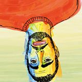
The mentor images ARE NOW DIAMONDS.
They hadn’t realized how much of the primary color would be on the site and asked to see it in another color. I tried a few and landed on a greenish blue.

Coding
Once I started coding the front-end, I took a more reductionistic look at each element. I began designing possible interesting interactions. The site was very minimal, and some delightful transitions could give it more personality.
When I started the work, The Rotationship didn’t have a brand in place. The small diamond elements became the start of one. I gave them a :hover animation for some dynamism. When visitors hover their cursor over the logo, the diamond rotates a single time. This represented the transition from one fellowship to another. I didn’t include a backward transition for when you remove your cursor. This way it seems as though every time you hover, there is a new rotation.
I added the same hover effect to the mentors’ diamond masks.
Finally, I created a hover effect for sponsor logos. I wanted to keep the logos greyscale to fit with the understated theme, but show colors on hover. I did this with a transition where logos would “fill up” with color as you hovered over them. When you removed your cursor, the color would drain from them.
Since the site was responsive, this proved to be more technically challenging than I had anticipated. I was adamant about using a single sprite per logo to keep load time down and so it would be easy for Kevin to maintain later on. This complicated things further. Since the logos were constantly growing and shrinking in size depending on the width of the browser, the proportions would break. After much trial and error, I had to insert a blank image with the correct proportions to maintain them. Not the most semantic code, but it got the job done.
<li class="company-name">
  <img class="sizing" src="logo.png">
  <div class="logo grey"></div>
  <div class="logo color"></div>
</li>
.sizing
width: 100%
max-width: 100%
height: autoI used two divs and overlaid one on top of the other. Other techniques proved problematic for the intended goal. I gave both the .logo class so I could set the background-image just once in the stylesheet. From this point on, it was rather easy. I set a transition on the height of the overlaid gray image to reveal the colored one under it.
.logo
  position: absolute
  width: 100%
  height: 100%
  background-size: 200% auto
  transition: all 0.3s ease

  &.color
    background-position: 0 0
    z-index: 1

  &.grey
    background-position: 100% 0
    z-index: 2

  &:hover, &:active
    .grey
      height: 0
The result was a sponsor logo that filled up with color on hover. A subtle effect, but I think it was worth it.
I sent Kevin and Alexey a long, thorough guide explaining how to maintain each element on the site, and that was it.
Check it Out
The version I submitted to Alexey and Kevin is available here. Check out some of the interactions we discussed.
After publishing the site, they gathered more input from visitors and friends and edited the site. The modified version of my work is up at therotationship.com.
Designated Compliment Box
It was a pleasure working with Joel; he was fast, responsive and considered not just our direct goals but brought in his design sensibility and product experience to ensure we worked on the right things. He’s also super creative and suggested nice touches and effects that really make a difference for the consumer experience. I’d work with him again!” —Kevin Gao