What is Crypt?
Crypt is a project in Game Design, Visual Design, and Web Development. In collaboration with Robert Vinluan and Peter Kim as an independent study. The project began as an homage to one of my favorite games, Uplink by Introversion Software, redesigned for the modern player.
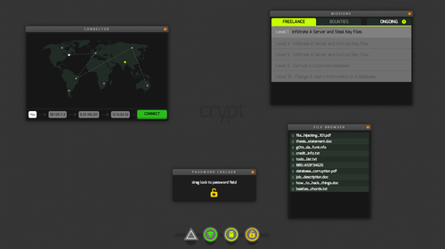
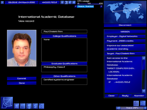
In Uplink, you are a hacker making your way to the top. You do this by hacking increasingly complex targets in a ridiculous Hollywood-style fashion. It’s a classic game—unique, nostalgic, replayable, and deeply outdated. Crypt was our attempt at both revamping the visuals and UX of the original game, and turning in into a full-fledged mass-multiplayer game.
Goals
The original game had out-dated visual design and frustrating interactions that were ill-suited for casual players. We intended to craft a sharp, contemporary visual design. We wanted to design new, delightful interactions and interesting multiplayer gameplay.
This turned out to be more work than we anticipated (which was a lesson in itself). We narrowed our scope mid-project and set to complete a playable prototype of Crypt’s first mission.
Research
Our first step was replaying the original critically. We mapped out UX failures and wins and figured out what made the game fun.
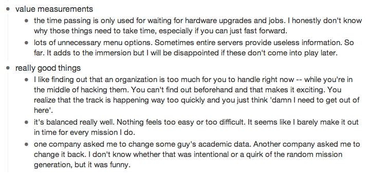
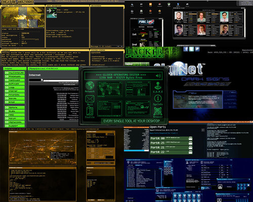
We then searched for was already out there. Many developers, enamored with Uplink, had created their own versions of the game. We went through every game we could find (about 8 in total) and took notes on what was and wasn’t working.
Ideation & Game Design
We started our process with a brainstorm that would last a month and fill half of the living room with post-its. Slowly, but surely, the game became more concrete. We scoped out what we wanted Crypt to be and began drawing up potential user flows. We began thinking about how to structure our system, both in terms of code and in terms of our players’ mental models.
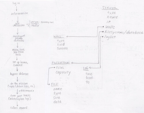
Our initial ideas for Crypt’s multiplayer aspect were especially ambitious, and an especially interesting excercise in game design. We wanted the player to always feel a sense of paranoia and impending doom.
One of the ways we thought to accomplish this was through what we called “Indirect Multiplayer.” The idea was that the player would interact with many other characters throughout the game, mainly by hacking them. Most of these would be NPCs (non-player characters). Some would be real people but players would have no way of knowing.
Since this was a hacking game, there would be a way of back-tracing the initial hack and setting up traps for other players. These weren’t concepts we had seen before. Especially the Indirect Multiplayer, which I’ve yet to see them in another game.
About a month went by and we had built a solid, thought out structure for the game. Once we narrowed the scope of the project, we focused on the first mission. This would adhere to the user flows and models we’d been developing. The first mission would consist of these steps:
- Accept a mission.
- Connect to a server.
- Crack the password.
- Steal a file.
- Submit that file for payment.
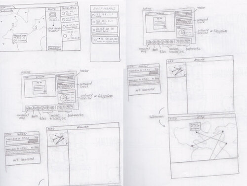
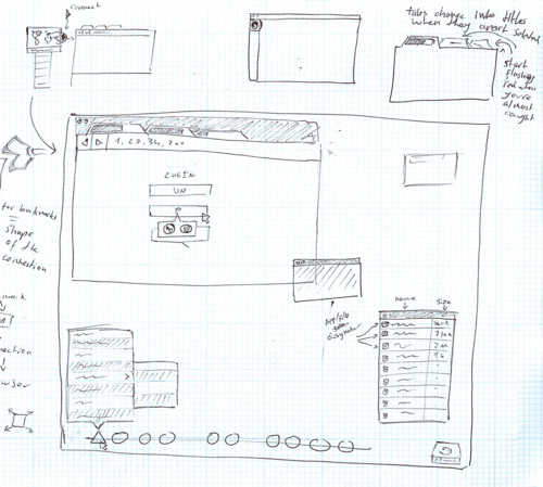
Visual Design
When it was released in 2001, Uplink’s aesthetic was in line with its contemporary future interfaces. Today, rather than seeming futuristic or technological, it feels like a relic of the past. One of our main objectives was to make Crypt feel contemporary, on the bleeding edge, and visual design played a large part in that.
The theme of hollywood hacking embraces the ridiculous nature of these cliche design. I wanted the interface to breed paranoia and make you feel like a hacker. I went with a dark carbon pattern. The icons would be neon colors, evoking a sort of Blade Runner dystopian future.

My UI design process here was iterative and quick.
Development
We had originally intended to build Crypt with backbone. This would have served as a first step towards turning it into a full-fledged multiplayer game. In the end, we only had time to create a static first mission.
I worked on the action bar, window management and styles, map UI and file systems. Peter worked on backbone and the password cracker. Rob worked on the missions.
JQuery UI
JQuery UI, back in 2012, was an irritating library to work with. We chose it because it gave us the draggable, resizable and stackable functionality that we needed. Coding this from scratch would have meant spending a month a month fixing our own bugs. We settled for a month fixing JQuery UI bugs.
Once I managed to rangle it into submission, I built the windows as objects. With this system in place, adding new windows becam incredibly easy. It’s always important to think ahead in projects you abandon. What is it they say? Premature optimization is the root of all evil.
Long story short, I built the windows so that they could be moved around, stacked (there was a bug with the z-indexing that took ages to fix), and resized. This meant that every window’s contents would have to be fluid.
Raphael JS
I started out with a raster map. When I decided that every window should be resizable—another premature optimization for when we’d have players who’d want to customize their interfaces—I had to code a map that was more dynamic.
This was my first time working with svg. I had a lot of Processing experience, so the learning curve wasn’ too difficult. But it wasn’t what I was used to dealing with in the context of web development. Once I got the hang of it, the map itself was relatively easy. Since the map was fluid, though, I had to set the node coordinates as percentages rather than numbers. This was fine for the nodes, but paths, for some reason, would not accept percentages.
Instead of accepting a perfectly fine MVP, I created a js function that would find the absolute X and Y positions of each node based on the current map size every time you clicked on one. This is the result.
When we finished, we were still under the impression that we’d come back to this and create a full-fledged game. Here is a screencast I put together over 4 years ago, in which I make promises I won’t keep.
User Testing
At this point, the demo of the first mission was fully playable. Considering this was our first prototype, I wanted to test a few of our assumptions. I put together 10 simple user tests.
Users were picked out of the game’s target audience, in a spectrum between moderately technical and highly technical.
I told them that Crypt was a hacking game, and gave them their task:
- Accept a mission.
- Complete the mission.
Everything else was up to them, including figuring out how to accept a mission.
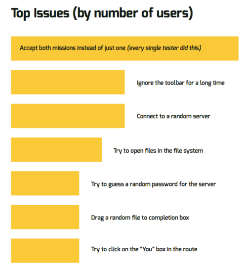
The test didn’t include nearly enough players to result in any conclusive lessons. We did notice a few big issues, though. One of the main issues was that most players would not read even the tiny amount of text we had on the missions window. So, right away, I made this portfolio.
I put together a full report on the user tests, including insights and possible solutions. Click for the full report in stunning PDF format.
Play The Game
Check it out at joelcalifa.com/crypt
Why not try it out for yourself? The following game is playable.